[SFCartesianChart] [Flutter] ColumnSeries Column is Cropped in Half at the start and end of the DateTime Axis #252
Description
Im using SFCartesianChart Widget with DateTimeAxis X Axis and NumericalAxis Y Axis, with a ColumnSeries. I want to display Weekly, Monthly & Yearly Columns in my Chart. I have set minimum & visibleMinimum to 'First Day of Current Week' and maximum & visibleMaximum to 'Last Day of Current Week', for the Weekly Data and respectively, for Month and Year.
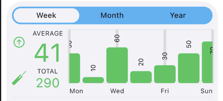
My Weekly Chart ranges from Monday to Sunday. The Data is mapped correctly, but the Monday & Sunday Columns are cropped by Half the Width of the Column on either sides.
I cant seem to figure out how to Pad the X Axis on both sides so that the columns are not cropped. Pls look at the attached screenshot for reference.
Kindly suggest how i can see Column Series where all the 7 Columns of a Week can be seen without Cropping the Columns. Thank You. Awaiting your response eagerly.
Code Below:
testWorkload = [ DataPoint(value: 30, xAxis: DateTime(2020, 12, 21)), DataPoint(value: 0, xAxis: DateTime(2020, 12, 22)), DataPoint(value: 30, xAxis: DateTime(2020, 12, 23)), DataPoint(value: 30, xAxis: DateTime(2020, 12, 24)), DataPoint(value: 0, xAxis: DateTime(2020, 12, 25)), DataPoint(value: 30, xAxis: DateTime(2020, 12, 26)), DataPoint(value: 30, xAxis: DateTime(2020, 12, 27)), DataPoint(value: 50, xAxis: DateTime(2020, 12, 28)), DataPoint(value: 10, xAxis: DateTime(2020, 12, 29)), DataPoint(value: 60, xAxis: DateTime(2020, 12, 30)), DataPoint(value: 20, xAxis: DateTime(2020, 12, 31)), DataPoint(value: 30, xAxis: DateTime(2021, 01, 01)), DataPoint(value: 50, xAxis: DateTime(2021, 01, 02)), DataPoint(value: 70, xAxis: DateTime(2021, 01, 03)), ];
SfCartesianChart( enableAxisAnimation: true, margin: EdgeInsets.only(top: 10), primaryXAxis: DateTimeAxis( rangePadding: ChartRangePadding.auto, axisLine: AxisLine(width: 0), majorGridLines: MajorGridLines(width: 5), majorTickLines: MajorTickLines(width: 0), minorGridLines: MinorGridLines(width: 0), minorTickLines: MinorTickLines(width: 0), intervalType: DateTimeIntervalType.auto, minimum: _trendRange == TimeLine.week ? DateUtils.firstDayOfWeek( DateTime.now()) : _trendRange == TimeLine.month ? DateUtils.firstDayOfMonth( DateTime.now()) : DateUtils.firstDayOfYear( DateTime.now()), maximum: _trendRange == TimeLine.week ? DateUtils.lastDayOfWeek( DateTime.now()) : _trendRange == TimeLine.month ? DateUtils.lastDayOfMonth( DateTime.now()) : DateUtils.lastDayOfYear( DateTime.now()), visibleMinimum: _trendRange == TimeLine.week ? DateUtils.firstDayOfWeek( DateTime.now()) : _trendRange == TimeLine.month ? DateUtils.firstDayOfMonth(DateTime.now()) : DateUtils.firstDayOfYear(DateTime.now()), visibleMaximum: _trendRange == TimeLine.week ? DateUtils.lastDayOfWeek(DateTime.now()) : _trendRange == TimeLine.month ? DateUtils.lastDayOfMonth(DateTime.now()) : DateUtils.lastDayOfYear(DateTime.now()), labelIntersectAction: AxisLabelIntersectAction.multipleRows, dateFormat: _trendRange == TimeLine.week ? DateFormat('E') : _trendRange == TimeLine.month ? DateFormat('c') : DateFormat('MMM'), labelStyle: Theme.of(context).textTheme.caption, labelAlignment: _trendRange != TimeLine.year ? LabelAlignment.center : LabelAlignment.start, edgeLabelPlacement: EdgeLabelPlacement.shift), primaryYAxis: NumericAxis( isVisible: false, minimum: 0, visibleMinimum: 0, anchorRangeToVisiblePoints: true, rangePadding: ChartRangePadding.auto, labelStyle: Theme.of(context) .textTheme .bodyText2, numberFormat: NumberFormat('###'), associatedAxisName: 'Workload', decimalPlaces: 0, majorGridLines: MajorGridLines(width: 0), majorTickLines: MajorTickLines(width: 0), minorGridLines: MinorGridLines(width: 0), minorTickLines: MinorTickLines(width: 0), ), series: <ChartSeries>[ ColumnSeries<DataPoint<DateTime>, DateTime>( dataSource: testWorkload, xValueMapper: (DataPoint workload, _) => workload.xAxis, yValueMapper: (DataPoint workload, _) => workload.value, width: 0.9, dataLabelSettings: DataLabelSettings( labelPosition: ChartDataLabelPosition .outside, labelIntersectAction: LabelIntersectAction .hide, angle: 270, labelAlignment: ChartDataLabelAlignment .auto, isVisible: true), color: colorName, borderRadius: BorderRadius.circular(5)) ], )
Happy New Year!!