Repository navigation


|
Where is the nice minimal version from old version? I don't like this bulky design. also the other designs are awful. 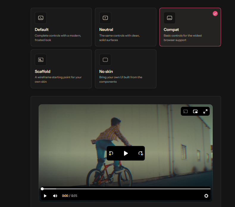
also, this one, the UI is messed up. |
Answered by
sampotts
Oct 25, 2026
Replies: 1 comment

|
It looks like you have "Reduce transparency" and/or "Increase contrast" enabled on your operating system which is why you're seeing the extra backgrounds and why some skins may appear "awful" - it's an accessibility feature, designed for folks with visual impairments so they can interact with the controls. Disable that and you should see the more modern skins. We may bring over some of the legacy skins moving forward but once you fix that setting you may find "Neutral" is what you're after. |
0 replies
Answer selected by
babakfp
Sign up for free
to join this conversation on GitHub.
Already have an account?
Sign in to comment


It looks like you have "Reduce transparency" and/or "Increase contrast" enabled on your operating system which is why you're seeing the extra backgrounds and why some skins may appear "awful" - it's an accessibility feature, designed for folks with visual impairments so they can interact with the controls. Disable that and you should see the more modern skins. We may bring over some of the legacy skins moving forward but once you fix that setting you may find "Neutral" is what you're after.