Repository navigation


|
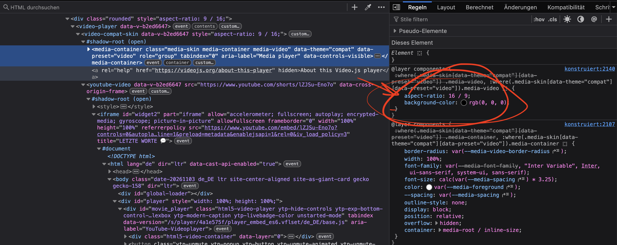
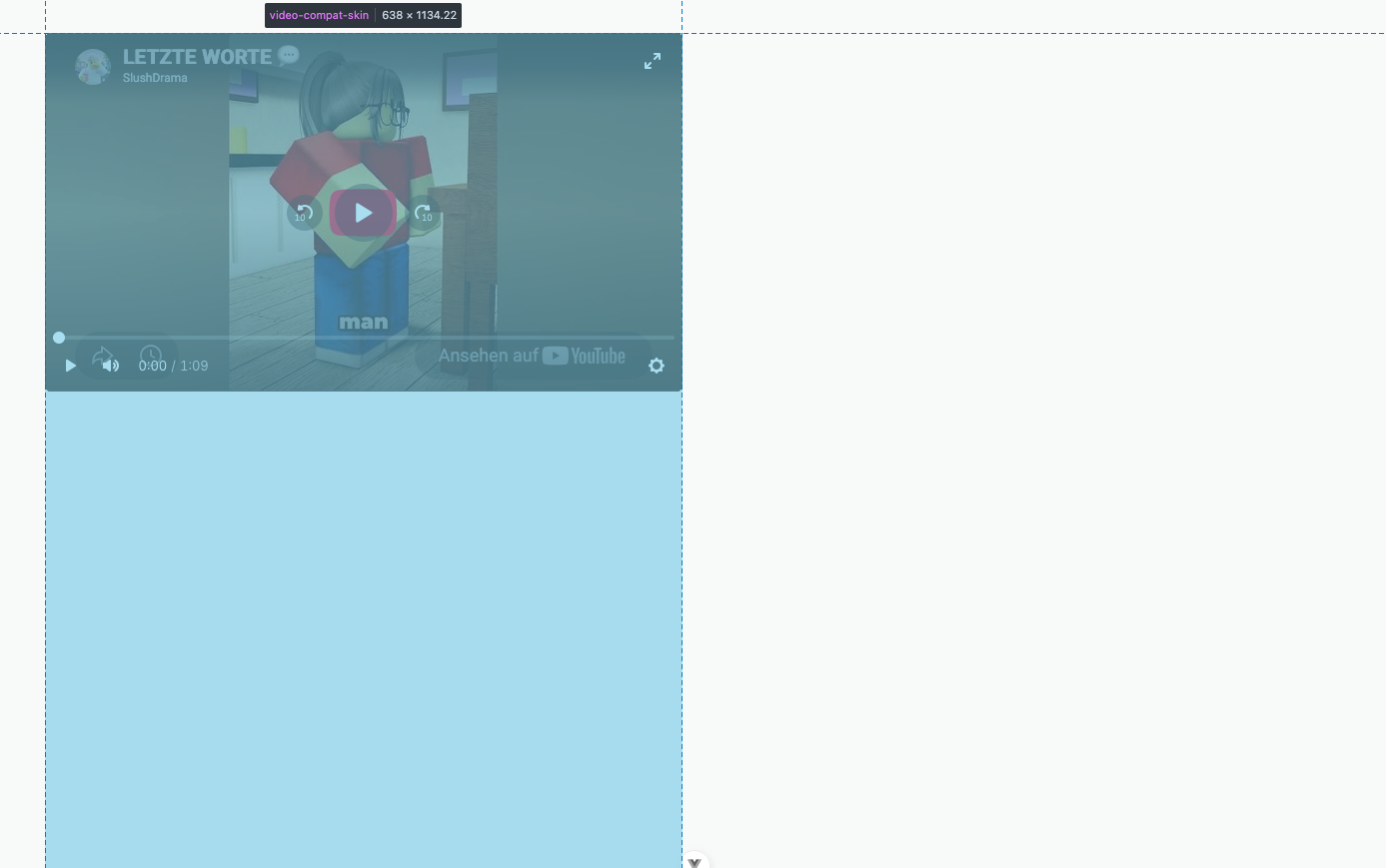
Hi, I use this library to display videos on my site. The content is user generated or might just be inserted via youtube, vimeo or tiktok. TikTok videos or YT shorts are usually in a 9:16 (portrait) aspect-ratio. When I want to display f.e. a YT short and set the container's aspect-ratio to 9:16, it still renders a video container of 16:9, but WHY?! Why is it hardcoded to 16:9 or where is this coming from?? See screenshots of debug console. I use videoJS with Vue: <template>
<video-player ref="player">
<video-compat-skin ref="skin" :style="{ aspectRatio }">
<component :is="videoTag" :src="src" v-bind="autoplayProps" />
</video-compat-skin>
</video-player>
</template>The Computed css: Sample: blue box would actually be the size (the 9:16) of the container. Thx, Br |
Replies: 2 comments 1 reply

|
The 16:9 comes from inside the compat skin's shadow root, not from your container. This is now tracked as a bug in #9691, and #9692 removes the fixed ratio (it's open, not released yet). Once it ships, Until then, you can add a small stylesheet to the skin's shadow root (it's an open shadow root): <script setup>
import { onMounted, ref } from 'vue';
const skin = ref(null); // same ref="skin" you already have on <video-compat-skin>
onMounted(async () => {
await customElements.whenDefined('video-compat-skin');
const root = skin.value?.shadowRoot;
if (!root) return;
const sheet = new CSSStyleSheet();
sheet.replaceSync(`
.media-container { aspect-ratio: auto; height: 100%; min-height: 0; }
::slotted(:not([slot])) { width: 100%; height: 100% !important; }
`);
root.adoptedStyleSheets = [...root.adoptedStyleSheets, sheet];
});
</script>The first rule makes the inner container follow the skin element's size. The second makes the slotted media element ( I tested this with
|

|
Thanks for the report and the screenshots. You're right: the compat skin was forcing 16:9 on the container inside its shadow root, so an This is fixed in v10.3.0 by #9692 (tracked in #9691). After you upgrade, the |

|
I'll close this discussion but feel free to leave a comment if it's not as expected! |


Thanks for the report and the screenshots. You're right: the compat skin was forcing 16:9 on the container inside its shadow root, so an
aspect-ratioon<video-compat-skin>only changed the outer element.This is fixed in v10.3.0 by #9692 (tracked in #9691). After you upgrade, the
aspect-ratioyou set on the skin element controls the player's shape in every skin. The video and poster fill the player and stay centered, even if your page uses a CSS reset like Tailwind'svideo { height: auto }.