H2 Border Consistent with Blockquote and Serif Font Consideration? #840
Description
Feature request
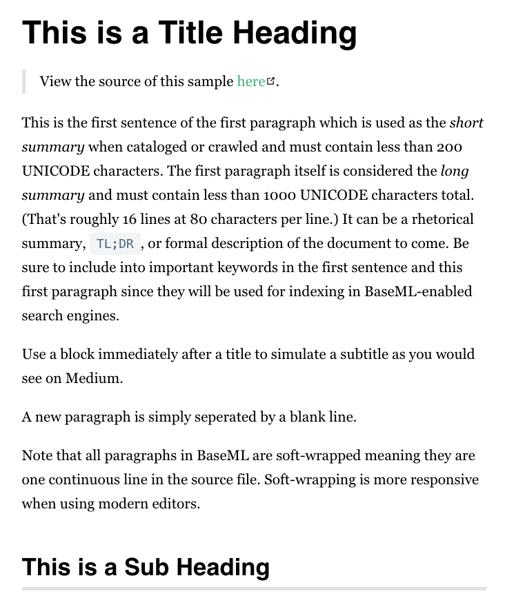
What if the now nearly invisible line under an H2 heading were made to match the thickness and color of that marking out a block quote? Just an idea.
Also, how heretical would it be to ask if serif could be used for the default body (like Medium)? I realize this is something that can easily be overriden and I don't want to start a flame war here. But there is quite a lot of UI research suggesting modern screens actually benefit from the same serif usage that paper has used in the past. Not that Georgia is a standard web font we actually have really good options.
I can say that my older eyes have a harder time reading the default theme font than after I make the conversion. But I also completely understand if y'all would prefer the sans-serif as used still on GitHub (which has a rather dated UI in my opinion).
I figured better to mention it than just complain to myself every time I have to change it, 😁. At least this way I will know I tried.
What problem does this feature solve?
Provides a bit more visual consistency.
What does the proposed API look like?
// probably a better selector

* {
    font-family: Georgia, Cambria, 'Times New Roman', Times, serif;
    font-size: 21px; // or equiv, that is from Medium
}

h1,h2 {
    font-family: Helvetica, Arial, sans-serif;
}

h2 {
    border-bottom-color: #dfe2e5;
    border-bottom-width: .25rem;
}
How should this be implemented in your opinion?
Just a default theme tweek.
Are you willing to work on this yourself?**
Sure.