feature: Add margin and side props to IconText #113
Conversation
ESLint Summary View Full Report
Report generated by eslint-plus-action |
|
Travis automatic deployment: |
|
Travis automatic deployment: |
 nicosampler
changed the title
nicosampler
changed the title
 nicosampler
left a comment
nicosampler
left a comment
nicosampler
left a comment
There was a problem hiding this comment.
There is a problem with the margins
|
@alongoni as per the retro discussion, could you add a short summary in the PR description? |
|
Shouldn't |
|
@katspaugh seems like a problem with the last build. Running it locally works as expected.
|
|
@alongoni you can run this command |
|
Travis automatic deployment: |
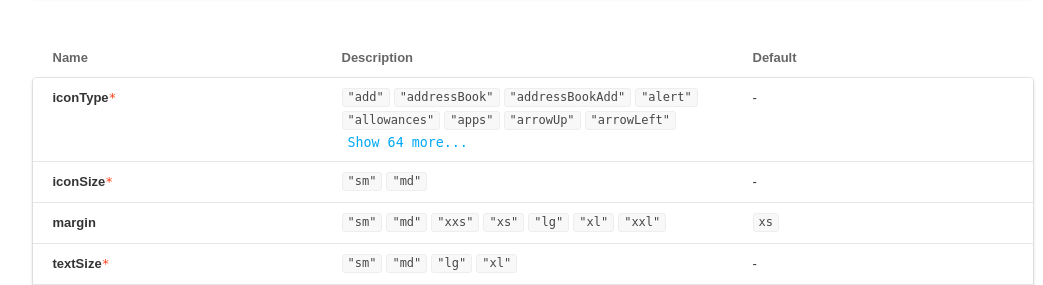
side (right or left)
|
Travis automatic deployment: |
|
Looks good!
|
Related to #109.
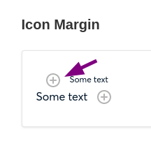
Motivation
Every time we are using an icon + label in SR (safe-react) or SRC (safe-react-components) we need to add a css wrapper in order to align the text and the icon.
This component intends to fix that problem.
What's new
Its adds two new properties to
IconText, side (left or right) and margin.How to test it
As this repo only provides components and as we making use of storybook, it would be enough to have a story that represents all the variants for each component. In the PR description, you will find a link to a deployed instance of
storybook. For this particular PR the link is https://pr113--safereactcomponents.review.gnosisdev.com.cc: @katspaugh