Repository navigation
Releases
Version 3.0.1

Fixed
-
The outline of the track is one pixel again. Since 2.0.0 it was drawn across
two rows of pixels at half strength on any display at 100%: the stroke was
moved inside the 40 × 20 track on the assumption that integer coordinates
fall on pixel edges, while GDI+ puts them on pixel centres unless told
otherwise. It is told now, so the outline, the track fill and the thumb all
sit on the pixel grid, at 200% as well. Fractional scales are antialiased as
before. -
The palette icon carries transparency and comes in four sizes. It was three
bitmaps on white, so the palette showed a white halo around it and stretched
it on a scaled display. The.dcrnow holds PNG images at 16, 24, 32 and
128 pixels as well, which the IDE composites over its own background and
picks by scale; the bitmaps stay as the fallback for an IDE that reads no
PNG. The files the.dcris built from are in the repository.
Version 3.0.0
The release takes the major number: the rename below breaks every
installation of 2.1.0.
Added
-
ReadOnly: Boolean, defaultFalse. A read-only switch shows a value the
user may not change: the pointer, the space bar and a drag of the thumb are
all closed, whileCheckedset from code works as always and still raises
OnChange. It is notEnabled := False— the switch keeps its normal
colours, stays in the tab order and still takes the focus when clicked. Since
nothing the user does reaches it, there is no hover highlight and no pressed
state, andOnClick, which reports a switch that changed, does not fire. -
An accelerator in the header.
&Soundunderlines the S, and Alt+S gives the
switch the focus and toggles it, the way an accelerator works a check box.
Both halves follow the rules a click follows: the value changes only where the
keyboard may change it, soKeyboardToggleoff orReadOnlyon leaves the
switch as it was, and the focus is taken only where a click would take it. The
underline keeps to the convention Windows sets for the window: hidden until
Alt is pressed, like the focus ring. -
ParentHeaderFont: Boolean, defaultTrue. The header font used to follow
Fontonly until something assigned toHeaderFont, and after that there was
no way back: the flag that remembered it was internal and write-once, so a
header font touched once in the designer stayed detached for good, with
nothing in the Object Inspector to say so or undo it. The flag is now a
property, and putting it back toTruereturns the header toFontat once. -
TCustomFluentToggleSwitch, the ancestor that carries the implementation.
TFluentToggleSwitchdescends from it and does nothing but publish
properties, so a component descending from the custom class can publish its
own selection or leave a property out. Code usingTFluentToggleSwitchis
unaffected: the class name, the published properties and the.dfmit
streams are what they were. -
Right-to-left layout.
BiDiModewas published from the start and never
read, so a switch on a right-to-left form laid itself out left to right. At
bdRightToLeftthe switch is now mirrored, the way WinUI, Android and iOS
mirror theirs: the thumb rests at the right end while off and travels left
to turn on, the caption goes to the other side of the track, the header and
the switch under it align against the other edge, and both lines are read
right to left.TextPositionandHeaderAlignmentare read the way the
text runs, asTCheckBoxandTLabelreadAlignment. The two reading-only
modes change the reading order alone. As everywhere in the VCL, this takes a
system set up for a right-to-left language; elsewhereBiDiModestill
changes nothing.
Changed
-
Breaking. An ampersand in
HeaderTextis no longer drawn as one. It marks
the letter after it, and&&draws a single ampersand, as in every VCL
caption. A header that carried a literal ampersand —Sound & vibration—
now readsSound vibrationwith the space underlined, and measures
narrower, so a switch left atAutoSizechanges width with it. Doubling the
ampersand keeps the old picture:Sound && vibration. -
Breaking. A compiled package carries the compiler version in its name:
FluentToggleSwitchR370.bplunder Florence,FluentToggleSwitchR290.bpl
under Athens, the way RAD Studio namesrtl290andvcl370. Both packages
used to build asFluentToggleSwitchR.bplandFluentToggleSwitchD.bpl
whichever IDE produced them. Inside the IDE that collided with nothing, since
every version keeps its ownBpldirectory, but two applications deployed
with runtime packages into one directory overwrote each other's copy, and the
name said nothing about which was which. -
Each package states what it is for. The runtime package is runtime only and
no longer appears in Component → Install Packages, where installing it
registered nothing; the design-time package is design-time only. Their
descriptions name the role, so the two are no longer identical entries in the
IDE lists. -
Both packages build for Win64 as well as Win32, and so do the tests. The
runtime package targeted Win32 alone while the README promised both, so a
Win64 application built with runtime packages had nothing to link against.
The component source needed no change for it — no pointer casts, no
assembler, no platform conditionals — and the tests pass on both platforms.
The Win64 design-time package installs into the 64-bit IDE of Florence. -
Both packages are set to explicit rebuild, the way component libraries
ship: a project that requires them no longer rebuilds them under its own
settings. -
The version resource of both packages is filled in: company, product and
copyright as they read inLICENSE, a description naming the package, and a
comment pointing at the repository. The properties of a.bplnow say who
made it and under what licence — which is worth something, since the file
travels withoutLICENSEbeside it.
Upgrading from 2.1.0
The .bpl files are renamed, so the IDE still has the old ones registered.
- Under Component → Install Packages remove the entry without a version
suffix,FluentToggleSwitchD.bpl, andFluentToggleSwitchR.bplif it is
listed there too. - Delete
FluentToggleSwitchR.bplandFluentToggleSwitchD.bpl— the ones
without a suffix — from$(BDSCOMMONDIR)\Bpl. Nothing rebuilds them any
more, and while they are there a project asking for the package by name can
still find them. The.dcp,.bpiand.libin$(BDSCOMMONDIR)\Dcp
keep their names: the suffix applies to the.bplalone, so those files are
simply overwritten and must stay. - Build and install the packages again, as in Installing in the README.
Version 2.1.0
Changed
-
Both packages now leave their
.dcuin.\$(Platform)\$(Config), beside the
package itself, instead of$(BDSCOMMONDIR)\Dcp. The old directory is on the
library path by default, which is why installing the packages used to be
enough on its own; it is also shared by every platform and configuration, so
Win32 and Win64, Debug and Release wrote.dcuof the same names over each
other and the last build won. The setting came from the IDE template and was
never a decision.Projects now compile the component from
sourceunder their own compiler
settings, the way the other component libraries for Delphi work, rather than
linking.dcubuilt with the package's settings. -
The leak monitor of the test project follows DUnitX through a rename of its
own: Florence shipsDUnitX.ServiceLocatorwithTDUnitXServiceLocator,
Athens shipsDUnitX.IoCwithTDUnitXIoC. The unit picks one by compiler
version, so the tests build on both. Nothing outsidetests/is affected.
Upgrading from 2.0.0
Installing the packages no longer makes the unit visible on its own.
- Add the
sourcedirectory of this release to the library path, under
Tools | Options | Language | Delphi | Library, for every platform you
build for. Without it projects stop findingFluent.ToggleSwitch. - Delete what the old layout left behind:
$(BDSCOMMONDIR)\Dcp\Fluent.ToggleSwitch*.dcu. While those files are
there the compiler keeps finding them, and the change appears to have done
nothing.
Nothing in the component itself changed: same unit, same class, same
properties.
Version 2.0.0
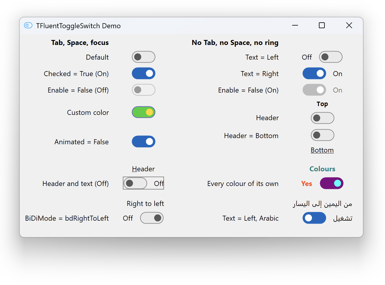
The switch answers the keyboard, carries a header, and follows the accent colour while the program runs.
This is not a drop-in replacement for 1.6. The unit and the package are renamed, the package is split in two, and two events mean something different. The upgrade steps are at the end of the changelog entry.
Breaking
- The unit is
Fluent.ToggleSwitch, the enumerations areTFluentTextPositionandTFluentHeaderPosition, and the palette page is Fluent. The class keeps its name. - One package became two:
FluentToggleSwitchRholds the component and builds for Win32 and Win64,FluentToggleSwitchDis what you install into the IDE. A program using the component no longer dragsdesignidebehind it. OnChangereports the value and fires for an assignment in code as well as for the user.OnClickreports the action: only on a real toggle, and after the value has moved.- The colour properties default to
clDefaultrather thanclNone. TextSpacingdefaults to 12 and is measured from the track outline.- The switch measures 42 by 22 rather than 44 by 24.
TabStopdefaults toTrue.
Added
The space bar toggles the switch, with KeyboardToggle to turn that off. A focus ring that follows the Windows convention, hidden until someone navigates by keyboard, with ShowFocus to opt out. A header above or below the switch with six properties of its own, described by ShowHeader, HeaderText, HeaderPosition, HeaderAlignment, HeaderSpacing and HeaderFont. A baseline handed to the form designer, published even with the caption hidden. The Windows accent colour followed while the program runs. A palette icon, a public TextTop, and a full API reference.
Fixed
TextSpacing was not scaled for the display. A gesture the system takes back, whether a modal dialog, the switch being disabled, or another window taking the capture, is now dropped rather than carried through. A drag begun while the thumb was still travelling counted from the wrong place. Freeing the switch from its own handler is safe.
Performance
The animation timer sits on the window the switch already has. It used to be a TTimer, which allocates a hidden window, and a passing pointer was enough to create one per switch. The layout is worked out once per event rather than once per property.
Installing
Build FluentToggleSwitchR, then build and install FluentToggleSwitchD. The component appears on the Fluent palette page.
Known limitations
Dark surfaces and VCL styles (#10), TAction (#11), right-to-left layout (#12), accessibility (#13), a header outside the control's window (#14), and four smaller API gaps (#15).
Version 1.6.0
What's Changed
Added
- Package version — the package reported
1.0.0.0no matter which release was installed. The number is now stamped into the compiled package and into its description, so the installed version is listed in Component → Install Packages without opening any file
Changed
- The switch is mouse-only — it no longer takes focus. Clicking it leaves focus where it was, and
TabStopdefaults toFalse, so the Tab key skips it. It already ignored the keyboard and drew no focus indicator, so the focus it held was invisible and did nothing
Upgrading
TabStop stays published, so forms that stored it explicitly still load. If something relied on clicking the switch to move focus off an edit, and so to fire that edit's OnExit, it will no longer happen.
Full Changelog: v1.5.0...v1.6.0
Version 1.5.0
What's Changed
A performance pass over the component. Behavior and appearance are unchanged.
Changed
- Per-frame allocations — a frame built a path, up to four brushes and a pen. At 60 frames per second that is roughly 450 GDI+ allocations per second per animating switch. It now builds one path, one brush and one pen per frame and recolors them for each shape. They stay local to the paint: the GDI+ wrapper unit shuts the library down in its finalization, which runs before the forms are freed, so objects held in fields would be deleted after GDI+ is gone
- Animation timer — every instance created a timer, and with it a hidden window, even when nothing ever animated. It is created on first use now
- Hidden controls — animations are skipped while the switch is not showing, for example on an inactive tab page. The state applies immediately instead
- Text metrics — height is measured when the font or the text changes rather than on every frame, and the font is assigned to the canvas once per paint instead of twice. Vertical centering now uses the same metric as the auto-sizing, which for some fonts disagreed with it
- Pixel alignment — the track sits on whole pixels, so its outline stays crisp when the text makes the control an odd number of pixels tall
- Transparent shapes — fills and strokes with zero alpha are skipped rather than rasterized
Tests
- Rendering through
PaintTois covered, and a loop creates, renders and frees fifty instances so FastMM4 covers the drawing objects
Full Changelog: v1.4.0...v1.5.0
Version 1.4.0
What's Changed
Animation and accent color now follow the WinUI 3 template instead of approximating it.
Changed
- Slide timing — the thumb waits 33 ms, then slides for 367 ms along the cubic Bezier curve
0.1,0.9 0.2,1.0, replacing the previous 150 ms ease-out.AnimationDurationnow defaults to 367. The curve is front-loaded, covering 90% of the travel in the first 120 ms - State transitions — hover, press and disabled changes cross-fade over 83 ms (250 ms into disabled) instead of taking effect instantly. Thumb size and position animate together with the colors, and interrupting a transition no longer jumps
- Accent color — the On track uses the accent color configured in Windows, read from the system palette, falling back to
#0067C0(the Windows 11 default). The previous#0078D4is the base accent, not the shade the light theme calls for, and#005A9Ecame from the Windows 10 palette - Hover and press on the On track — these now lighten the track toward the background by lowering opacity to 0.9 and 0.8. They previously darkened it, the opposite of the WinUI behavior
Fixed
- A click that nudged the pointer by less than the drag threshold left the thumb permanently offset by those few pixels
- Disabling the component while it was pressed left it stuck in the pressed state, because a disabled window never receives the matching mouse release
- A DPI change measured the layout once at the old scale before correcting itself
Full Changelog: v1.3.0...v1.4.0
Version 1.3.0
What's Changed
Visuals and interaction now match the Windows 11 ToggleSwitch (WinUI 3, Light theme). See #5.
Added
- Thumb dragging — the thumb can be dragged within the track; releasing it past the middle switches the state, otherwise it snaps back
- Pressed thumb — stretches into a 17×14 pill hugging the track edge, as in WinUI 3
Changed
- Off-state colors — translucent fill, stroke and thumb from the WinUI 3 Light theme, blended over the parent background; hover darkens the track fill instead of the stroke and thumb
- Transition — Off and On tracks cross-fade instead of interpolating colors
- Track stroke — centered on the outline and scaled with DPI (was a fixed 1 px inset stroke)
OnChange— fires only when the user toggles the switch; settingCheckedin code no longer raises it- Click area — clicking anywhere on the component, including the text label, toggles it and focuses the control
- DPI — sizes are recomputed from the base constants on every DPI change
Removed
- Space and Enter no longer toggle the switch
- Focus rectangle
Docs
- Added
CHANGELOG.md - README updated for the new behavior
Full Changelog: v1.2.0...v1.3.0
Version 1.2.0
What's Changed
Fixes
- DPI-aware scaling — correct rendering on high-DPI displays (per-monitor V2), scaled geometry fields instead of hard-coded constants
- AdjustBounds fix — text properties can be set safely before Parent assignment (uses screen DC instead of control Canvas)
- Keyboard OnClick — Space/Enter now fires OnClick in addition to OnChange
- Color=clNone fix — background now uses parent color as documented in README
- Click area — only the track responds to clicks, text label remains passive
- Compiler warnings resolved — added missing units (System.Types, System.UITypes), removed unused variables
Tests
- New tests: handle guard (no-parent scenario), toggle logic, OnChange event firing, default state
Docs
- Added DPI-aware feature to README
- Updated platform to Win32/Win64
- Added demo screenshot
Demo
- Dynamic layout — positions calculated from control heights, no overlap on high-DPI
Full Changelog: v1.1.0...v1.2.0
Version 1.1.0
Added
- Customizable colors — 5 new published properties (
TrackFrameColor,TrackColorOff,TrackColorOn,ThumbColorOff,ThumbColorOn) to override the default WinUI 3 color scheme. Set toclNone(default) to use built-in colors - Text label — optional text next to the toggle with 5 new properties (
ShowText,TextOn,TextOff,TextPosition,TextSpacing) and a newTTextPositionenum (tpLeft,tpRight). The component auto-adjusts its width based on text content - Font property — re-published
Fontfor text label rendering via Object Inspector - DUnitX tests — 17 unit tests covering color properties, text properties, auto-sizing, and input validation
Fixed
- Click area is now restricted to the track — clicking the text label does not toggle the switch
- Component correctly recalculates bounds after DPI scaling (
ChangeScaleoverride) - Negative
TextSpacingvalues are clamped to 0 - Test runner always waits for user input before closing the console window
FastMM4is now conditionally compiled ({$IFDEF FASTMM})
Installation
- Open
ToggleSwitch-PG.groupprojin Delphi IDE - In Project Manager: right-click ToggleSwitch.bpl → Compile → Install
- Done — use
TFluentToggleSwitchin any project
Full Changelog: v1.0.1...v1.1.0