
Flutter Tutorial Overlay is a Flutter package for building interactive tutorials, onboarding flows, guided tours, and user instruction overlays in your apps.
With this package, you can highlight specific widgets, display tooltips, and guide users step-by-step through your app’s features. It’s perfect for creating in-app tutorials, walkthroughs, and user instruction guides that improve onboarding and help users understand your UI quickly.
- Target Highlighting: Emphasize any widget using just a
GlobalKey - Customizable Tooltips: Titles, descriptions, and action buttons
- Flexible Styling: Colors, borders, blur effects, and button styles
- Responsive Design: Tooltips adapt to screen boundaries
- Step-by-Step Navigation: Guide users through multiple tutorial steps
- Step Tagging: Add custom tags for analytics and tracking
- Easy Integration: Simple setup with minimal code
- Step-Specific Callbacks: Handle interactions at each step
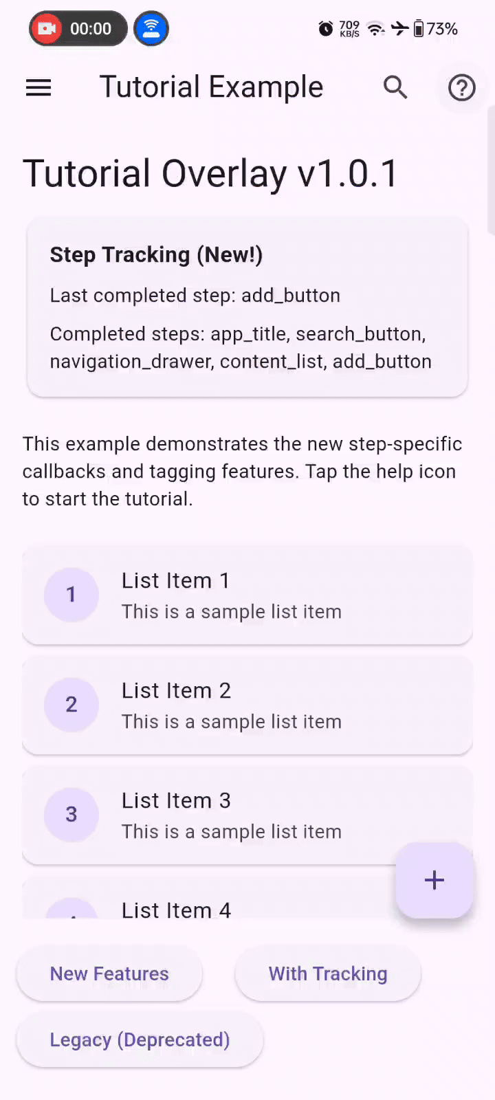
Here’s how Flutter Tutorial Overlay looks in action:
Run this in your terminal:
flutter pub add flutter_tutorial_overlay- Import the package
import 'package:flutter_tutorial_overlay/flutter_tutorial_overlay.dart';- Create GlobalKeys for your target widgets
final GlobalKey _buttonKey = GlobalKey();
final GlobalKey _menuKey = GlobalKey();- Assign keys to your widgets
ElevatedButton(
  key: _buttonKey,
  onPressed: () {},
  child: Text('Target Button'),
)- Create tutorial steps and show the overlay
void _startTutorial() {
  final steps = [
    TutorialStep(
      targetKey: _buttonKey,
      title: "Welcome!",
      description: "This is your main action button. Tap it to perform the primary action.",
      tag: "main_button",
      onStepNext: (stepTag) {
        print('User completed step: $stepTag');
        // Add analytics or specific logic for this step
      },
    ),
    TutorialStep(
      targetKey: _menuKey,
      title: "Menu",
      description: "Access additional options and settings from this menu.",
      tag: "navigation_menu",
      onStepNext: (stepTag) {
        print('User completed step: $stepTag');
      },
    ),
  ];

  final tutorial = TutorialOverlay(
    context: context,
    steps: steps,
    onComplete: () {
      print('Tutorial completed!');
    },
  );

  tutorial.show();
}Step-Specific Callbacks (New in v1.0.1) Use step-specific callbacks for better control and analytics:
TutorialStep(
  targetKey: _buttonKey,
  title: "Action Button",
  description: "This performs the main action",
  tag: "primary_action",
  onStepNext: (stepTag) {
    // Log analytics for this specific step
    analytics.logEvent('tutorial_step_completed', {'step': stepTag});

    // Perform step-specific actions
    if (stepTag == "primary_action") {
      // Enable the button or show additional hints
      _enablePrimaryButton();
    }
  },
)If you're upgrading from v1.0.0, replace the global onNext callback with step-specific ones:
TutorialOverlay(
  context: context,
  steps: steps,
  onNext: () => print('Next step'), // This is now deprecated
)TutorialOverlay(
context: context,
steps: [
TutorialStep(
targetKey: myKey,
title: "Step Title",
description: "Step description",
tag: "unique_step_id", // Optional but recommended
onStepNext: (stepTag) => print('Completed step: $stepTag'),
),
],
)TutorialOverlay(
context: context,
steps: steps,
// Tooltip styling
tooltipBackgroundColor: Colors.white,
tooltipBorderRadius: 12.0,
tooltipMaxWidth: 300.0,
tooltipPadding: EdgeInsets.all(16.0),
// Text styling
titleTextColor: Colors.black87,
descriptionTextColor: Colors.black54,
// Highlight styling
highlightRadius: 8.0,
highlightBorderWidth: 2.0,
highlightBorderColor: Colors.blue,
targetPadding: 8.0,
// Overlay styling
blurSigma: 6.0,
blurOpacity: 20,
overlayTint: Color(0x8A000000),
// Button customization
nextButtonStyle: ElevatedButton.styleFrom(
backgroundColor: Colors.blue,
foregroundColor: Colors.white,
),
skipButtonStyle: ElevatedButton.styleFrom(
backgroundColor: Colors.grey,
),
finishButtonStyle: ElevatedButton.styleFrom(
backgroundColor: Colors.green,
),
// Button text
nextText: "Continue",
skipText: "Skip Tour",
finishText: "Done",
// Behavior
dismissable: true,
showButtons: true,
// Global callbacks
onSkip: () => print('Tutorial skipped'),
onFinish: () => print('Tutorial finished'),
onComplete: () => print('Tutorial completed'),
);With step tags and callbacks, you can easily track user progress:
final steps = [
  TutorialStep(
    targetKey: _searchKey,
    title: "Search",
    description: "Find what you're looking for",
    tag: "search_feature",
    onStepNext: (stepTag) {
      // Track completion
      FirebaseAnalytics.instance.logEvent(
        name: 'tutorial_step_completed',
        parameters: {'step_id': stepTag},
      );
    },
  ),
  TutorialStep(
    targetKey: _profileKey,
    title: "Profile",
    description: "Manage your account settings",
    tag: "profile_management",
    onStepNext: (stepTag) {
      // Track and perform specific action
      analytics.track('StepCompleted', {'step': stepTag});
      _highlightProfileFeatures();
    },
  ),
];You can create a tap-to-continue tutorial by hiding the buttons:
TutorialOverlay(
  context: context,
  steps: steps,
  showButtons: false,
  dismissable: true, // Allow tap anywhere to continue
);| Property | Type | Description |
|---|---|---|
| targetKey | GlobalKey | The key of the widget to highlight |
| title | String | The title text for the tooltip |
| description | String | The description text for the tooltip |
| tag | String | New! Unique identifier for the step |
| onStepNext | Function(String)? | New! Callback when user taps "Next" on this step |
| Property | Type | Default | Description |
|---|---|---|---|
| context | BuildContext | required | The build context |
| steps | List | required | List of tutorial steps |
| onComplete | VoidCallback? | null | Called when tutorial completes |
| tooltipMaxWidth | double | 320.0 | Maximum width of tooltips |
| tooltipBackgroundColor | Color | Colors.white | Background color of tooltips |
| titleTextColor | Color? | null | Color of title text |
| descriptionTextColor | Color? | null | Color of description text |
| highlightRadius | double | 12.0 | Border radius of highlight |
| highlightBorderColor | Color | Colors.transparent | Border color of highlight |
| highlightBorderWidth | double | 0.0 | Border width of highlight |
| targetPadding | double | 0.0 | Padding around target widget |
| blurSigma | double | 6.0 | Blur intensity of overlay |
| blurOpacity | double | 20 | Opacity of overlay blur |
| overlayTint | Color | Color(0x8A000000) | Tint color of the overlay |
| dismissable | bool | false | Allow tap to dismiss |
| showButtons | bool | true | Show navigation buttons |
| nextButtonStyle | ButtonStyle? | null | Style for the "Next" button |
| skipButtonStyle | ButtonStyle? | null | Style for the "Skip" button |
| finishButtonStyle | ButtonStyle? | null | Style for the "Finish" button |
| nextText | String | "Next" | Text for the "Next" button |
| skipText | String | "Skip" | Text for the "Skip" button |
| finishText | String | "Finish" | Text for the "Finish" button |
| onNext | VoidCallback? | null | DEPRECATED Use TutorialStep.onStepNext |
| onSkip | VoidCallback? | null | Callback when tutorial is skipped |
| onFinish | VoidCallback? | null | Callback when tutorial finishes |
This parameter will be removed in version 2.0.0. Please migrate to using onStepNext in individual TutorialStep instances for better step-specific control and cleaner code organization.
Check out the /example folder for a complete sample app demonstrating various features and customization options.
Contributions are welcome! Please feel free to submit a Pull Request. For major changes, please open an issue first to discuss what you would like to change.
This project is licensed under the MIT License - see the LICENSE file for details.
If you find this package helpful, please give it a ⭐ on GitHub!
For issues and feature requests, please visit our issue tracker.