Visual
The Visual page allows you to create basic Excel tables and charts from your usage data. Its output includes an entire Excel spreadsheet including the data and chart, so you can make further modifications as desired.
Its parameters are more limited than the Search function, but also offers two aggregating options, for cost ratios, and "top #" lists.
See below for important implications about using non-calendar year date ranges.
Select the type of chart you want from Chart Type followed by Calculation Type. Calculation Type is how you want the data to be analyzed or broken down.
For instance, if you want a monthly breakdown, you most likely want to choose a Line chart.
If you select Top #, the option to select the particular platform/database/title/item will be grayed out, so always select Calculation Type before moving further down the form.
When choosing Top# with items that may have long names (like titles), a horizontal bar chart is highly recommended rather than vertical or line.
You can select any number you want for Top# but consider that many charts become unreadable with too many data points. However you can use this to generate a much bigger "top" list as a spreadsheet table and then ignore the chart.
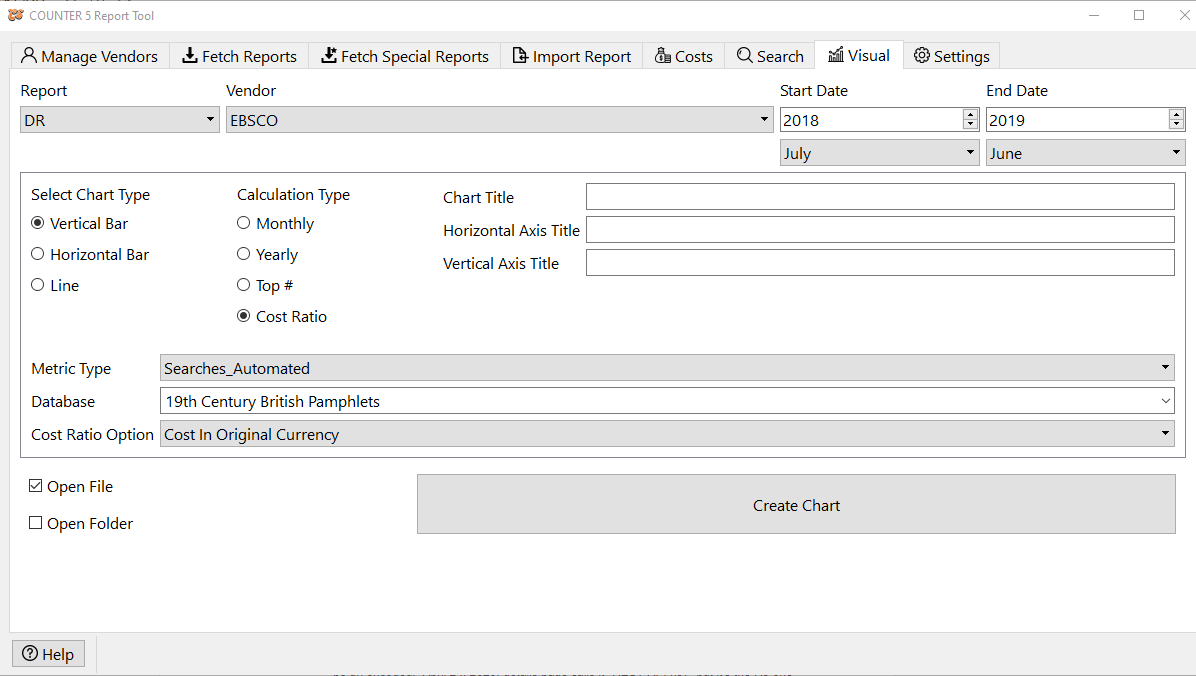
If you select Cost Ratio, you then need to also select whether you want it to use the Cost in Original Currency, the Cost in Local Currency, or Cost in Local Currency with tax, the three metrics you would have entered in the Costs table.
When selecting your date range, make sure that the data you are looking for has already been added into the database either by fetching the reports or importing them. You will get an error if there is no data that matches your selections.
If you choose the Top # calculation, the data will be calculated for the entire date range, not broken down by year.
If you choose "yearly" or "cost ratio" and a date range that begins with a month other than January, and includes more than 12 months, the tool will define a "year" as 12-month increments starting with the month you chose. For instance, if you choose July 2017 - June 2019 and to do a "yearly" report, you will get two data points, representing the aggregate of July 2017-June 2018 and then July 2018-June 2019. It is highly recommended that in such situations, you choose an end month that completes a 12 month "cycle" as otherwise the last data point may look artificially low (or have an artificially high cost ratio) as it does not include as many months as the others.
If you have added Cost data and are choosing Cost Ratio as your calculation type, your date range does not need to align with the cost (e.g. subscription) cycles, as the system will calculate every month separately and will not attempt to include missing cost data in its calculation (will not treat it as zero cost). However, because COUNTER 5 does not distinguish a lack of usage (zero usage) from a lack of reporting data (unharvested or not available) the same is not true for when the usage data is not available. Here is a summary of the logic used when handling overlapping date ranges where either cost data or usage data is missing for parts of the range requested in a cost ratio calculation chart:
IF [ cost data and non-zero usage data for every month in date range]
THEN [normal calculation and display rules apply]
ELSEIF [no cost data for entire user-selected date range]
THEN [show "NO RATIO" in the cost per metric column and "NO COST DATA" in total cost cell in table]
ELSEIF [no cost data for an entire 12-month cycle that aligns with user selected date range of 12 months or more]
THEN[show "NO RATIO" in the cost per metric column and "NO COST DATA" in total cost cell in table]
ELSEIF[cost data is missing for one or more months within the 12-month cycle regardless of whether there is usage or not for those same months]
THEN [don't count those months in either the cost or usage calculations but have actual numbers in all columns for the data you do use]
ELSEIF [cost data is present for all months in cycle but usage data is missing for some of those months]
THEN [count all months towards cost and the missing months count as zero usage towards a full 12-month calculation of the ratio so all three columns have normal numbers]
ELSEIF [cost data is present for some or all of the months but there is no usage data for the entire cycle, which would result in division by zero]
THEN [print "NO RATIO" in the cost per metric column, the normal total cost in that column, and "NO USAGE" in the metric column of that row]
You can customize your chart by entering Chart Title, Horizontal Axis Title and Vertical Axis Title. You will also be able to edit these in the resulting Excel file.
Select the Metric_Type corresponding to the metric you want to chart. This list will change depending on the report type selected above.
Select the platform/database/title/item to retrieve (if not using Top #). This list will change to correspond to the actual data for the vendor selected above.
Finally decide if you want it to immediately open the resulting Excel file, open the folder where the file was saved to, or both, when it finishes.
After you click on Create Chart, you will get your operating system dialogue to choose the folder and filename to save the spreadsheet in.