[EOSF-924] Make navbar more mobile friendly #50
Merged
Conversation
This file contains hidden or bidirectional Unicode text that may be interpreted or compiled differently than what appears below. To review, open the file in an editor that reveals hidden Unicode characters.
Learn more about bidirectional Unicode characters
jamescdavis
suggested changes
Dec 6, 2017
Member
 jamescdavis
left a comment
jamescdavis
left a comment
There was a problem hiding this comment.
This looks good. Please update to use latest ember-osf develop.
jamescdavis
approved these changes
Dec 7, 2017
Sign up for free
to join this conversation on GitHub.
Already have an account?
Sign in to comment
3 participants
Add this suggestion to a batch that can be applied as a single commit.
This suggestion is invalid because no changes were made to the code.
Suggestions cannot be applied while the pull request is closed.
Suggestions cannot be applied while viewing a subset of changes.
Only one suggestion per line can be applied in a batch.
Add this suggestion to a batch that can be applied as a single commit.
Applying suggestions on deleted lines is not supported.
You must change the existing code in this line in order to create a valid suggestion.
Outdated suggestions cannot be applied.
This suggestion has been applied or marked resolved.
Suggestions cannot be applied from pending reviews.
Suggestions cannot be applied on multi-line comments.
Suggestions cannot be applied while the pull request is queued to merge.
Suggestion cannot be applied right now. Please check back later.
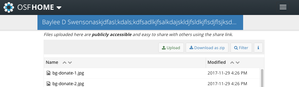
Purpose
When viewing quickfiles on smaller devices, the navbar displays weird behavior. The navbar should have styling changes that match expected behavior.
Summary of Changes
min-heightof elements to keep height of navbar consistentmargin-leftfor extra small screens to keep the element centered and off of the sidepadding-leftandpadding-rightto add more space between text and element's boundaryline-heightto keep text centered vertically** In the case of long names, more of the name will be displayed up to the edge of the page before overflowing
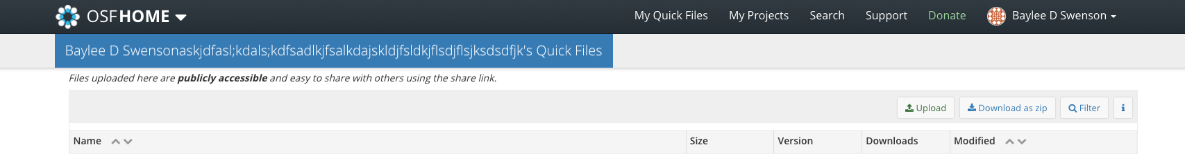
** Once it gets to a certain point, it will overflow hidden
Ticket
https://openscience.atlassian.net/browse/EOSF-924
Reviewer Checklist
changes described in(don't have initial release yet)CHANGELOG.md