To Perform Data Visualization on the given dataset and save the data to a file.
Data visualization is the graphical representation of information and data. By using visual elements like charts, graphs, and maps, data visualization tools provide an accessible way to see and understand trends, outliers, and patterns in data.
Read the given Data
Clean the Data Set using Data Cleaning Process
Apply Feature generation and selection techniques to all the features of the data set
Apply data visualization techniques to identify the patterns of the data.
Name: Dharshini D.S
Register number: 212221230022
#Reading the given dataset
import pandas as pd
df=pd.read_csv("Superstore.csv",encoding='unicode_escape')
df.head()
#Data Visualization using Seaborn
import seaborn as sns
from matplotlib import pyplot as plt
#1.Line Plot
plt.figure(figsize=(9,6))
sns.lineplot(x="Segment",y="Region",data=df,marker='o')
plt.xticks(rotation = 90)
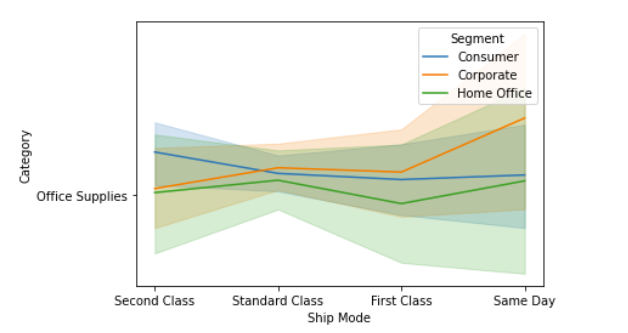
sns.lineplot(x='Ship Mode',y='Category', hue ="Segment",data=df)
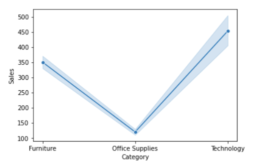
sns.lineplot(x="Category",y="Sales",data=df,marker='o')
#2.Scatterplot
sns.scatterplot(x='Category',y='Sub-Category',data=df)
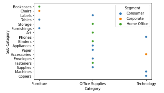
sns.scatterplot(x='Category', y='Sub-Category', hue ="Segment",data=df)
plt.figure(figsize=(10,7))
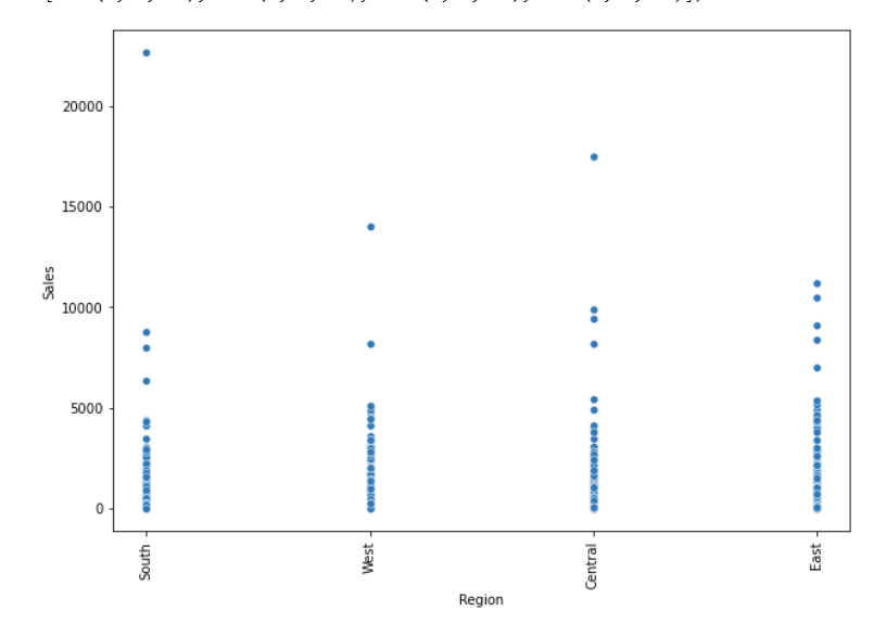
sns.scatterplot(x="Region",y="Sales",data=df)
plt.xticks(rotation = 90)
#3.Boxplot
sns.boxplot(x="Sub-Category",y="Discount",data=df)
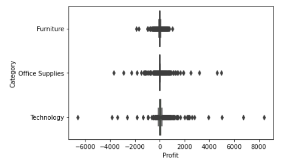
sns.boxplot( x="Profit", y="Category",data=df)
#4.Violin Plot
sns.violinplot(x="Profit",data=df)
#5.Barplot
sns.barplot(x="Sub-Category",y="Sales",data=df)
plt.xticks(rotation = 90)
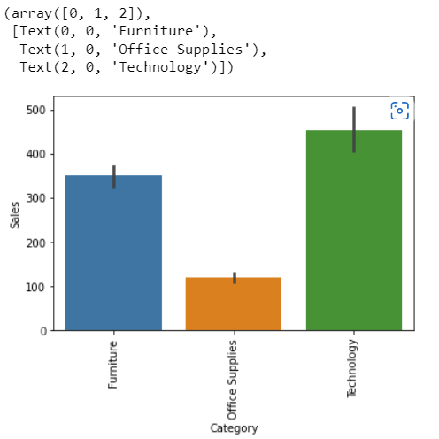
sns.barplot(x="Category",y="Sales",data=df)
plt.xticks(rotation = 90)
#6.Pointplot
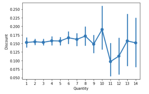
sns.pointplot(x=df["Quantity"],y=df["Discount"])
#7.Count plot
sns.countplot(x="Category",data=df)
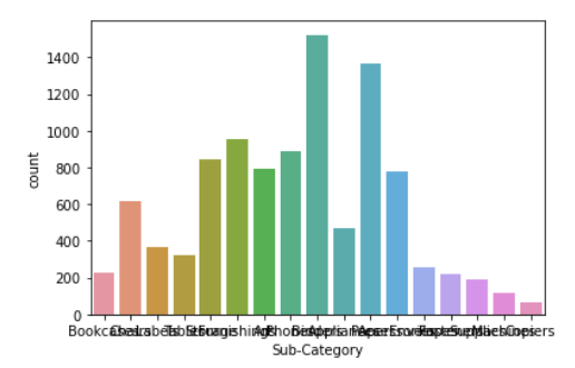
sns.countplot(x="Sub-Category",data=df)
#8.Histogram
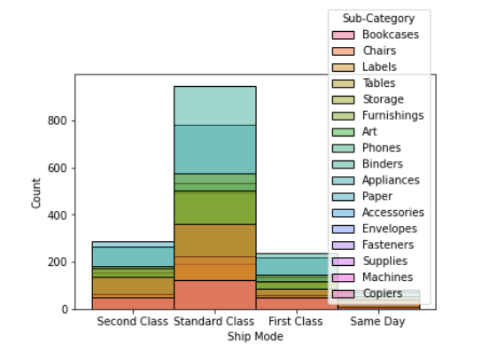
sns.histplot(data=df,x ='Ship Mode',hue='Sub-Category')
#9.KDE Plot
sns.kdeplot(x="Profit", data = df,hue='Category')
#Data Visualization Using MatPlotlib
#1.Plot
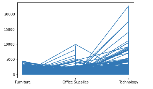
plt.plot(df['Category'], df['Sales'])
plt.show()
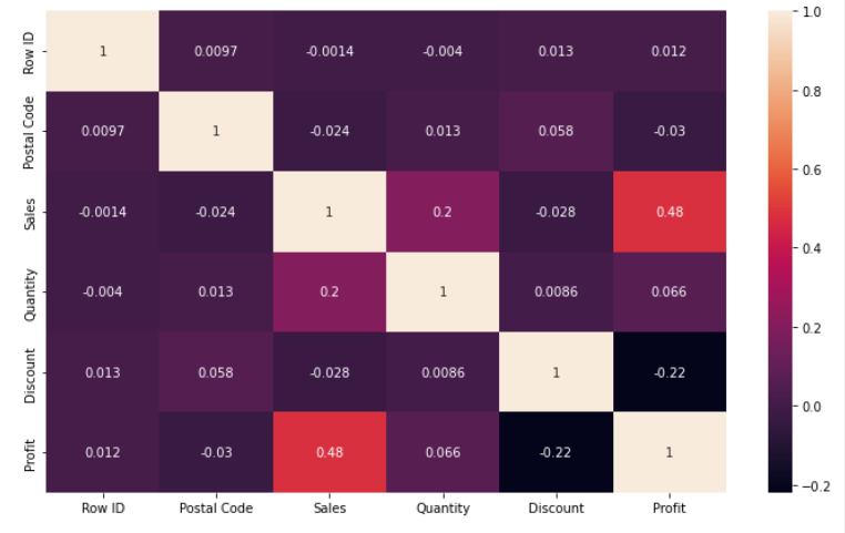
#2.Heatmap
df.corr()
plt.subplots(figsize=(12,7))
sns.heatmap(df.corr(),annot=True)
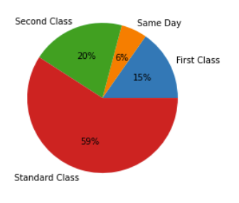
#3.Piechart
df1=df.groupby(by=["Ship Mode"]).sum()
labels=[]
for i in df1.index:
labels.append(i)
colors=sns.color_palette("bright")
plt.pie(df1["Sales"],labels=labels,autopct="%0.0f%%")
plt.show()
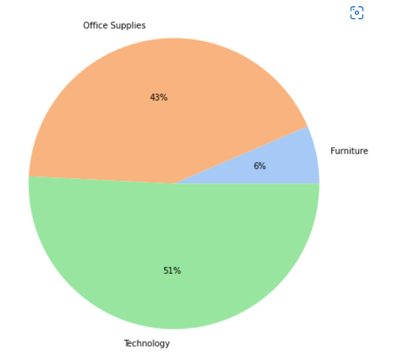
df3=df.groupby(by=["Category"]).sum()
labels=[]
for i in df3.index:
labels.append(i)
plt.figure(figsize=(8,8))
colors = sns.color_palette('pastel')
plt.pie(df3["Profit"],colors = colors,labels=labels, autopct = '%0.0f%%')
plt.show()
#4.Histogram
plt.hist(df["Sub-Category"],facecolor="peru",edgecolor="blue",bins=10)
plt.show()
#5.Bargraph
plt.bar(df.index,df['Category'])
plt.show()
#6.Scatterplot
OUPUT
Reading the given dataset
## Data Visualization Using Seaborn: ### 1.Line Plot
plt.scatter(df["Region"],df["Profit"], c ="blue")
plt.show()
#7.Boxplot
plt.boxplot(x="Sales",data=df)
plt.show()


Hence,Data Visualization is applied on the complex dataset using libraries like Seaborn and Matplotlib successfully and the data is saved to file.