A react-native dropdown/picker/selector component for both Android & iOS.
- Pure JS.
- Compatible with both iOS and Android.
- Auto position. (Won't be covered or clipped by the edge of screen.)
- Zero configuration. (Options are needed of course or a loading indicator will show.)
- Highly customizable.
- Controllable with API by code. (Show/Hide/Select)
- Change everything into a dropdown list trigger.
You can find them in the example.
- Fix bug: #9 undefined is not an object (evaluating '_this.updatePosition.bind') in v0.3.1.
- Fix bug: Wrong width of dropdown in very few cases.
- Fix bug: #6 Can not specify
heightstyle fordropdownStyle. - Remove
updatePositionfunction.
- Auto update position before show.
- Mark
updatePositionfunction as depreciated. (May be removed in next version.)
- Add wrapper / container support
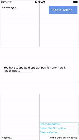
Now you can use these component as a wrapper / container. Anything wrapped in it can be the trigger of the dropdown.
npm i react-native-modal-dropdown --saveImport this module:
import ModalDropdown from 'react-native-modal-dropdown';Use as a component:
<ModalDropdown options={['option 1', 'option 2']}/>Use as a wrapper / container:
<ModalDropdown options={['option 1', 'option 2']}>
  ...
</ModalDropdown>Give the style props as your choice:
style: Change the style of the button (basic mode) / container (wrapper mode).textStyle: Change the style of text of the button. Invalid in wrapper mode.dropdownStyle: Change the style of dropdown container.
You can also render your option row by implement the renderRow function.
| Prop | Type | Optional | Default | Description |
|---|---|---|---|---|
disabled |
bool | Yes | false | disable/enable the component. |
defaultIndex |
number | Yes | -1 | Init selected index. -1: None is selected. This only change the highlight of the dropdown row, you have to give a defaultValue to change the init text. |
defaultValue |
string | Yes | Please select... | Init text of the button. Invalid in wrapper mode. |
options |
arrayOf(string) | Yes | Options. The dropdown will show a loading indicator if options is null/undefined. |
|
style |
object | Yes | Style of the button. | |
textStyle |
object | Yes | Style of the button text. Invalid in wrapper mode. | |
dropdownStyle |
object | Yes | Style of the dropdown list. | |
renderRow |
func | Yes | Customize render option rows. Will render a default row if null/undefined. |
|
onDropdownWillShow |
func | Yes | Trigger when dropdown will show by touching the button. Return false can cancel the event. |
|
onDropdownWillHide |
func | Yes | Trigger when dropdown will hide by touching the button. Return false can cancel the event. |
|
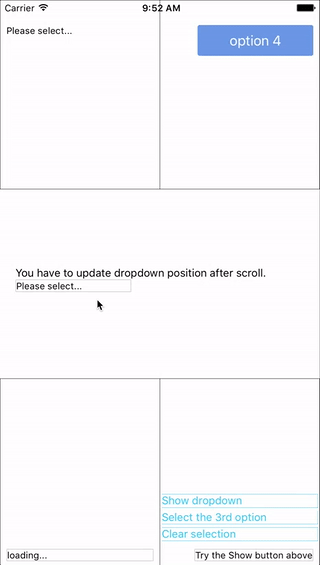
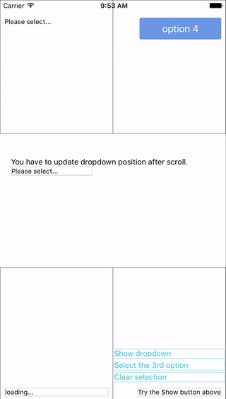
onSelect |
func | Yes | Trigger when option row touched with selected index and value. Return false can cancel the event. |
| Method | Description |
|---|---|
updatePosition() |
Depreciated since v0.3.0. May be removed in next version. Manually update the position of the dropdown. onScroll function of the scrollView. |
show() |
Show the dropdown. Won't trigger onDropdownWillShow. |
hide() |
Hide the dropdown. Won't trigger onDropdownWillHide. |
select(idx) |
Select the specified option of the idx. Won't trigger onSelect. |
Any suggestion is welcome.
Is this necessary to open renderSeperator function of the dropdown list? Please let me know if you have this request. Thank you.