Monitoring graphs for instances and message types are too small to show any meaningful data #1208
Description
The Monitoring pages show details of the endpoint's processing.
The graphs also show the breakdown of processing time, critical time, throughput, and retries per message type and per physical endpoint instance. The graphs for these don't show the scale value though unless the current latest value has a value.
It would be helpful if there was a expanded page or details page to show larger graphs with the average values (similar to the large graphs shown for the entire endpoint).
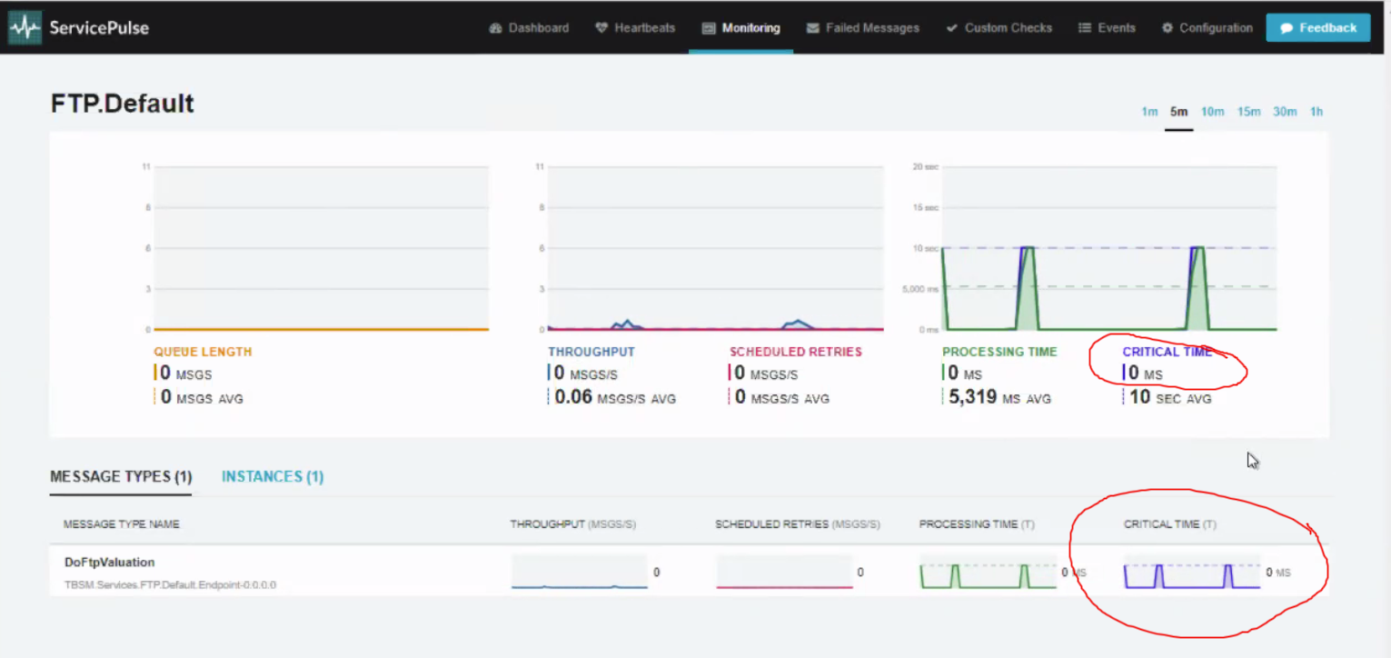
A specific use case is for a user to be able to see which message type is causing the average critical time of an endpoint to be so high. With the current graphs it is very difficult to be able to tell because there are no long-lived time scales as the graphs are so small.