-
Notifications
You must be signed in to change notification settings - Fork 1.2k
Description
Problem
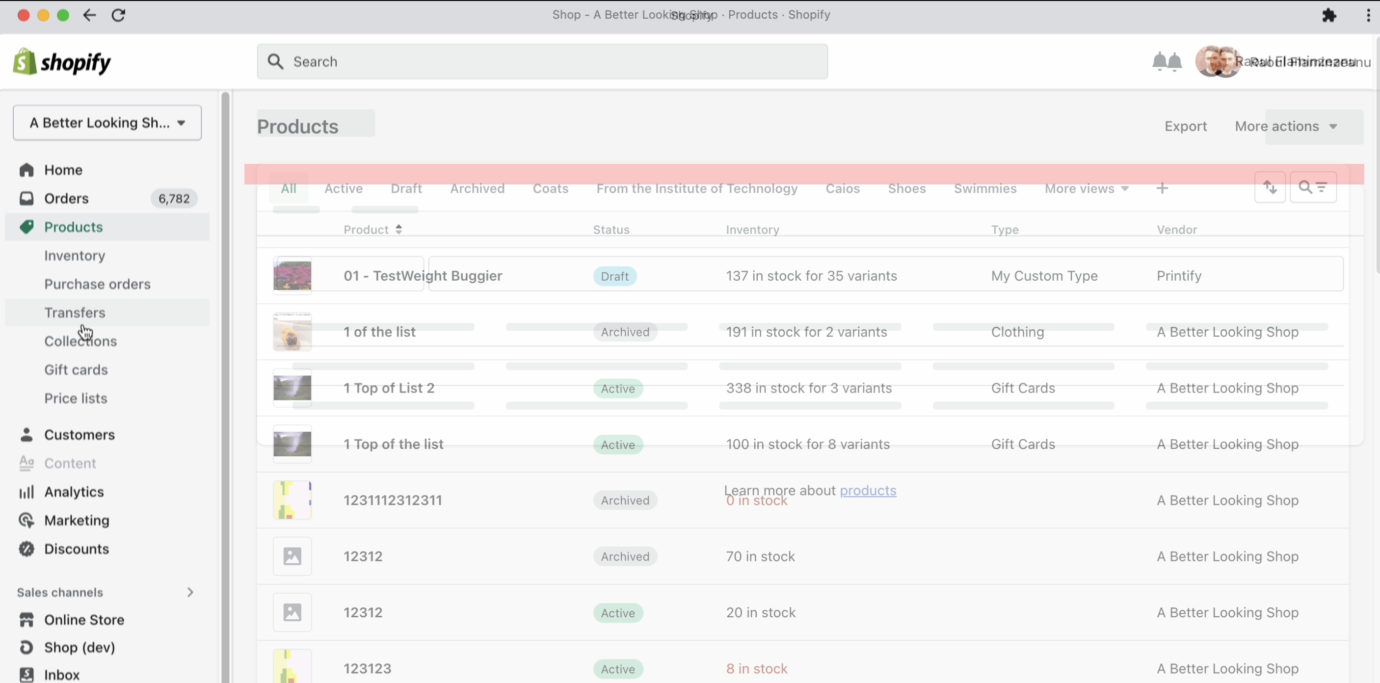
While working on the Loading Audit, @hiraoul observed that the title skeleton in SkeletonPage is a bit off. It appears a bit to high, relative to the Title text that appears on Page.
He also noticed that the 'body' of the SkeletonPage, below the header, is about 20px lower than where the Page component positions it.
Both of these issues cause visual jitter as pages load in the admin that we should eliminate.
Proposed Solution
Below are the two change requests, matching the details in Pattern 5 and 6 in this Figma shows the details.
Title
From @johanstromqvist:
The least visual change is perceived when the dimensions and visual weight of the two states match optically. In other words, matching the outlines of the skeleton content with the perceived outlines of the text's highest visual weight. I don't think it's important to cover everything, as long as the vast majority of the pixels are.
Based on that same principle of optical match-making, perhaps a slightly shorter skeleton Title might actually represent the Title's visual weight better? It would also make the skeleton Title more distinguishable from the actions. As is, titles and headlines look a lot like actions.
- Shift the vertical position, height, and length of the skeleton Title to match the one proposed.
Current is red, proposed is pink:

Body
- Shift vertical position of the body up to match
Page.
