-
Notifications
You must be signed in to change notification settings - Fork 1.2k
Description
Issue summary
iOS webkit browsers do not properly calculate viewport height when using vh units.
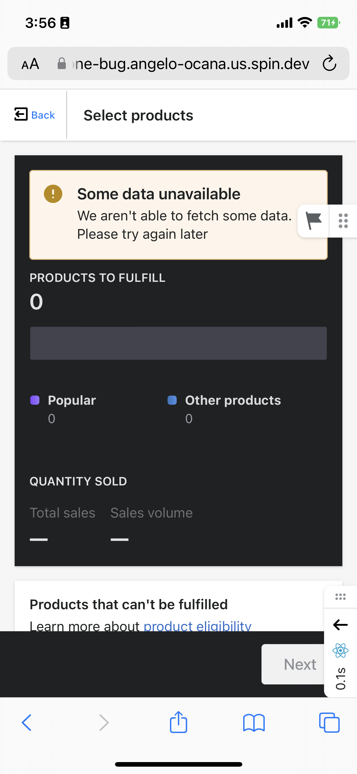
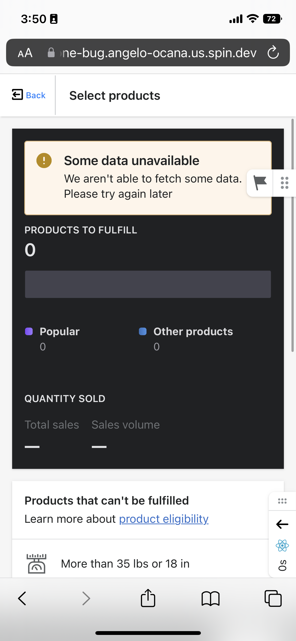
Content positioned at the bottom of the Polaris Frame, which uses min-height: 100vh, is cut off on iOS Safari.
This is noticeable for apps embedded inside of Admin, where the app iframe fills the height of the Frame in "Fullscreen" mode. Because iframes create a new browsing context, the embedded app inside of the iframe has no idea how large the merchant's actual viewport is. We rely on the Frame to render the app inside the right sized container for the viewport, and not cause merchants to scroll to content unexpectedly.
Expected behavior
When no long-running content is placed inside, the Frame should fill the exact viewport height for iOS mobile devices.
Any content placed at the bottom of the viewport inside the Frame that is visible on desktop should also be visible on iOS.
Actual behavior
On iOS Safari, the height of the Frame exceeds the height of the usable viewport.
If the consumer has content inside of the Frame, such as the iframe used for Embedded Apps within Shopify Admin, content may become cut off unexpectedly.
Steps to reproduce the problem
- Visit an app using the Polaris Frame on an iOS device with a Webkit browser
- Verify the height of the Frame against the actual usable viewport height
- Scroll down to see if any content is hidden outside of the usable frame
This cannot be reproduced in the Chrome/browser devtools, only on an actual iOS device.
It reproduces with the Safari address bar on the top or bottom of the screen.
Reduced test case
Codesandbox: https://codesandbox.io/s/polaris-frame-ios-bottomnav-gttibh?file=/src/index.tsx
Visit direct link for mobile: https://gttibh.csb.app/
Video demo:
RPReplay_Final1678230309.MP4
Specifications
- Are you using the React components? (Y/N): Y
- Polaris version number: v10+
- Browser: Safari
- Device: iPhone 14
- Operating System: iOS 15+

