[Checkable Button, Button and ButtonGroup, BulkAction] apply design language #2684
Conversation
This file contains hidden or bidirectional Unicode text that may be interpreted or compiled differently than what appears below. To review, open the file in an editor that reveals hidden Unicode characters.
Learn more about bidirectional Unicode characters
 dleroux
requested review from
BPScott,
danrosenthal and
tmlayton
as code owners
dleroux
requested review from
BPScott,
danrosenthal and
tmlayton
as code owners
 dleroux
force-pushed
the
cs-checkable-button
branch
from
dleroux
force-pushed
the
cs-checkable-button
branch
from
ef3516c to
e46a4e8
Compare
dleroux
commented
Jan 29, 2020
dleroux
commented
Jan 29, 2020
documentation/Color system.md
Outdated
| |`--p-non-null-content`|`''`| | ||
| |`--p-choice-size`|`2rem`| | ||
| |`--p-choice-margin`|`0.1rem`| | ||
| |`--p-control-border-width`|`0.2rem`| |
There was a problem hiding this comment.
Not sure why this entire file changed but this is what actually changed
dleroux
commented
Jan 29, 2020
| } | ||
| > :first-child .Button { | ||
| > :first-child .Button, | ||
| > :first-child .Button::after { |
There was a problem hiding this comment.
Easy peasy. I didn't bother adding the .globalTheming here because this doesn't impact the non-themable buttons.
dleroux
commented
Jan 29, 2020
| } | ||
|
|
||
| &:focus { | ||
| box-shadow: 0 0 0 1px currentColor; |
There was a problem hiding this comment.
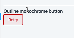
This is actual bug fix for outline monochrome focus.
dleroux
commented
Jan 29, 2020
| @@ -1,5 +1,4 @@ | |||
| @import '../../styles/common'; | |||
| $control-size: rem(16px); | |||
There was a problem hiding this comment.
This wasn't being used 🤷♂
dleroux
commented
Jan 29, 2020
| } | ||
|
|
||
| .RadioButton.globalTheming { | ||
| --control-border-width: #{rem(2px)}; |
There was a problem hiding this comment.
moved this to tokens since it was was in 2 places
dleroux
commented
Jan 29, 2020
| // padding to fix the bottom of letters being cutoff by overflow: hidden | ||
| padding: rem(1px) 0; | ||
| .globalTheming & { | ||
| margin-left: calc(#{$chekbox-label-margin} - var(--p-control-border-width)); |
There was a problem hiding this comment.
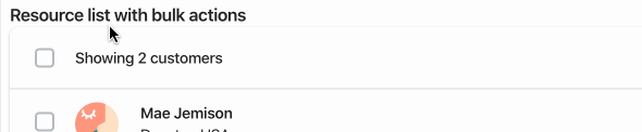
This was causing the checkbox to be misaligned
dleroux
force-pushed
the
cs-checkable-button
branch
from
e761a84 to
7a5297d
Compare
dleroux
changed the title
dleroux
force-pushed
the
cs-checkable-button
branch
3 times, most recently
from
61df2ce to
e5ea832
Compare
danrosenthal
approved these changes
Feb 3, 2020
dleroux
force-pushed
the
cs-checkable-button
branch
from
e5ea832 to
f26b0d7
Compare
 dleroux
force-pushed
the
cs-checkable-button
branch
from
dleroux
force-pushed
the
cs-checkable-button
branch
from
f26b0d7 to
fe6031a
Compare
Sign up for free
to join this conversation on GitHub.
Already have an account?
Sign in to comment
4 participants
Add this suggestion to a batch that can be applied as a single commit.
This suggestion is invalid because no changes were made to the code.
Suggestions cannot be applied while the pull request is closed.
Suggestions cannot be applied while viewing a subset of changes.
Only one suggestion per line can be applied in a batch.
Add this suggestion to a batch that can be applied as a single commit.
Applying suggestions on deleted lines is not supported.
You must change the existing code in this line in order to create a valid suggestion.
Outdated suggestions cannot be applied.
This suggestion has been applied or marked resolved.
Suggestions cannot be applied from pending reviews.
Suggestions cannot be applied on multi-line comments.
Suggestions cannot be applied while the pull request is queued to merge.
Suggestion cannot be applied right now. Please check back later.
WHY are these changes introduced?
Touches on:
https://github.com/Shopify/polaris-ux/issues/371
https://github.com/Shopify/polaris-ux/issues/382
https://github.com/Shopify/polaris-ux/issues/361
WHAT is this pull request doing?
For Button this fixes the focus state of outline monochrome buttons (Not .globalTheming hence the change log entry)
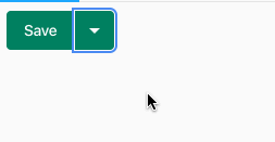
For Split Button this fixes the focus ring
For Checkable Button this fixes the alignment of the checkbox which was off by a few pixels
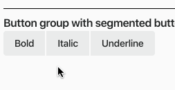
For ButtonGroup and BulkActions this fixes the focus ring
How to 🎩
🖥 Local development instructions
🗒 General tophatting guidelines
📄 Changelog guidelines
🎩 checklist
README.mdwith documentation changes