[ResourceItem] Fix vertical alignment of checkbox and media #2743
Conversation
|
👋 Thanks for opening your first pull request. A contributor should give feedback soon. If you haven’t already, please check out the contributing guidelines. |
|
🟢 This pull request modifies 5 files and might impact 2 other files. Details:All files potentially affected (total: 2)📄
|
 attila-berki
changed the title
attila-berki
changed the title
|
Hey @BerkiAttila 👋 Tagged in @sarahill to get some design perspective on this. From an API/code perspective I agree it'd be best to put this behind a prop for the consumer to control, since changing the alignment may be an unexpected breaking visual change. |
|
Hey @chloerice . Thank you for you feedback, I will update the PR and add a prop to control the alignment. |
I'd default to the current layout of |
|
Hey @chloerice . I added the alignment as a public property with a default value of flex-start. |
 attila-berki
force-pushed
the
resource-item-alignment
branch
from
attila-berki
force-pushed
the
resource-item-alignment
branch
from
f9b92d8 to
6c83398
Compare
Hey @chloerice. Thank you for your suggestions, I have incorporated all of them. Please take another look and let me know if anything else needs to be changed. |
attila-berki
force-pushed
the
resource-item-alignment
branch
3 times, most recently
from
1d6528c to
bc09eab
Compare
Adding changelog entry to UNRELEASED.md

Adding alignment to the public interface of the component

Incorporating content suggestions

Update CHANGELOG.md

Revert CHANGELOG.md update

Remove already released entries from UNRELEASED.md
attila-berki
force-pushed
the
resource-item-alignment
branch
from
bc09eab to
d6a0271
Compare
3 participants
WHY are these changes introduced?
Alignment of the
<ResourceItem>content is slightly inconsistent. While the main content is center aligned all the other components like the checkbox, media and shortcut actions are set toflex-start.I would suggest to center align all of the items, or maybe in the future enable the consumers to choose the alignment.
An issue have been reported on the product details page:
Sandbox example:
https://codesandbox.io/s/patient-platform-43qls?fontsize=14&hidenavigation=1&theme=dark
WHAT is this pull request doing?
This PR would enable the consumers to change the vertical item alignment of the main container, keeping the default alignment with the current flex-start.
Before:
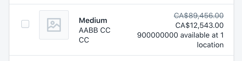
After adding the
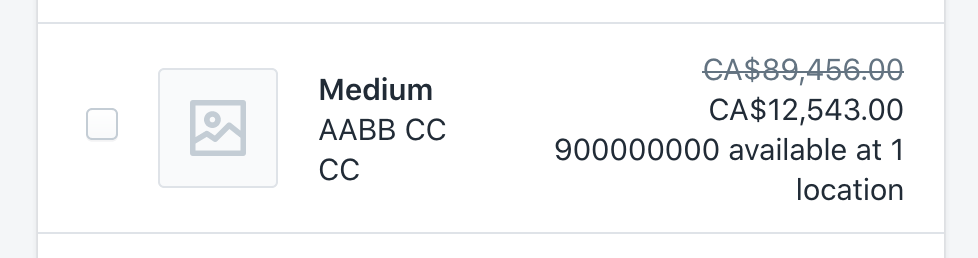
alignment="center"propertyBefore:
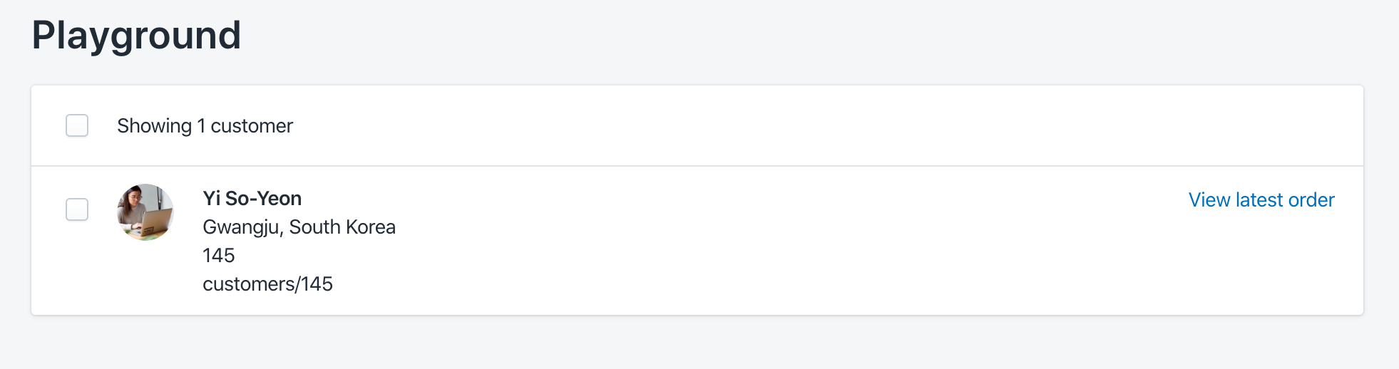
After adding the
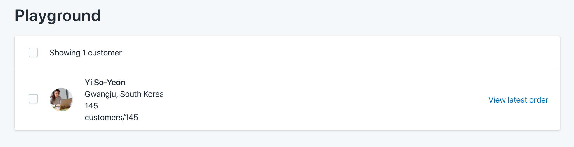
alignment="center"propertyHow to 🎩
🖥 Local development instructions
🗒 General tophatting guidelines
📄 Changelog guidelines
Copy-paste this code in
playground/Playground.tsxand try the alignment with all of the 5 options'leading' | 'trailing' | 'center' | 'fill' | 'baseline':🎩 checklist
README.mdwith documentation changes