[Popover] Add preferInputActivator prop to Popover #2754
Conversation
| ); | ||
|
|
||
| expect( | ||
| getRectForNodeSpy.mock.calls.some(([node]) => node === input), |
There was a problem hiding this comment.
Unfortunately, we can't check for the correct Rect being passed in the render prop because jsdom will always return 0 for all values. So we thought this is the second best way of assuring that the input has been used.
There was a problem hiding this comment.
Also getRectForNode is called multiple times for different elements so we could not just use toHaveBeenCalledWith. We didn't want to use toHaveBeenNthCalledWith because this would make the test less resilient to a slightly changing implementation.
There was a problem hiding this comment.
Makes sense. Maybe @AndrewMusgrave will have opinion about this.
| }); | ||
|
|
||
| it("passes 'preferInputActivator' to PopoverOverlay", () => { | ||
| const popover = mountWithAppProvider( |
There was a problem hiding this comment.
small nit, we're trying to switch over the react-testing as much as possible. If you can, change this to use mountWithApp instead and avoid the testId.
There was a problem hiding this comment.
We actually thought about that, but wanted to keep the test file consistent and not use different testing libraries in one file.
Depending on the effort, we'd try to refactor the entire file.
There was a problem hiding this comment.
That would be great if you could. We have been mixing though :|
There was a problem hiding this comment.
We updated the entire test file, could you please take a look?
There was a problem hiding this comment.
That's awesome thank you! 1 test is failing and there's a merge conflict but apart from that, it looks good!
| preferInputActivator = true, | ||
| } = this.props; | ||
|
|
||
| const textFieldActivator = activator.querySelector('input'); |
There was a problem hiding this comment.
| const textFieldActivator = activator.querySelector('input'); | |
| const activator = preferInputActivator ? activator.querySelector('input') : activatorProp |
Above where you deconstruct the props, I woud just rename activator to activator: activatorProp
There was a problem hiding this comment.
Wouldn't that introduce a breaking change? In its current state activatorRect will always be based on an existing node. If the input does not exist, we use the activator
With your suggested change, we might end up with null. When preferInputActivator is true, but there's no input.
Since preferInputActivator defaults to true this would probably break most of the usages where no TextField is the activator
There was a problem hiding this comment.
yes my bad. I missed the part we do check for null today. Was trying to get away for querying the for the input if preferInputActivator is false.
|
|
||
| const textFieldActivator = activator.querySelector('input'); | ||
|
|
||
| const activatorRect = |
There was a problem hiding this comment.
| const activatorRect = | |
| const activatorRect = getRectForNode(activator); |
The reason I am making these suggestions is that we won't do an unnecessary activator.querySelector('input') if preferInputActivator is false, but also because by letting people specify preferInputActivator and then doing this logic, the component might still work but not return what was intended. Does that make sense?
| ); | ||
|
|
||
| expect( | ||
| getRectForNodeSpy.mock.calls.some(([node]) => node === input), |
There was a problem hiding this comment.
Makes sense. Maybe @AndrewMusgrave will have opinion about this.
|
|
||
| const textFieldActivator = activator.querySelector('input'); | ||
| const preferredActivator = preferInputActivator | ||
| ? activator.querySelector('input') || activator |
There was a problem hiding this comment.
We now only query for input when preferredActivator is true.
|
We'll update the conflicting |
UNRELEASED.md
Outdated
| - Fixed focus state color on monochrome `Buttons` ([#2684](https://github.com/Shopify/polaris-react/pull/2684)) | ||
| - Fixed container's width on `Modal` ([#2692](https://github.com/Shopify/polaris-react/pull/2692)) | ||
| - Fixed the position property for the backdrop on `Select` from being overwritten by the focus ring ([#2748](https://github.com/Shopify/polaris-react/pull/2748)) | ||
| - Fixed the `Popover` reference position calculation ([#2752](https://github.com/Shopify/polaris-react/issues/2752)) ([#1415](https://github.com/Shopify/polaris-react/issues/1415)) |
There was a problem hiding this comment.
| - Fixed the `Popover` reference position calculation ([#2752](https://github.com/Shopify/polaris-react/issues/2752)) ([#1415](https://github.com/Shopify/polaris-react/issues/1415)) |
There was a problem hiding this comment.
This should probably go into the "Enhancements" section. Also, the link simply points to the PR as opposed to the issue.
- Added a
preferInputActivatorprop toPopoverto allow better positioning of the overlay (#2754)
There was a problem hiding this comment.
It's technically (also) a bugfix for #2752, but I have no issues moving it in the enhancements section. Thanks for the hint about linking to the issue. I wasn't aware that it should point to that.
Co-authored-by: Robin Drexler <robin.drexler@shopify.com>
Co-authored-by: Robin Drexler <robin.drexler@shopify.com>
Co-authored-by: Robin Drexler <robin.drexler@shopify.com>
Co-authored-by: Robin Drexler <robin.drexler@shopify.com>
 robin-drexler
force-pushed
the
popover-prefer-input-activator
branch
from
robin-drexler
force-pushed
the
popover-prefer-input-activator
branch
from
c10b430 to
48ae201
Compare
Co-Authored-By: Daniel Leroux <dleroux@users.noreply.github.com>
|
@dleroux thanks for your review and suggestions. This PR should be good to go now. Should we wait for a second review or can we |
 ? :)
? :)
|
🎉 Thanks for your contribution to Polaris React! |
3 participants
Co-authored-by: Robin Drexler robin.drexler@shopify.com
WHY are these changes introduced?
Fixes #2752
Fixes #1415
When the activator of a Popover (or PositonedOverlay) contains an input element, the Overlay always uses said element to calculate its position and width/height.
WHAT is this pull request doing?
Introduces a
preferInputActivatorprop to thePopover(and hencePositonedOverlaycomponent). This prop would betrueby default to not introduce a breaking change.When it's
true, the behavior does not change. The Overlay will continue to search for aninput, and if it finds one, use it. If the consumer sets the prop tofalse, the Overlay will never search for aninputand always use theactivatorto calculate its dimensions.How to 🎩
🖥 Local development instructions
🗒 General tophatting guidelines
📄 Changelog guidelines
If you set the
preferActivatorInputto false the Popover should expand to the size of the Textfield. By removing the property it should only have the width of the nested input node.Before:
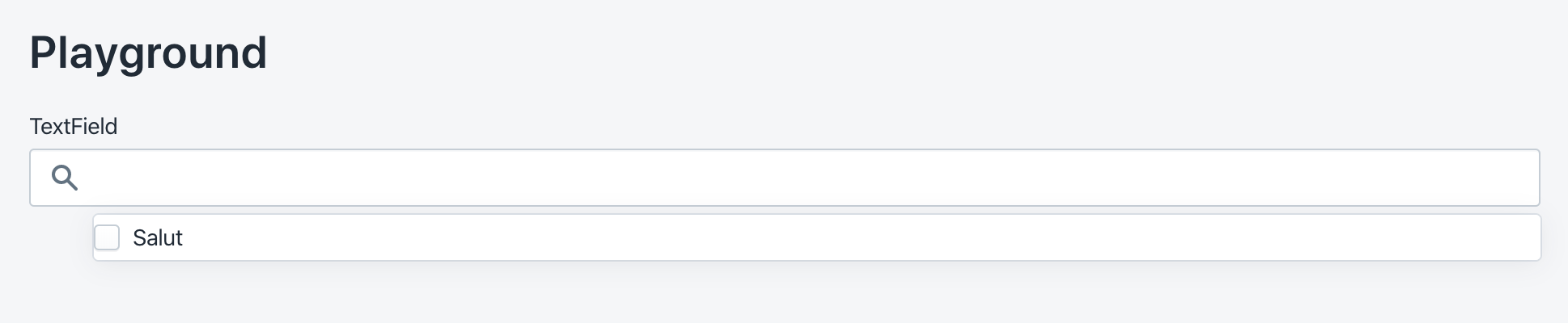
After:
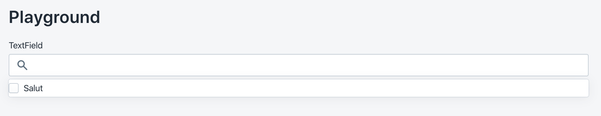
Copy-paste this code in
playground/Playground.tsx:🎩 checklist
README.mdwith documentation changes