[Various component] Add high contrast to design language #2792
Conversation
This file contains hidden or bidirectional Unicode text that may be interpreted or compiled differently than what appears below. To review, open the file in an editor that reveals hidden Unicode characters.
Learn more about bidirectional Unicode characters
dleroux
commented
Feb 27, 2020
| @include control-backdrop(active, $global-theming: true); | ||
| } | ||
| ~ .Icon { | ||
| transition-timing-function: var(--p-ease-in); |
There was a problem hiding this comment.
this was an oversight.
dleroux
commented
Feb 27, 2020
| @media (-ms-high-contrast: active) { | ||
| box-shadow: inset 0 0 0 border-width(base) ms-high-contrast-color('text'); | ||
| } | ||
| outline: 1px solid transparent; |
There was a problem hiding this comment.
simplified with this. box-shadow had no effect.
dleroux
commented
Feb 27, 2020
| overflow: var(--p-override-visible, hidden); | ||
| background-color: var(--p-surface, color('white')); | ||
| box-shadow: var(--p-card-shadow, shadow()); | ||
| outline: border-width(base) solid transparent; |
There was a problem hiding this comment.
box-shadow had no effect. Could be a chromium edge update
 dleroux
changed the title
dleroux
changed the title
 alex-page
requested review from
AndrewMusgrave
and removed request for
alex-page
alex-page
requested review from
AndrewMusgrave
and removed request for
alex-page
 chloerice
requested review from
danrosenthal and
tmlayton
and removed request for
chloerice
chloerice
requested review from
danrosenthal and
tmlayton
and removed request for
chloerice
|
(Removed myself as I still need to set up a virtual machine) |
danrosenthal
approved these changes
Mar 2, 2020
Sign up for free
to join this conversation on GitHub.
Already have an account?
Sign in to comment
4 participants
Add this suggestion to a batch that can be applied as a single commit.
This suggestion is invalid because no changes were made to the code.
Suggestions cannot be applied while the pull request is closed.
Suggestions cannot be applied while viewing a subset of changes.
Only one suggestion per line can be applied in a batch.
Add this suggestion to a batch that can be applied as a single commit.
Applying suggestions on deleted lines is not supported.
You must change the existing code in this line in order to create a valid suggestion.
Outdated suggestions cannot be applied.
This suggestion has been applied or marked resolved.
Suggestions cannot be applied from pending reviews.
Suggestions cannot be applied on multi-line comments.
Suggestions cannot be applied while the pull request is queued to merge.
Suggestion cannot be applied right now. Please check back later.
WHY are these changes introduced?
Fixes minor issues with Popover, Card
Applies high contrast to the indicator, checkable button, option list
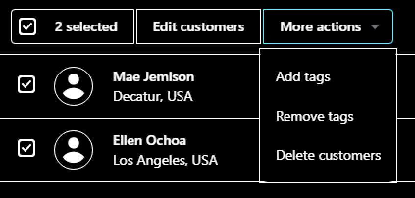
Bulk actions and checkable button
indicator

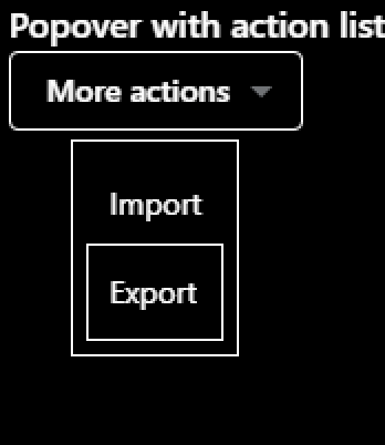
popover
card

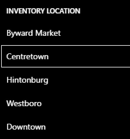
option list
How to 🎩
🖥 Local development instructions
🗒 General tophatting guidelines
📄 Changelog guidelines
Copy-paste this code in
playground/Playground.tsx:🎩 checklist
README.mdwith documentation changes