[Navigation] Fix secondary navigation spacing when no icon is present #2874
Conversation
This file contains hidden or bidirectional Unicode text that may be interpreted or compiled differently than what appears below. To review, open the file in an editor that reveals hidden Unicode characters.
Learn more about bidirectional Unicode characters
|
👋 Thanks for opening your first pull request. A contributor should give feedback soon. If you haven’t already, please check out the contributing guidelines. |
|
🟢 This pull request modifies 3 files and might impact 2 other files. Details:All files potentially affected (total: 2)📄
|
kyledurand
approved these changes
Mar 30, 2020
 dustinmalik
force-pushed
the
dmalik/nav-no-icon
branch
from
dustinmalik
force-pushed
the
dmalik/nav-no-icon
branch
from
4b8879a to
7be9b91
Compare
|
🎉 Thanks for your contribution to Polaris React! |
5 tasks
alexanderMontague
added a commit
that referenced
this pull request
Feb 17, 2023
…o nav icon (#8343)

<!--
  ☝️How to write a good PR title:
- Prefix it with [ComponentName] (if applicable), for example: [Button]
  - Start with a verb, for example: Add, Delete, Improve, Fix…
  - Give as much context as necessary and as little as possible
  - Prefix it with [WIP] while it’s a work in progress
-->

### WHY are these changes introduced?

Fixes #8342

Before:

<img width="257" alt="Screenshot 2023-02-14 at 10 32 05 AM"
src="https://user-images.githubusercontent.com/29992628/218789163-ea365e03-732b-4592-9aab-5945377626ae.png">

<img width="262" alt="Screenshot 2023-02-14 at 10 32 16 AM"
src="https://user-images.githubusercontent.com/29992628/218789445-7ff2875d-48ba-4bd2-bb14-27f2be1749d2.png">

After:

<img width="326" alt="image"
src="https://user-images.githubusercontent.com/29992628/218789292-fa10a152-7060-4576-a4ad-b39c941c89f1.png">

<img width="333" alt="image"
src="https://user-images.githubusercontent.com/29992628/218789515-99038b3f-a2a4-4edf-91db-707bd429ad48.png">


### WHAT is this pull request doing?

- While building a nav in Partners I stumbled across this weird
behaviour, more details in the linked issue above
- TLDR: when a nav item does not have an icon and there are sub items,
if one of those sub items are selected the selector indicator (green
indicator on left of item) does not fully hug the leftmost margin
- This was due to legacy no icon styles that were introduced a while ago
- See this PR that added in these styles
#2874

### How to 🎩

- head to my spin
http://240.26.37.19:6006/?path=/story/playground--nav-1
- toggle between `nav-1` and `nav-2` which are the navs with an icon and
without
- they should now have the same spacing and the selector should fully
hug the left margin

🖥 [Local development
instructions](https://github.com/Shopify/polaris/blob/main/README.md#local-development)
🗒 [General tophatting
guidelines](https://github.com/Shopify/polaris/blob/main/documentation/Tophatting.md)
📄 [Changelog
guidelines](https://github.com/Shopify/polaris/blob/main/.github/CONTRIBUTING.md#changelog)


### 🎩 checklist

- [x] Tested on
[mobile](https://github.com/Shopify/polaris/blob/main/documentation/Tophatting.md#cross-browser-testing)
- [x] Tested on [multiple
browsers](https://help.shopify.com/en/manual/shopify-admin/supported-browsers)
- [x] Tested for
[accessibility](https://github.com/Shopify/polaris/blob/main/documentation/Accessibility%20testing.md)
- [ ] Updated the component's `README.md` with documentation changes
- [x] [Tophatted
documentation](https://github.com/Shopify/polaris/blob/main/documentation/Tophatting%20documentation.md)
changes in the style guide
juzser
pushed a commit
to juzser/polaris
that referenced
this pull request
Jul 27, 2023
…o nav icon (Shopify#8343)

<!--
  ☝️How to write a good PR title:
- Prefix it with [ComponentName] (if applicable), for example: [Button]
  - Start with a verb, for example: Add, Delete, Improve, Fix…
  - Give as much context as necessary and as little as possible
  - Prefix it with [WIP] while it’s a work in progress
-->

### WHY are these changes introduced?

Fixes Shopify#8342

Before:

<img width="257" alt="Screenshot 2023-02-14 at 10 32 05 AM"
src="https://user-images.githubusercontent.com/29992628/218789163-ea365e03-732b-4592-9aab-5945377626ae.png">

<img width="262" alt="Screenshot 2023-02-14 at 10 32 16 AM"
src="https://user-images.githubusercontent.com/29992628/218789445-7ff2875d-48ba-4bd2-bb14-27f2be1749d2.png">

After:

<img width="326" alt="image"
src="https://user-images.githubusercontent.com/29992628/218789292-fa10a152-7060-4576-a4ad-b39c941c89f1.png">

<img width="333" alt="image"
src="https://user-images.githubusercontent.com/29992628/218789515-99038b3f-a2a4-4edf-91db-707bd429ad48.png">


### WHAT is this pull request doing?

- While building a nav in Partners I stumbled across this weird
behaviour, more details in the linked issue above
- TLDR: when a nav item does not have an icon and there are sub items,
if one of those sub items are selected the selector indicator (green
indicator on left of item) does not fully hug the leftmost margin
- This was due to legacy no icon styles that were introduced a while ago
- See this PR that added in these styles
Shopify#2874

### How to 🎩

- head to my spin
http://240.26.37.19:6006/?path=/story/playground--nav-1
- toggle between `nav-1` and `nav-2` which are the navs with an icon and
without
- they should now have the same spacing and the selector should fully
hug the left margin

🖥 [Local development
instructions](https://github.com/Shopify/polaris/blob/main/README.md#local-development)
🗒 [General tophatting
guidelines](https://github.com/Shopify/polaris/blob/main/documentation/Tophatting.md)
📄 [Changelog
guidelines](https://github.com/Shopify/polaris/blob/main/.github/CONTRIBUTING.md#changelog)


### 🎩 checklist

- [x] Tested on
[mobile](https://github.com/Shopify/polaris/blob/main/documentation/Tophatting.md#cross-browser-testing)
- [x] Tested on [multiple
browsers](https://help.shopify.com/en/manual/shopify-admin/supported-browsers)
- [x] Tested for
[accessibility](https://github.com/Shopify/polaris/blob/main/documentation/Accessibility%20testing.md)
- [ ] Updated the component's `README.md` with documentation changes
- [x] [Tophatted
documentation](https://github.com/Shopify/polaris/blob/main/documentation/Tophatting%20documentation.md)
changes in the style guide
Sign up for free
to join this conversation on GitHub.
Already have an account?
Sign in to comment
2 participants
Add this suggestion to a batch that can be applied as a single commit.
This suggestion is invalid because no changes were made to the code.
Suggestions cannot be applied while the pull request is closed.
Suggestions cannot be applied while viewing a subset of changes.
Only one suggestion per line can be applied in a batch.
Add this suggestion to a batch that can be applied as a single commit.
Applying suggestions on deleted lines is not supported.
You must change the existing code in this line in order to create a valid suggestion.
Outdated suggestions cannot be applied.
This suggestion has been applied or marked resolved.
Suggestions cannot be applied from pending reviews.
Suggestions cannot be applied on multi-line comments.
Suggestions cannot be applied while the pull request is queued to merge.
Suggestion cannot be applied right now. Please check back later.
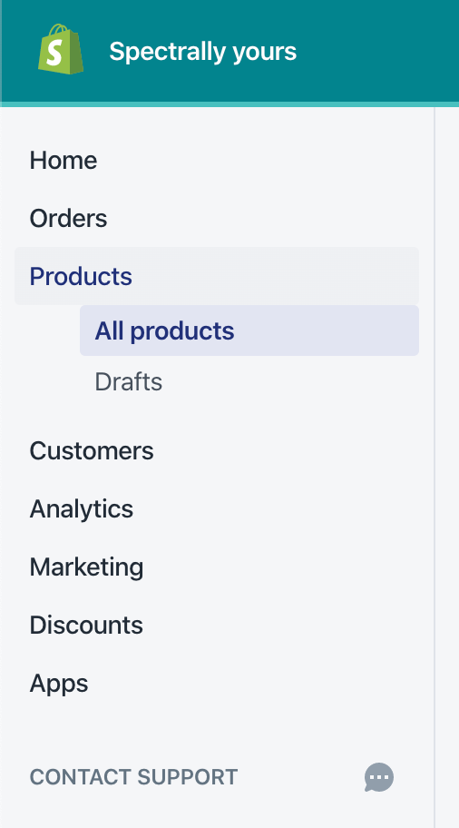
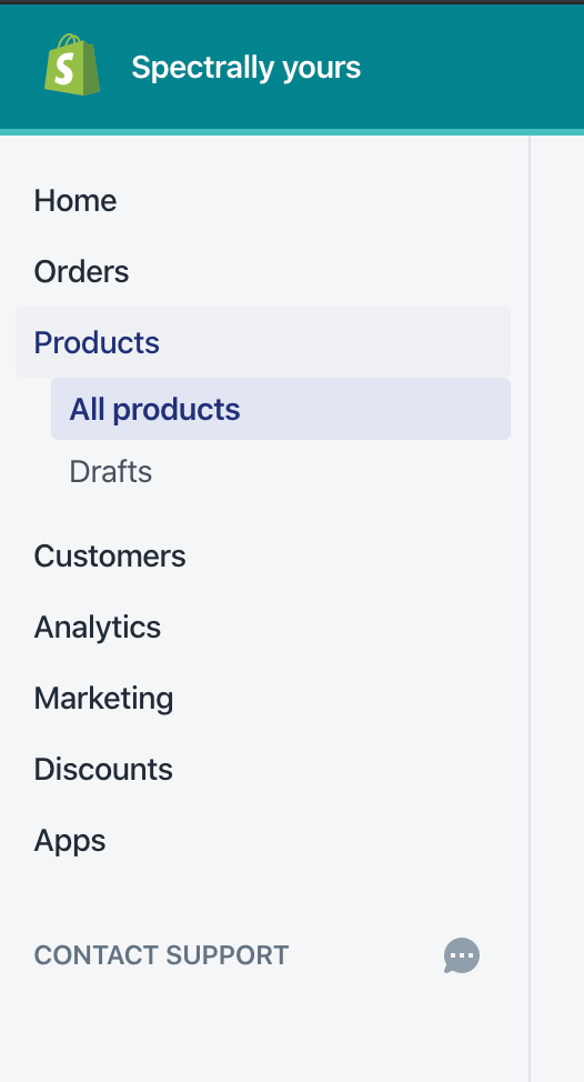
WHY are these changes introduced?
Fixes https://github.com/Shopify/destinations/issues/569
WHAT is this pull request doing?
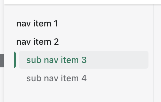
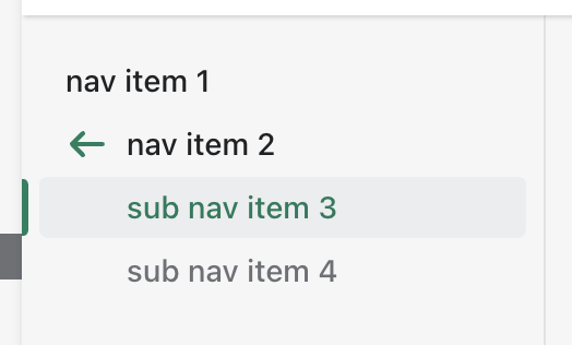
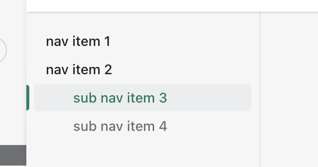
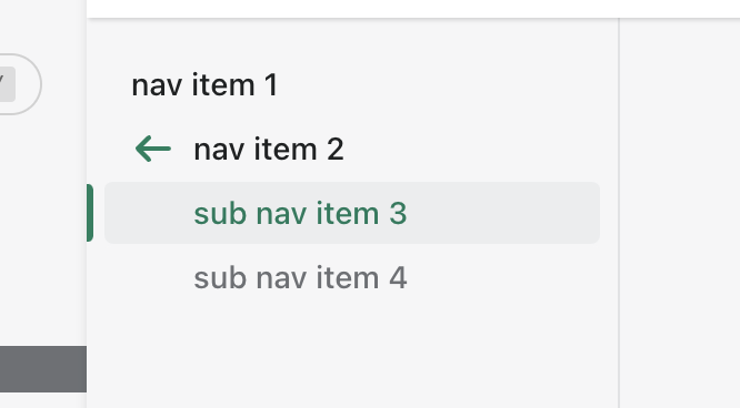
This removes unnecessary margin for secondary navigation when no icon is present.
Before:
After:
How to 🎩
Comment out all the icons in DetailsPage.tsx
🎩 checklist
README.mdwith documentation changes