Skip to content

Conversation

alex-page
Copy link
Member

@alex-page alex-page commented Apr 6, 2020

WHY are these changes introduced?

When the user has a white TopBar the navigation icon is not visible when using the mobile navigation. This PR makes the navigation icon color the same as the search icon color, allowing it to be updated by the topbar theme. This will also fix https://github.com/Shopify/destinations/issues/744 when merged in web.

WHAT is this pull request doing?

Makes the navigation icon use the same color as the search icon.

How to 🎩

Open this Playground on a mobile device. Change the text color, the navigation icon should change.

🖥 Local development instructions
🗒 General tophatting guidelines
📄 Changelog guidelines

Copy-paste this code in playground/Playground.tsx:
import React, {useState, useCallback} from 'react';
import {ArrowLeftMinor} from '@shopify/polaris-icons';

import {Page, Frame, TopBar, Card, ActionList, AppProvider} from '../src';

function TopBarExample() {
  const [isUserMenuOpen, setIsUserMenuOpen] = useState(false);
  const [isSearchActive, setIsSearchActive] = useState(false);
  const [searchValue, setSearchValue] = useState('');

  const toggleIsUserMenuOpen = useCallback(
    () => setIsUserMenuOpen((isUserMenuOpen) => !isUserMenuOpen),
    [],
  );

  const handleSearchResultsDismiss = useCallback(() => {
    setIsSearchActive(false);
    setSearchValue('');
  }, []);

  const handleSearchChange = useCallback((value) => {
    setSearchValue(value);
    setIsSearchActive(value.length > 0);
  }, []);

  const handleNavigationToggle = useCallback(() => {
    console.log('toggle navigation visibility');
  }, []);

  const theme = {
    colors: {
      topBar: {
        color: '#212B36',
        background: '#ffffff',
        backgroundLighter: '#DFE3E8',
      },
    },
    logo: {
      width: 124,
      topBarSource:
        'https://cdn.shopify.com/s/files/1/0446/6937/files/jaded-pixel-logo-color.svg?6215648040070010999',
      url: 'http://jadedpixel.com',
      accessibilityLabel: 'Jaded Pixel',
    },
  };

  const userMenuMarkup = (
    <TopBar.UserMenu
      actions={[
        {
          items: [{content: 'Back to Shopify', icon: ArrowLeftMinor}],
        },
        {
          items: [{content: 'Community forums'}],
        },
      ]}
      name="Dharma"
      detail="Jaded Pixel"
      initials="D"
      open={isUserMenuOpen}
      onToggle={toggleIsUserMenuOpen}
    />
  );

  const searchResultsMarkup = (
    <Card>
      <ActionList
        items={[
          {content: 'Shopify help center'},
          {content: 'Community forums'},
        ]}
      />
    </Card>
  );

  const searchFieldMarkup = (
    <TopBar.SearchField
      onChange={handleSearchChange}
      value={searchValue}
      placeholder="Search"
      showFocusBorder
    />
  );

  const topBarMarkup = (
    <TopBar
      showNavigationToggle
      userMenu={userMenuMarkup}
      searchResultsVisible={isSearchActive}
      searchField={searchFieldMarkup}
      searchResults={searchResultsMarkup}
      onSearchResultsDismiss={handleSearchResultsDismiss}
      onNavigationToggle={handleNavigationToggle}
    />
  );

  return (
    <div style={{height: '250px'}}>
      <AppProvider
        theme={theme}
        i18n={{
          Polaris: {
            Avatar: {
              label: 'Avatar',
              labelWithInitials: 'Avatar with initials {initials}',
            },
            Frame: {skipToContent: 'Skip to content'},
            TopBar: {
              toggleMenuLabel: 'Toggle menu',
              SearchField: {
                clearButtonLabel: 'Clear',
                search: 'Search',
              },
            },
          },
        }}
      >
        <Frame topBar={topBarMarkup} />
      </AppProvider>
    </div>
  );
}

export function Playground() {
  return <TopBarExample />;
}

🎩 checklist

  • Tested on mobile
  • Tested on multiple browsers
  • Tested for accessibility
  • Updated the component's README.md with documentation changes
  • Tophatted documentation changes in the style guide
  • For visual design changes, pinged one of @ HYPD, @ mirualves, @ sarahill, or @ ry5n to update the Polaris UI kit

Visual changes

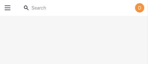
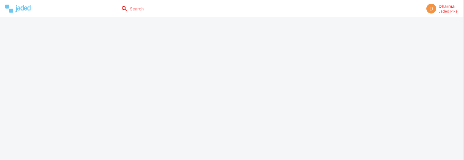
There should be no visual changes to the TopBar unless the user is theming it.

Desktop with red color:
Screen Shot 2020-04-06 at 6 23 48 PM

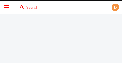
Mobile with red color:
Screen Shot 2020-04-06 at 6 23 43 PM

Mobile with ink:
Screen Shot 2020-04-06 at 6 23 07 PM

@alex-page alex-page requested a review from HYPD April 6, 2020 22:22
@github-actions
Copy link
Contributor

github-actions bot commented Apr 6, 2020

🟢 This pull request modifies 2 files and might impact 1 other files.

Details:
All files potentially affected (total: 1)
📄 UNRELEASED.md (total: 0)

Files potentially affected (total: 0)

🎨 src/components/TopBar/TopBar.scss (total: 1)

Files potentially affected (total: 1)

@alex-page alex-page self-assigned this Apr 6, 2020
Copy link
Contributor

@amrocha amrocha left a comment

Choose a reason for hiding this comment

The reason will be displayed to describe this comment to others. Learn more.

Tophatted in storybook!

Copy link
Contributor

@ry5n ry5n left a comment

Choose a reason for hiding this comment

The reason will be displayed to describe this comment to others. Learn more.

👍

@alex-page alex-page merged commit 0fd2392 into master Apr 6, 2020
@alex-page alex-page deleted the topbar-nav-icon-color branch April 6, 2020 22:41

### Bug fixes

- `TopBar` navigation icon to use the `var(--top-bar-color)` ([#](https://github.com/Shopify/polaris-react/pull/)).
Copy link
Contributor

Choose a reason for hiding this comment

The reason will be displayed to describe this comment to others. Learn more.

missing the PR number

athornburg pushed a commit to athornburg/polaris-react that referenced this pull request Apr 15, 2020
Sign up for free to join this conversation on GitHub. Already have an account? Sign in to comment

Labels

None yet

Projects

None yet

Development

Successfully merging this pull request may close these issues.

5 participants