[ResourceItem] Use layout components #7784
Merged
Conversation
This file contains hidden or bidirectional Unicode text that may be interpreted or compiled differently than what appears below. To review, open the file in an editor that reveals hidden Unicode characters.
Learn more about bidirectional Unicode characters
 kyledurand
force-pushed
the
resource-item_re-build
branch
from
kyledurand
force-pushed
the
resource-item_re-build
branch
from
cdcf329 to
dda717f
Compare
Contributor
size-limit report 📦
|
kyledurand
force-pushed
the
resource-item_re-build
branch
from
dda717f to
0daf9e8
Compare
kyledurand
force-pushed
the
resource-item_re-build
branch
from
e682f89 to
dd90d0b
Compare
kyledurand
force-pushed
the
resource-item_re-build
branch
from
dd90d0b to
cb3fbaf
Compare
kyledurand
force-pushed
the
resource-item_re-build
branch
from
93d2069 to
a5065c4
Compare
kyledurand
requested review from
aveline,
chazdean,
laurkim,
sarahill and
yurm04
Member
Author
sarahill
approved these changes
Nov 25, 2022
aveline
approved these changes
Nov 25, 2022
| import {mountWithApp} from 'tests/utilities'; | ||
| import {matchMedia} from '@shopify/jest-dom-mocks'; | ||
|
|
||
| // import {setMediaWidth} from 'tests/utilities/breakpoints'; |
| padding="3" | ||
| paddingInlineStart={{xs: '4', sm: '5'}} | ||
| paddingInlineEnd={{xs: '4', sm: '5'}} | ||
| zIndex="var(--pc-resource-item-content-stacking-order)" |
Contributor
There was a problem hiding this comment.
Are we not enforcing token usage for z-index?
Member
Author
There was a problem hiding this comment.
No, going from 100 to 400 to 510 (z-1, z-2, z-3) just doesn't make sense for a localized stacking order.
If there's a component that makes use of lots of z-indexes (these components exist) then we get up to pretty high numbers, pretty quickly. This will cause issues where elements start overlapping backdrops, popovers, navigation etc...
kyledurand
commented
Nov 25, 2022
polaris-react/src/components/ResourceList/tests/ResourceList.test.tsx
Outdated
Show resolved
Hide resolved
chazdean
approved these changes
Nov 25, 2022
Member
Author
|
/snapit |
Contributor
|
🫰✨ Thanks @kyledurand! Your snapshots have been published to npm. Test the snapshots by updating your yarn add @shopify/plugin-polaris@0.0.0-snapshot-release-20221128165329yarn add @shopify/polaris-icons@0.0.0-snapshot-release-20221128165329yarn add @shopify/polaris-migrator@0.0.0-snapshot-release-20221128165329yarn add @shopify/polaris@0.0.0-snapshot-release-20221128165329 |
chazdean
pushed a commit
that referenced
this pull request
Dec 2, 2022
Closes: #7580 This slightly moves the checkbox handle 2px to the left. This means it now lines up with our 20px padding instead of 22px from the card edge. Also improves vertical alignment of the checkboxes and bulk select on xs screens Before | After ---|--- 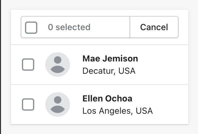 | 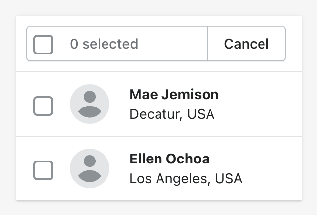 The only CSS that remains is for interactive elements, interactive behavior (hover, focus), and transitions (which are being removed in https://github.com/Shopify/polaris/pull/7290/files).
laurkim
pushed a commit
that referenced
this pull request
Dec 7, 2022
Closes: #7580 This slightly moves the checkbox handle 2px to the left. This means it now lines up with our 20px padding instead of 22px from the card edge. Also improves vertical alignment of the checkboxes and bulk select on xs screens Before | After ---|---  |  The only CSS that remains is for interactive elements, interactive behavior (hover, focus), and transitions (which are being removed in https://github.com/Shopify/polaris/pull/7290/files).
laurkim
pushed a commit
that referenced
this pull request
Dec 15, 2022
Closes: #7580 This slightly moves the checkbox handle 2px to the left. This means it now lines up with our 20px padding instead of 22px from the card edge. Also improves vertical alignment of the checkboxes and bulk select on xs screens Before | After ---|---  |  The only CSS that remains is for interactive elements, interactive behavior (hover, focus), and transitions (which are being removed in https://github.com/Shopify/polaris/pull/7290/files).
chazdean
pushed a commit
that referenced
this pull request
Jan 12, 2023
Closes: #7580 This slightly moves the checkbox handle 2px to the left. This means it now lines up with our 20px padding instead of 22px from the card edge. Also improves vertical alignment of the checkboxes and bulk select on xs screens Before | After ---|---  |  The only CSS that remains is for interactive elements, interactive behavior (hover, focus), and transitions (which are being removed in https://github.com/Shopify/polaris/pull/7290/files).
chazdean
pushed a commit
that referenced
this pull request
Jan 13, 2023
Closes: #7580 This slightly moves the checkbox handle 2px to the left. This means it now lines up with our 20px padding instead of 22px from the card edge. Also improves vertical alignment of the checkboxes and bulk select on xs screens Before | After ---|---  |  The only CSS that remains is for interactive elements, interactive behavior (hover, focus), and transitions (which are being removed in https://github.com/Shopify/polaris/pull/7290/files).
laurkim
pushed a commit
that referenced
this pull request
Jan 26, 2023
Closes: #7580 This slightly moves the checkbox handle 2px to the left. This means it now lines up with our 20px padding instead of 22px from the card edge. Also improves vertical alignment of the checkboxes and bulk select on xs screens Before | After ---|---  |  The only CSS that remains is for interactive elements, interactive behavior (hover, focus), and transitions (which are being removed in https://github.com/Shopify/polaris/pull/7290/files).
kyledurand
added a commit
that referenced
this pull request
Jan 26, 2023
Closes: #7580 This slightly moves the checkbox handle 2px to the left. This means it now lines up with our 20px padding instead of 22px from the card edge. Also improves vertical alignment of the checkboxes and bulk select on xs screens Before | After ---|---  |  The only CSS that remains is for interactive elements, interactive behavior (hover, focus), and transitions (which are being removed in https://github.com/Shopify/polaris/pull/7290/files).
Sign up for free
to join this conversation on GitHub.
Already have an account?
Sign in to comment
4 participants
Add this suggestion to a batch that can be applied as a single commit.
This suggestion is invalid because no changes were made to the code.
Suggestions cannot be applied while the pull request is closed.
Suggestions cannot be applied while viewing a subset of changes.
Only one suggestion per line can be applied in a batch.
Add this suggestion to a batch that can be applied as a single commit.
Applying suggestions on deleted lines is not supported.
You must change the existing code in this line in order to create a valid suggestion.
Outdated suggestions cannot be applied.
This suggestion has been applied or marked resolved.
Suggestions cannot be applied from pending reviews.
Suggestions cannot be applied on multi-line comments.
Suggestions cannot be applied while the pull request is queued to merge.
Suggestion cannot be applied right now. Please check back later.
Closes: #7580
This slightly moves the checkbox handle 2px to the left. This means it now lines up with our 20px padding instead of 22px from the card edge. Also improves vertical alignment of the checkboxes and bulk select on xs screens
The only CSS that remains is for interactive elements, interactive behavior (hover, focus), and transitions (which are being removed in https://github.com/Shopify/polaris/pull/7290/files).