[Tooltip] Add optional zIndexOverride prop to Tooltip #8080
Conversation
size-limit report 📦
|
| */ | ||
| borderRadius?: BorderRadius; | ||
| /** Override on the default z-index of 400 */ | ||
| zIndexOverride?: number; |
There was a problem hiding this comment.
Would it be worth making this with the tokens? https://polaris.shopify.com/tokens/z-index
There was a problem hiding this comment.
Initially I thought no since this would mirror the Popover implementation, though it does seem ideal to enforce the usage of tokens.
There was a problem hiding this comment.
As in making the zIndexOverride into the token types zIndexZScale, but this currently matches the Popover prop exactly 😄, I know Polaris is trying to move the Props into more token types, but I have no idea! 🤷🏽♀️ 😄
cc: @alex-page
https://github.com/Shopify/polaris/blob/8fc0fefdfcedd92830639d040a042055a0105f71/polaris-react/src/components/Popover/Popover.tsx#L55
There was a problem hiding this comment.
I think it would require some reworking since the PositionedOverlay accepts a number, which would impact all Popover usages:
There was a problem hiding this comment.
Omg, I missed your replies :yells-at-github: 😆 ❤️
polaris-react/src/components/Tooltip/components/TooltipOverlay/tests/TooltipOverlay.test.tsx
Outdated
Show resolved
Hide resolved
 LauraAubin
force-pushed
the
add-z-index-prop
branch
from
LauraAubin
force-pushed
the
add-z-index-prop
branch
from
7175936 to
ef41e62
Compare
Co-authored-by: Chloe Rice <chloerice@users.noreply.github.com>
This PR was opened by the [Changesets
release](https://github.com/changesets/action) GitHub action. When
you're ready to do a release, you can merge this and the packages will
be published to npm automatically. If you're not ready to do a release
yet, that's fine, whenever you add more changesets to main, this PR will
be updated.


# Releases
## @shopify/polaris-icons@6.8.0

### Minor Changes

- [#8049](#8049)
[`dca31f2a0`](dca31f2)
Thanks [@leileu](https://github.com/leileu)! - Added 8 minor icons for
metafields


- [#8069](#8069)
[`f67e2997e`](f67e299)
Thanks [@leileu](https://github.com/leileu)! - Added file minor icon


- [#8063](#8063)
[`d5da4778c`](d5da477)
Thanks [@eric-blue](https://github.com/eric-blue)! - Added minor icon
for diamond_alert


- [#8037](#8037)
[`1aeed2414`](1aeed24)
Thanks [@dGoligorsky](https://github.com/dGoligorsky)! - Added major and
minor icon for Magic

### Patch Changes

- [#8085](#8085)
[`56b757036`](56b7570)
Thanks [@sarahill](https://github.com/sarahill)! - Added icon name for
magic major and minor


- [#8066](#8066)
[`68acc4593`](68acc45)
Thanks [@kyledurand](https://github.com/kyledurand)! - Added better
error documentation on icon validation

## @shopify/polaris@10.22.0

### Minor Changes

- [#8054](#8054)
[`c44c96c6b`](c44c96c)
Thanks [@mrcthms](https://github.com/mrcthms)! - Update focus states to
be present on :focus-visible rather than :focus

### Patch Changes

- [#8080](#8080)
[`1c926b9da`](1c926b9)
Thanks [@LauraAubin](https://github.com/LauraAubin)! - Added an optional
`zIndexOverride` prop to `Tooltip`


- [#8077](#8077)
[`dc2ed0a5c`](dc2ed0a)
Thanks [@kyledurand](https://github.com/kyledurand)! - Removed data
attribute css from legacy polyfill


- [#8040](#8040)
[`ba6b04c79`](ba6b04c)
Thanks [@kyledurand](https://github.com/kyledurand)! - Fixed modal
footer vertical alignment when noScroll is true

- Updated dependencies
\[[`dca31f2a0`](dca31f2),
[`56b757036`](56b7570),
[`f67e2997e`](f67e299),
[`68acc4593`](68acc45),
[`d5da4778c`](d5da477),
[`1aeed2414`](1aeed24)]:
    -   @shopify/polaris-icons@6.8.0

## @shopify/plugin-polaris@0.0.29


## polaris.shopify.com@0.29.0

### Minor Changes

- [#8027](#8027)
[`8fc0fefdf`](8fc0fef)
Thanks [@qt314](https://github.com/qt314)! - Add tooling section to
document tools help build and maintain Polaris in consuming
applications.

### Patch Changes

- Updated dependencies
\[[`dca31f2a0`](dca31f2),
[`56b757036`](56b7570),
[`f67e2997e`](f67e299),
[`1c926b9da`](1c926b9),
[`c44c96c6b`](c44c96c),
[`dc2ed0a5c`](dc2ed0a),
[`ba6b04c79`](ba6b04c),
[`68acc4593`](68acc45),
[`d5da4778c`](d5da477),
[`1aeed2414`](1aeed24)]:
    -   @shopify/polaris-icons@6.8.0
    -   @shopify/polaris@10.22.0

Co-authored-by: github-actions[bot] <github-actions[bot]@users.noreply.github.com>
<!--
  ☝️How to write a good PR title:
- Prefix it with [ComponentName] (if applicable), for example: [Button]
  - Start with a verb, for example: Add, Delete, Improve, Fix…
  - Give as much context as necessary and as little as possible
  - Prefix it with [WIP] while it’s a work in progress
-->

### WHY are these changes introduced?

In situations where there are two activators that render a `Tooltip`,
we'd like the ability to give visual priority to one of them. An example
of this is using sortable headers on the `IndexTable`, followed by an
information tooltip within that header which causes this overlap:

<img width="224" alt="Screenshot 2023-01-18 at 1 27 02 PM"
src="https://user-images.githubusercontent.com/22782157/213264009-a15aca00-7157-459c-810d-54208d7b1b5f.png">

It also looks like this prop can be used in other places in the Web repo
as there are multiple places which are overriding the z-index value by
selecting the `'Polaris-PositionedOverlay'` class.

### WHAT is this pull request doing?

This PR mirrors the `zIndexOverride` prop implementation as seen in the
`Popover` component, since both components use the shared
`PositionedOverlay` component.

### How to 🎩

No tophatting is necessary.

### 🎩 checklist

- [ ] Tested on
[mobile](https://github.com/Shopify/polaris/blob/main/documentation/Tophatting.md#cross-browser-testing)
- [ ] Tested on [multiple
browsers](https://help.shopify.com/en/manual/shopify-admin/supported-browsers)
- [ ] Tested for
[accessibility](https://github.com/Shopify/polaris/blob/main/documentation/Accessibility%20testing.md)
- [ ] Updated the component's `README.md` with documentation changes
- [ ] [Tophatted
documentation](https://github.com/Shopify/polaris/blob/main/documentation/Tophatting%20documentation.md)
changes in the style guide

Co-authored-by: Chloe Rice <chloerice@users.noreply.github.com>
This PR was opened by the [Changesets
release](https://github.com/changesets/action) GitHub action. When
you're ready to do a release, you can merge this and the packages will
be published to npm automatically. If you're not ready to do a release
yet, that's fine, whenever you add more changesets to main, this PR will
be updated.


# Releases
## @shopify/polaris-icons@6.8.0

### Minor Changes

- [Shopify#8049](Shopify#8049)
[`dca31f2a0`](Shopify@dca31f2)
Thanks [@leileu](https://github.com/leileu)! - Added 8 minor icons for
metafields


- [Shopify#8069](Shopify#8069)
[`f67e2997e`](Shopify@f67e299)
Thanks [@leileu](https://github.com/leileu)! - Added file minor icon


- [Shopify#8063](Shopify#8063)
[`d5da4778c`](Shopify@d5da477)
Thanks [@eric-blue](https://github.com/eric-blue)! - Added minor icon
for diamond_alert


- [Shopify#8037](Shopify#8037)
[`1aeed2414`](Shopify@1aeed24)
Thanks [@dGoligorsky](https://github.com/dGoligorsky)! - Added major and
minor icon for Magic

### Patch Changes

- [Shopify#8085](Shopify#8085)
[`56b757036`](Shopify@56b7570)
Thanks [@sarahill](https://github.com/sarahill)! - Added icon name for
magic major and minor


- [Shopify#8066](Shopify#8066)
[`68acc4593`](Shopify@68acc45)
Thanks [@kyledurand](https://github.com/kyledurand)! - Added better
error documentation on icon validation

## @shopify/polaris@10.22.0

### Minor Changes

- [Shopify#8054](Shopify#8054)
[`c44c96c6b`](Shopify@c44c96c)
Thanks [@mrcthms](https://github.com/mrcthms)! - Update focus states to
be present on :focus-visible rather than :focus

### Patch Changes

- [Shopify#8080](Shopify#8080)
[`1c926b9da`](Shopify@1c926b9)
Thanks [@LauraAubin](https://github.com/LauraAubin)! - Added an optional
`zIndexOverride` prop to `Tooltip`


- [Shopify#8077](Shopify#8077)
[`dc2ed0a5c`](Shopify@dc2ed0a)
Thanks [@kyledurand](https://github.com/kyledurand)! - Removed data
attribute css from legacy polyfill


- [Shopify#8040](Shopify#8040)
[`ba6b04c79`](Shopify@ba6b04c)
Thanks [@kyledurand](https://github.com/kyledurand)! - Fixed modal
footer vertical alignment when noScroll is true

- Updated dependencies
\[[`dca31f2a0`](Shopify@dca31f2),
[`56b757036`](Shopify@56b7570),
[`f67e2997e`](Shopify@f67e299),
[`68acc4593`](Shopify@68acc45),
[`d5da4778c`](Shopify@d5da477),
[`1aeed2414`](Shopify@1aeed24)]:
    -   @shopify/polaris-icons@6.8.0

## @shopify/plugin-polaris@0.0.29


## polaris.shopify.com@0.29.0

### Minor Changes

- [Shopify#8027](Shopify#8027)
[`8fc0fefdf`](Shopify@8fc0fef)
Thanks [@qt314](https://github.com/qt314)! - Add tooling section to
document tools help build and maintain Polaris in consuming
applications.

### Patch Changes

- Updated dependencies
\[[`dca31f2a0`](Shopify@dca31f2),
[`56b757036`](Shopify@56b7570),
[`f67e2997e`](Shopify@f67e299),
[`1c926b9da`](Shopify@1c926b9),
[`c44c96c6b`](Shopify@c44c96c),
[`dc2ed0a5c`](Shopify@dc2ed0a),
[`ba6b04c79`](Shopify@ba6b04c),
[`68acc4593`](Shopify@68acc45),
[`d5da4778c`](Shopify@d5da477),
[`1aeed2414`](Shopify@1aeed24)]:
    -   @shopify/polaris-icons@6.8.0
    -   @shopify/polaris@10.22.0

Co-authored-by: github-actions[bot] <github-actions[bot]@users.noreply.github.com>
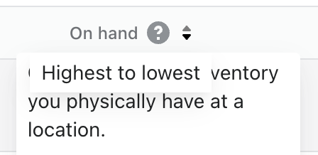
WHY are these changes introduced?
In situations where there are two activators that render a
Tooltip, we'd like the ability to give visual priority to one of them. An example of this is using sortable headers on theIndexTable, followed by an information tooltip within that header which causes this overlap:It also looks like this prop can be used in other places in the Web repo as there are multiple places which are overriding the z-index value by selecting the
'Polaris-PositionedOverlay'class.WHAT is this pull request doing?
This PR mirrors the
zIndexOverrideprop implementation as seen in thePopovercomponent, since both components use the sharedPositionedOverlaycomponent.How to 🎩
No tophatting is necessary.
🎩 checklist
README.mdwith documentation changes