HEEDLS-659 - implemented action plan resource on current page sans fe… #780
Conversation
| @model CurrentCourseViewModel | ||
|
|
||
| <div class="searchable-element nhsuk-panel @Model.DateStyle()" id="@Model.Id-card"> | ||
| <div class="searchable-element nhsuk-panel @Model.DateStyle()" id="@Model.Id-course-card"> |
There was a problem hiding this comment.
I noticed that the current course card and self assessment card used the same Id template ("{Id}-card") which could conflict on the off chance the id of a self assessment matched the id of a course (which could be possible given they are at different tables). So I took the liberty to change these here.
| } | ||
| } | ||
| @if (Model is LearningResourceCardViewModel resource) { | ||
| <div class="tag nhsuk-u-font-size-14" aria-describedby="@Model.Id-name"> |
There was a problem hiding this comment.
I just gave these tags the same styling as the tags in the other Current cards for courses and self assessments. So these are consistent with the page, but not consistent with tags we use elsewhere (e.g. tracking system filters).
Have a look at the screenshots and see if they look too much like buttons. Otherwise I can probably refactor the tags to look more like the tags we use elsewhere.
There was a problem hiding this comment.
I do think the tags look confusingly like buttons a bit too much, especially because they are the same color as the Mark as complete and Edit buttons. I don't know if "Image" and "WebLink" are test values or values likely to be displayed in the tags, but if they are, it seems likely users would click on them thinking that will open the image or link. I think it would be worth making they look like the tags we use elsewhere.
There was a problem hiding this comment.
I've updated the tags on the learning resource cards (and added new tags for each type). I've not updated the old course and self assessment tags yet. I will ask Kevin a question in the slack thread about the new tags to see what he thinks of them. Images below:

There was a problem hiding this comment.
I think that looks a lot better! And I support changing them on the other cards for consistency as long as Kevin okays that
|
Still need to implement the UseSignposting feature management flag now that it is merged. |
|
UseSignposting feature management flag is now being used. |
| private const string LearningHubOpenApiKey = "LearningHubOpenAPIKey"; | ||
| private const string LearningHubOpenApiBaseUrl = "LearningHubOpenAPIBaseUrl"; | ||
| private const string UseSignposting = "FeatureManagement:UseSignposting"; | ||
| public const string UseSignposting = "FeatureManagement:UseSignposting"; |
There was a problem hiding this comment.
Found out why it's good to have this as public - useful for unit tests.
DigitalLearningSolutions.Data.Tests/DataServices/LearningLogItemsDataServiceTests.cs
Show resolved
Hide resolved
| SeqInt, | ||
| LastAccessedDate, | ||
| LinkedCompetencyLearningResourceID, | ||
| clr.LHResourceReferenceID AS LearningHubResourceReferenceID |
There was a problem hiding this comment.
slightly weird indentation here?
DigitalLearningSolutions.Web/Views/LearningPortal/Current/_CurrentLearningResourceCard.cshtml
Show resolved
Hide resolved
| } | ||
| } | ||
| @if (Model is LearningResourceCardViewModel resource) { | ||
| <div class="tag nhsuk-u-font-size-14" aria-describedby="@Model.Id-name"> |
There was a problem hiding this comment.
I do think the tags look confusingly like buttons a bit too much, especially because they are the same color as the Mark as complete and Edit buttons. I don't know if "Image" and "WebLink" are test values or values likely to be displayed in the tags, but if they are, it seems likely users would click on them thinking that will open the image or link. I think it would be worth making they look like the tags we use elsewhere.
DigitalLearningSolutions.Web/Views/LearningPortal/Current/_CurrentLearningResourceCard.cshtml
Show resolved
Hide resolved
DigitalLearningSolutions.Web/Views/LearningPortal/Current/_CurrentLearningResourceCard.cshtml
Show resolved
Hide resolved
There was a problem hiding this comment.
Looking good, just left one more nickpicky styling suggestion which you can take or leave, and seems like the one weird indentation is still there on the sql is still there, but no need for rereview. I'll move this along so we can get more eyes on it sooner :)
DigitalLearningSolutions.Data/DataServices/LearningLogItemsDataService.cs
Show resolved
Hide resolved
| private const string LearningHubOpenApiKey = "LearningHubOpenAPIKey"; | ||
| private const string LearningHubOpenApiBaseUrl = "LearningHubOpenAPIBaseUrl"; | ||
| private const string UseSignposting = "FeatureManagement:UseSignposting"; | ||
| public const string UseSignposting = "FeatureManagement:UseSignposting"; |
DigitalLearningSolutions.Web/Views/LearningPortal/Current/AllCurrentItems.cshtml
Outdated
Show resolved
Hide resolved
DigitalLearningSolutions.Web/Views/LearningPortal/Current/_CurrentLearningResourceCard.cshtml
Outdated
Show resolved
Hide resolved
DigitalLearningSolutions.Web/Views/LearningPortal/SelfAssessments/_SelfAssessmentCard.cshtml
Outdated
Show resolved
Hide resolved
|
|
||
| Task<IEnumerable<ActionPlanItem>> GetIncompleteActionPlanItems(int delegateId); | ||
|
|
||
| Task<string?> AccessLearningResource(int learningLogItemId, int delegateId); |
There was a problem hiding this comment.
Couldn't really think of a good name for this. Thoughts on this? Might be worth a refactor?
There was a problem hiding this comment.
I like how short and sweet it is but it does seem a bit ambiguous. The only other thing I can think of is GetLearningResourceLinkAndUpdateLastAccessedDate, which is a mouthful but would be clearer
…ature flag
JIRA link
https://softwiretech.atlassian.net/browse/HEEDLS-659
Description
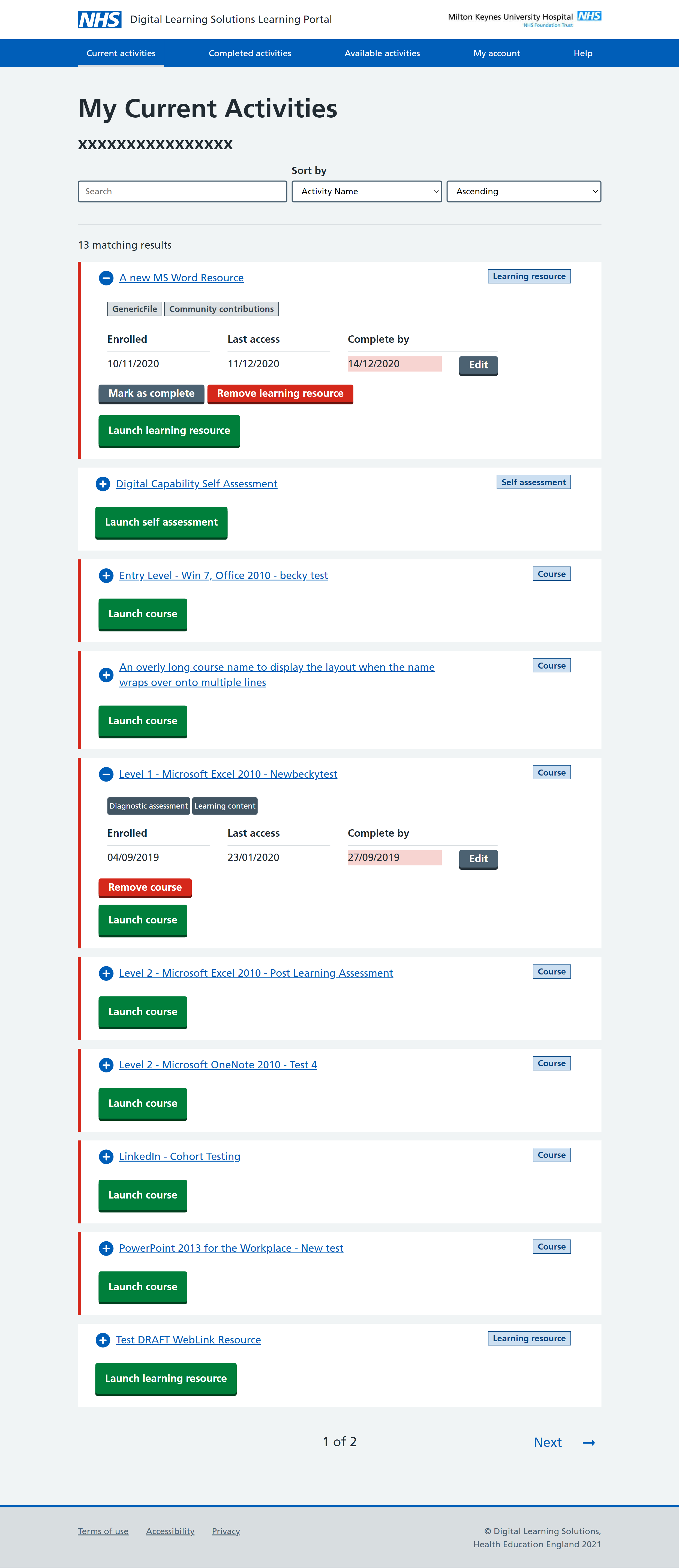
Implemented the retrieval of incomplete action plan items for display the Current page in the learning portal. Did some minor refactoring of the existing page.
Screenshots
I've shown a few resources below (all have come from the API so presumably match how we expect the live resources to be).
Desktop:
Tablet:
Mobile:
Developer checks
(Leave tasks unticked if they haven't been appropriate for your ticket.)
I have: