
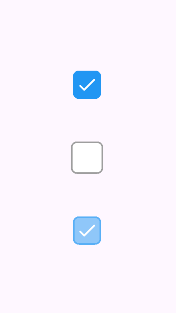
A fully customizable, animated, and accessible Flutter checkbox widget ✨
Designed for developers who want complete control over visuals and interactions while maintaining simplicity and accessibility ♿.
✅ Customizable Design
- Control size, shape (rounded or circular), border, colors, and icon.
- Use your own icons or color schemes for branding consistency.
🎞️ Smooth Animation
- Uses
AnimatedContainer&AnimatedSwitcherfor clean state transitions.
♿ Accessibility-Ready
- Built-in Semantics, Tooltip, and large tap area for screen readers and better usability.
💻 Web & Desktop Friendly
- Proper mouse cursor handling, InkWell feedback, and focus support.
🔔 Haptic Feedback
- Optional tactile feedback on mobile platforms.
Add the dependency to your pubspec.yaml:
dependencies:
  custom_checkbox: ^1.0.0
Import the package:
import 'package:custom_checkbox/custom_checkbox.dart';Use it anywhere in your widget tree:
bool isChecked = false;

CustomCheckBox(
  value: isChecked,
  onChanged: (v) => setState(() => isChecked = v),
  size: 24,
  borderRadius: 6,
  borderColor: Colors.grey,
  activeBorderColor: Colors.blue,
  fillColor: Colors.white,
  activeFillColor: Colors.blue,
  iconColor: Colors.white,
  tooltip: 'Accept terms',
)
| Property | Type | Default | Description |
|---|---|---|---|
value |
bool |
– | Whether the checkbox is checked. |
onChanged |
ValueChanged<bool>? |
– | Callback when toggled. null disables the widget. |
size |
double |
24.0 |
Overall size of the box. |
borderRadius |
double |
6.0 |
Corner roundness (ignored for circles). |
shape |
BoxShape |
BoxShape.rectangle |
Shape: rectangle or circle. |
borderColor |
Color |
Colors.grey |
Border color when unchecked. |
activeBorderColor |
Color |
Colors.blue |
Border color when checked. |
fillColor |
Color |
Colors.white |
Background color when unchecked. |
activeFillColor |
Color |
Colors.blue |
Background color when checked. |
iconColor |
Color |
Colors.white |
Checkmark icon color. |
icon |
Widget? |
Icon(Icons.check_rounded) |
Custom icon when checked. |
iconSize |
double? |
size * 0.8 |
Size of the checkmark icon. |
disabledOpacity |
double |
0.5 |
Opacity multiplier when disabled. |
tooltip |
String? |
null |
Optional tooltip text. |
semanticsLabel |
String? |
null |
Accessibility label for screen readers. |
animationDuration |
Duration |
150ms |
Duration of the toggle animation. |
curve |
Curve |
Curves.easeInOut |
Curve of the toggle animation. |
enableHapticFeedback |
bool |
false |
Enables vibration feedback on tap. |
This package includes full widget tests:
- ✅ Toggle behavior
- ✅ Disabled state
- ✅ Icon rendering
- ✅ Circular shape
- ✅ Tooltip & Semantics
- ✅ Animation behavior
- ✅ Haptic feedback
Run tests:
flutter testCheck out the example/ folder for a live demo of different checkbox styles:
flutter run example/lib/main.dartSee CHANGELOG.md for release history.
This package is licensed under the MIT License.
© 2025 Your Name. All rights reserved.
If you like this package, ⭐ star it on GitHub to support development!
GitHub Repository →