-
Notifications
You must be signed in to change notification settings - Fork 1.3k
Adding collapsible Tabs #1145
New issue
Have a question about this project? Sign up for a free GitHub account to open an issue and contact its maintainers and the community.
By clicking “Sign up for GitHub”, you agree to our terms of service and privacy statement. We’ll occasionally send you account related emails.
Already on GitHub? Sign in to your account
Adding collapsible Tabs #1145
Conversation
still need to figure out how to get the icons as Item children and into the picker
also handle case where selected key is removed from list of tabs. fix lint as well
|
Build successful! 🎉 |
also fixed tabline resizing on tab change when tabs are collapsed
was using the wrong ref
|
Build successful! 🎉 |
|
Build successful! 🎉 |
|
Build successful! 🎉 |
| 'aria-label': ariaLabel | ||
| }; | ||
|
|
||
| // TODO: Figure out if tabListProps should go onto the div here, v2 doesn't do it |
There was a problem hiding this comment.
Choose a reason for hiding this comment
The reason will be displayed to describe this comment to others. Learn more.
I assume stuff like "role: tablist" shouldn't go here so I excluded adding tablistProps from useTabs to the picker
There was a problem hiding this comment.
Choose a reason for hiding this comment
The reason will be displayed to describe this comment to others. Learn more.
cc @majornista
| () => render({keyboardActivation: 'manual'}) | ||
| ) | ||
| .add( | ||
| 'overflowMode: dropdown', |
There was a problem hiding this comment.
Choose a reason for hiding this comment
The reason will be displayed to describe this comment to others. Learn more.
got rid of overflow mode stories for now since the prop isn't a thing yet
|
Build successful! 🎉 |
…umbs

adds useValueEffect as a util. Also removes extraneous propagation of styleprops from other tab elements
|
Build successful! 🎉 |
|
Build successful! 🎉 |
There was a problem hiding this comment.
Choose a reason for hiding this comment
The reason will be displayed to describe this comment to others. Learn more.
thanks for fixing that css!
|
Build successful! 🎉 |
| checkShouldCollapse(); | ||
| }, [props.children, checkShouldCollapse]); | ||
|
|
||
| useResizeObserver({ref: wrapperRef.current && wrapperRef, onResize: checkShouldCollapse}); |
There was a problem hiding this comment.
Choose a reason for hiding this comment
The reason will be displayed to describe this comment to others. Learn more.
interesting, i didn't have any issue with this one just passing wrapperRef and not checking if current wasn't null
I take it you did?
There was a problem hiding this comment.
Choose a reason for hiding this comment
The reason will be displayed to describe this comment to others. Learn more.
I think this is a hold over from before I tweaked useResizeObserver, removed it and didn't see any issues
There was a problem hiding this comment.
Choose a reason for hiding this comment
The reason will be displayed to describe this comment to others. Learn more.
but if I remember correctly the reproduction was doing the orientation switch from vertical to horizontal
|
Build successful! 🎉 |
| if (state.selectionManager.isEmpty || !state.collection.getItem(state.selectedKey)) { | ||
| state.selectionManager.replaceSelection(state.collection.getFirstKey()); | ||
| } | ||
| }, [state]); |
There was a problem hiding this comment.
Choose a reason for hiding this comment
The reason will be displayed to describe this comment to others. Learn more.
Do we want to listen to the entire state or just the selectedKey or selectionManager?
|
|
||
| useEffect(() => { | ||
| if (ref.current) { | ||
| let tabs: HTMLElement[] = Array.from(ref.current.querySelectorAll('.' + styles['spectrum-Tabs-item'])); |
There was a problem hiding this comment.
Choose a reason for hiding this comment
The reason will be displayed to describe this comment to others. Learn more.
What am I missing that we check the HTML for the tabs instead of using the children?
There was a problem hiding this comment.
Choose a reason for hiding this comment
The reason will be displayed to describe this comment to others. Learn more.
The reason behind this is that we want to obtain the Tab HTML element so we can get things like offsetTop, offsetParent, etc for TabLine positioning
|
Build successful! 🎉 |
There was a problem hiding this comment.
Choose a reason for hiding this comment
The reason will be displayed to describe this comment to others. Learn more.
Found a bug, in the story "resizable" if i select tab 5, then collapse it to the dropdown, then select tab 3, then expand it again. Tab 3 won't get the indicator line
Simpler repro steps, go to that story, select tab 3, collapse, then expand.
used to work when state was in the dep array since state.selectionManager updated constantly on resize, replaced that with collapse
|
Build successful! 🎉 |
There was a problem hiding this comment.
Choose a reason for hiding this comment
The reason will be displayed to describe this comment to others. Learn more.
Looks good overall. A few suggestions. Please address in a followup!
| disallowEmptySelection: true | ||
| }); | ||
|
|
||
| // Ensure a tab is always selected |
There was a problem hiding this comment.
Choose a reason for hiding this comment
The reason will be displayed to describe this comment to others. Learn more.
Hmm, I think we need to at least have a default. I think it's weird that you'd need to implement this yourself when it will be most common for the first tab to be selected on mount. If you wish to control it some other way, you can use the controlled props. IMO this logic should be in stately.
| tabListclassName?: string | ||
| } | ||
|
|
||
| const CollapsibleTabList = React.forwardRef(function <T> (props: CollapsibleTabListProps<T>, ref: MutableRefObject<HTMLDivElement>) { |
There was a problem hiding this comment.
Choose a reason for hiding this comment
The reason will be displayed to describe this comment to others. Learn more.
Curious why this is a separate component from Tabs? You already render a tab list there, so could theoretically also just render a tab picker as well?
There was a problem hiding this comment.
Choose a reason for hiding this comment
The reason will be displayed to describe this comment to others. Learn more.
Originally it was in Tabs as well, but was split out like this for readability as per previous reviews.
Since the CollapsibleTabList has a wrapping div (aka collapseWrapper) that shouldn't be present on a vertical tablist it looked something like this:
  let tablist = (
    <TabList
      {...tabListProps}
      ref={ref}
      orientation={orientation}
      density={density}
      isQuiet={isQuiet}
      isDisabled={isDisabled}
      state={state}
      selectedTab={selectedTab} />
  );

  if (collapse && orientation !== 'vertical') {
    tablist = (
      <TabPicker
        {...props}
        state={state} />
    );
  }

  if (orientation !== 'vertical') {
    tablist = (
      <div
        ref={wrapperRef}
        className={classNames(
          styles,
          'spectrum-Tabs--collapsible'
        )}>
        {tablist}
      </div>
    );
  }
| <Text>{item.name}</Text> | ||
| </> | ||
| }> | ||
| <Content margin="size-160"> |
There was a problem hiding this comment.
Choose a reason for hiding this comment
The reason will be displayed to describe this comment to others. Learn more.
Is the Content required here or why is it needed? Should this margin be built into the tab itself?
There was a problem hiding this comment.
Choose a reason for hiding this comment
The reason will be displayed to describe this comment to others. Learn more.
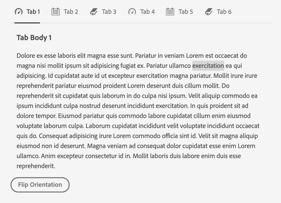
This Content w/ margin is to provided margins around the tab panel content.
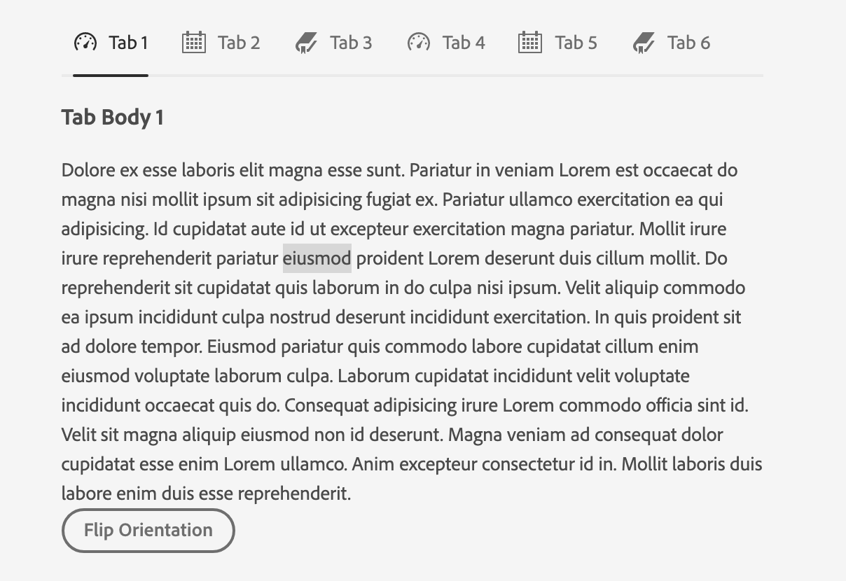
Without:

I assume the original contributer added these since it looks better, XD files don't have any examples on what the tab panel content should look like. IMO we should keep as is since it allows users to customize what the tab panel content should look like in terms of positioning relative to the tab list
| key={item.name} | ||
| textValue={item.name} | ||
| title={ | ||
| <> |
There was a problem hiding this comment.
Choose a reason for hiding this comment
The reason will be displayed to describe this comment to others. Learn more.
We should maybe consider whether we want this to be the way of adding icons to tabs or whether we want to do a semantic element/slots style API with children like we have for other components... Does seem a bit harder in this case though due to to needing to place the two parts in different elements completely.
There was a problem hiding this comment.
Choose a reason for hiding this comment
The reason will be displayed to describe this comment to others. Learn more.
yeah, a bit tricky since we need to differentiate from the Tab and the Tab's contents (tab panel stuff)
|
Build successful! 🎉 |
|
Build successful! 🎉 |
|
Please address comments from Devon in a follow PR |

Closes #1117
✅ Pull Request Checklist:
📝 Test Instructions:
🧢 Your Project: