styles(topMenu):space between .home and .hamburger#23624
styles(topMenu):space between .home and .hamburger#23624aghArdeshir wants to merge 2 commits intoangular:masterfrom aghArdeshir:patch-1
Conversation
|
You can preview b73ca91 at https://pr23624-b73ca91.ngbuilds.io/. |
 gkalpak
left a comment
gkalpak
left a comment
There was a problem hiding this comment.
Thx for working on this. It has been bothering me for a while 😁
Adding some margin would also be more consistent with the Material Design guidelines.
I believe it would be more consistent to fix it by adjusting the hamburger's margin (since that is what we use for spacing the hamburger button and the logo.
So, can you please change the following lines (instead of adding a margin to the logo):
angular/aio/src/styles/1-layouts/_top-menu.scss
Lines 2 to 3 in c5cfc3a
$hamburgerShownMargin: 0 8px 0 0;
$hamburgerHiddenMargin: 0 16px 0 -88px;
Changing the "hidden" margin to 16px, makes it more consistent with the margin on the right side of the toolbar. And making the "shown" margin 8px looked better to me (because the hamburger button itself has plenty of padding). Open to different suggestions.
|
Thank you @gkalpak 😃 But there is still one tiny thing (very trivial) that bothers me 😆
as you see the the outline is started from the very beginning of image, but at the end there is 20px margin : )))) Thank You! 👍 |
|
You can preview a4ca306 at https://pr23624-a4ca306.ngbuilds.io/. |
|
Awesome! Thx 👍 WRT the asymmetric outline: You can remove the angular/aio/src/styles/1-layouts/_top-menu.scss Lines 96 to 99 in c5cfc3a ...and apply it to angular/aio/src/styles/1-layouts/_top-menu.scss Lines 142 to 153 in c5cfc3a ...to: a.nav-link {
margin: 0;
padding: 24px 16px;
cursor: pointer;
+
+ $.home {
+ margin-right: 20px;
+ }
&:focus {
background: rgba($white, 0.15);
border-radius: 4px;
outline: none;
padding: 8px 16px;
}
}BTW, it would be great if you could follow our commit message guidelines ❤️ |
|
oops! sorry for those commit messages 😁 I did as you said! and its great right now! 😃 thanks! Thank you so much for walking me through this. I'm learning so much. +1 |
|
You can preview e8c9d1a at https://pr23624-e8c9d1a.ngbuilds.io/. |
When the `.hamburger` icon is clicked, it's background is drawn until
the very edge of `.home`'s image, leaving no space.
This makes the outline of `.home` symmetric.
|
Thank you for working on this ❤️ This should be ready to get merged now 🎉 |
|
You can preview 6789f3b at https://pr23624-6789f3b.ngbuilds.io/. |
When the `.hamburger` icon is clicked, it's background is drawn until
the very edge of `.home`'s image, leaving no space.

PR Close #23624
|
This issue has been automatically locked due to inactivity. Read more about our automatic conversation locking policy. This action has been performed automatically by a bot. |
when hamburger menu is clicked, it's ripple background is drawn until the very edge of home's image, leaving no space. this adds a tiny space there
PR Checklist
Please check if your PR fulfills the following requirements:
PR Type
What kind of change does this PR introduce?
What is the current behavior?
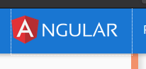
On the top header, when hamburger menu button is present, when clicked on it, a ripple background is drawn and is extended just to very edge of the main
Angularimage in home link.Issue Number: N/A
What is the new behavior?
I added a tiny space, and in my opinion it just looks nicer
Does this PR introduce a breaking change?
Other information
this is just self-opinionated. I just saw it on website and felt like there needs to be a small space there