nav responsive by default? #14969
Description
Please describe the feature you would like to request.
Make nav responsive by default (for small/mobile screens)
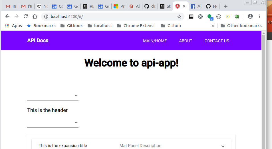
I have this in app.component.html:
<app-nav></app-nav>

<div style="text-align:center">
  <h1>
    Welcome to {{ title }}!
  </h1>
</div>


<section>
  <router-outlet></router-outlet>
</section>
and then for nav.component.html I have:
<header>
  <div class="container">
    <a routerLink="/" class="logo">API Docs</a>
    <nav>
      <ul>
        <li><a routerLink="/">Main/Home</a></li>
        <li><a routerLink="/about">About</a></li>
        <li><a routerLink="/contact">Contact us</a></li>
      </ul>
    </nav>
  </div>
</header>
but when I shrink my browser window down, medium size looks like this:
then the smallest I can make it with Chrome is like this:

as you can see the nav menu items overlap each other, is there a way to get them to use the responsibe drop-down menu style?