The best pre-built component collection for shadcn/ui developers.
250+ production-ready components, blocks, and templates — copy, paste, ship.
Website · Docs · Templates · Issues


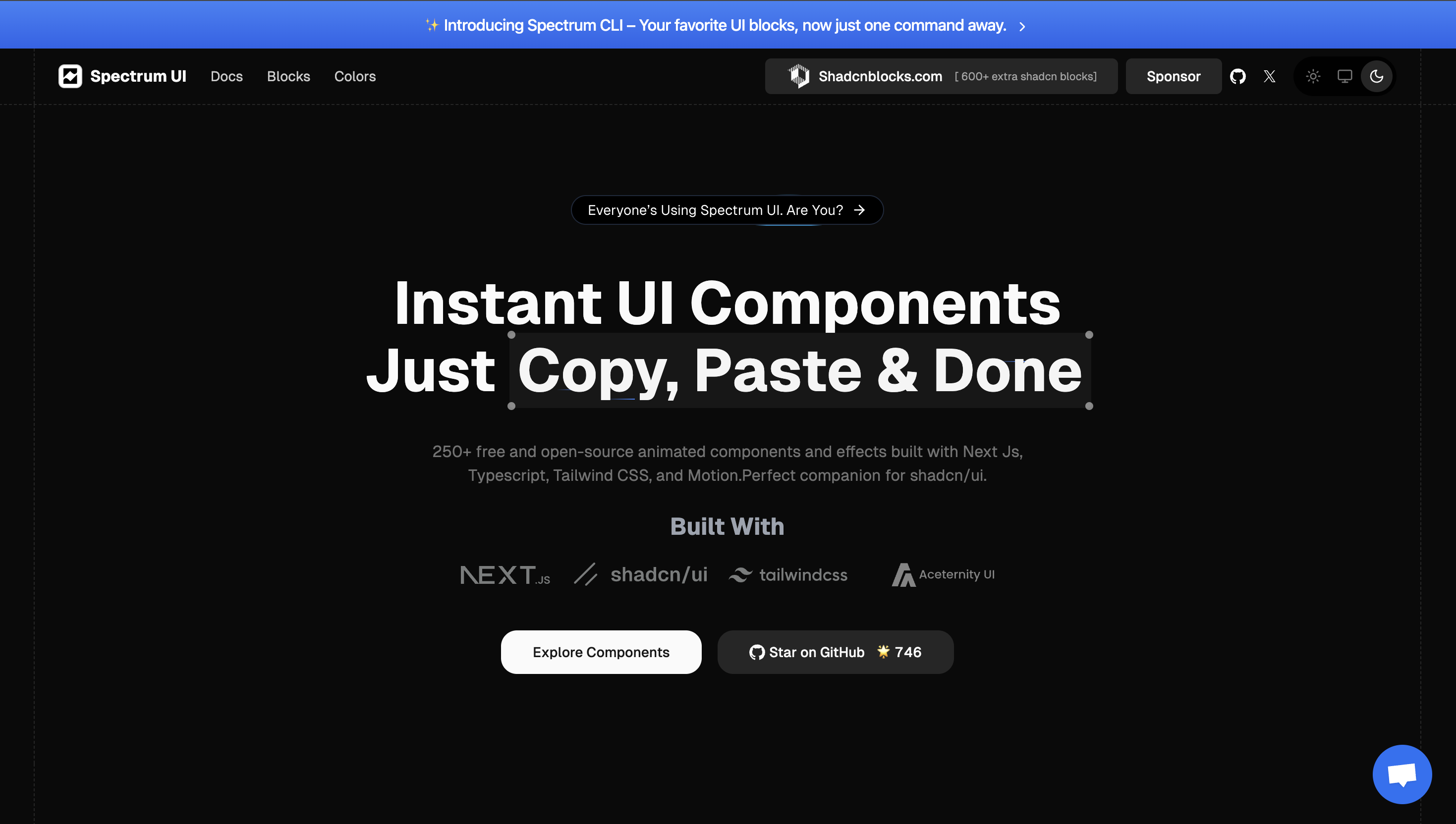
Spectrum UI is an open-source collection of 250+ production-ready components built on top of shadcn/ui and Tailwind CSS. It is not a separate library — it extends shadcn/ui with pre-designed, copy-paste-ready components, blocks, and full-page templates so you spend zero time on boilerplate UI.
Stop building buttons. Start shipping products.
- 250+ Components — Forms, cards, dashboards, marketing sections, navigation, modals, and more — all with dark mode support out of the box.
- Blocks & Sections — Pre-composed page sections (hero, pricing, FAQ, footer, CTA) ready to drop into any layout.
- Pro Templates — Full-page, production-ready templates for SaaS, landing pages, and dashboards.
- Built on shadcn/ui — Fully compatible with your existing shadcn setup. No lock-in, no new dependencies.
- Animated Components — Motion-ready components powered by Framer Motion, Three.js, and Spline.
- TypeScript-first — Every component ships with proper TypeScript types.
- Copy-paste DX — No npm install. Browse, copy, paste, done.
| Layer | Technology |
|---|---|
| Framework | Next.js 14 (App Router) |
| Styling | Tailwind CSS + custom design tokens |
| Language | TypeScript |
| UI Primitives | shadcn/ui + Radix UI |
| Animation | Framer Motion, Three.js, Spline, React Three Fiber |
| Database | Supabase (PostgreSQL) |
| Auth | NextAuth (Google + GitHub OAuth) |
| Resend | |
| Payments | Stripe, Polar, Dodo Payments |
| Analytics | PostHog |
| Cache | Upstash Redis |
| Deployment | Vercel |
| Category | Examples |
|---|---|
| Forms & Inputs | Date picker, OTP input, dual range slider, file upload |
| Cards | Stats card, pricing card, chat card, user profile card |
| Navigation | Navbar, sidebar, breadcrumbs, command menu, dock |
| Overlays | Dialog, drawer, sheet, auth gate modal |
| Data Display | Data table, charts (area, bar, line), code block |
| Marketing | Hero sections, CTA, pricing table, newsletter, FAQ |
| Magic UI | Animated shiny text, number ticker, rainbow button, border beam |
| Dashboard | Full dashboard layouts with charts, tables, and sidebars |
Prerequisites: Node.js 18+, an existing Next.js project with shadcn/ui configured.
# Clone the repo (to run docs locally or contribute)
git clone https://github.com/arihantcodes/spectrum-ui.git
cd spectrum-ui

# Install dependencies
yarn install

# Set up environment variables
cp .env.example .env.local
# Edit .env.local with your keys

# Start the dev server
yarn dev
Open http://localhost:3000.
Just want a component? Head to ui.spectrumhq.in/docs, pick a component, and copy the code directly into your project.
| Script | Description |
|---|---|
yarn dev |
Start the Next.js development server |
yarn build |
Build the production bundle |
yarn start |
Run the production build locally |
yarn lint |
Run ESLint |
yarn test |
Run Jest test suite |
Contributions are welcome — new components, bug fixes, docs, and templates.
Please read the Contributing Guide before submitting a pull request.
Quick contribution steps:
- Fork the repo
- Create a branch:
git checkout -b feat/your-component - Commit your changes
- Open a pull request
If you find a bug or want to request a component, open an issue.
Thanks to everyone who has helped build Spectrum UI.
Licensed under the Apache License 2.0.
Built with care by Arihant and the open-source community.
Website · Docs · Templates · Twitter / X