

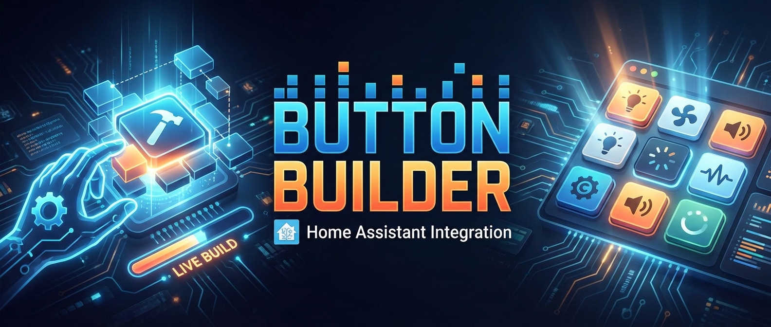
So here's the deal — I built Button Builder because I got tired of hand-writing YAML for custom:button-card. Don't get me wrong, button-card is amazing, but staring at indentation errors at 2am isn't my idea of a good time.
Button Builder gives you a visual UI for designing buttons. Pick your style, set up tap actions, choose icons, define states, tweak colors, add animations — all the fun stuff — and the app spits out the YAML for you. Copy it, paste it into your dashboard, and boom: your button looks exactly how you imagined.
Oh, and there's an AI-powered button creator too. Just describe what you want — something like "Give me a button that glows red when the garage is open and pulses blue when it's closed" — and it'll try to build that YAML for you. Sometimes it nails it. Sometimes it creates a Frankenstein monster. But honestly? That's half the fun.
- This thing is nowhere near finished. I'm sure it's carrying more bugs than a backyard garden.
- I've literally never coded a day in my life. Every single line of this project was built through back-and-forth sessions with AI tools. Yes, really.
- It takes real time (and money) to build — especially the AI features. If you end up liking the idea and want to support it, my Buy Me a Coffee is open and very much appreciated. Totally optional, of course.
- Feedback — Tell me what works and what doesn't
- Suggestions — Features you'd love to see
- Bug reports — Things will break, I promise
- Tips & tricks — I'm learning as I go
- Pull requests — Especially from actual developers who won't cry reading my AI-generated code
If you're into dashboards, custom controls, or you just like experimenting with new toys in Home Assistant, give this a shot and let me know what breaks.
Happy automating — and thanks in advance to anyone willing to play with this thing! 🚀
- 🎯 Visual Editor: Real-time preview as you configure your button cards
- 🤖 AI-Powered Design: Generate complete button configurations from natural language descriptions
- 🎨 Full Style Control: Colors, gradients, opacity, borders, shadows, glassmorphism effects
- ⚡ Animations: 10+ animation types (pulse, flash, spin, shake, bounce, etc.)
- 📐 Layout Options: Multiple layout presets for icon, name, state, and label positioning
- 📋 YAML Export: Copy generated YAML directly to your Home Assistant configuration
- 🔧 All button-card Features: Comprehensive support for custom:button-card options
- Open HACS in your Home Assistant instance
- Click on "Integrations"
- Click the "+" button
- Search for "Button Builder"
- Click "Download"
- Restart Home Assistant
- Go to Settings → Devices & Services → Add Integration → Search "Button Builder"
- The "Button Builder" panel will appear in your sidebar
- Download the latest release from the releases page
- Extract the
button_builderfolder from the archive - Copy it to your Home Assistant
custom_componentsdirectory:config/ └── custom_components/ └── button_builder/ - Restart Home Assistant
- Go to Settings → Devices & Services → Add Integration → Search "Button Builder"
- The "Button Builder" panel will appear in your sidebar
- Click "Button Builder" in your Home Assistant sidebar
- Use the left panel to configure your button:
- Set entity ID, name, icon, and label
- Choose layout and visibility options
- Customize colors, borders, shadows, and typography
- Add animations and configure tap actions
- View the live preview in the center canvas
- Copy the generated YAML from the right panel
- Paste into your Lovelace dashboard configuration
- Click the "Magic Build" button in the top right
- First time? You'll be prompted to enter your free Gemini API key:
- Click the link to Google AI Studio
- Create a free API key (takes 30 seconds)
- Paste it into the app — it's stored locally in your browser, never sent to our servers
- Describe your ideal button in plain English:
- Example: "A futuristic cyan button for a bedroom fan that glows when on"
- Example: "Glassmorphism style button for living room lights with purple accent"
- Example: "Minimal dark button for garage door with red color when open"
- Click "Generate Design"
- The AI will create a complete button configuration matching your description
- Fine-tune the design using the visual editor if needed
Note: Your API key is stored in your browser's localStorage and never leaves your device. You can manage or remove it by clicking the key icon in the Magic Builder dialog.
Important: This tool generates YAML for the custom:button-card integration. You must install button-card separately through HACS or manually.
For AI Features: The Magic Builder requires a free Gemini API key:
- Get a free API key from Google AI Studio (free tier, no credit card required)
- Enter it when prompted in the Magic Builder dialog
- Your key is stored locally in your browser — we never see it
- Colors: Background, text, icon, name, state, label colors with opacity control
- Auto Colors: Automatically inherit entity colors (lights, switches, etc.)
- Glassmorphism: Backdrop blur effects with transparency
- Shadows: Multiple shadow sizes with custom colors and opacity
- Borders: Solid, dashed, dotted, double, and groove styles
- Typography: Font size, weight, and text transform options
- Vertical (icon + name)
- Icon + Name + State
- Icon + State + Name (2nd line)
- Icon + Label
- Name + State
- And more...
Choose from 10+ animations for both the card and icon:
- Flash, Pulse, Jiggle, Marquee, Spin, Blink, Shake, Bounce, Rotate
- Trigger animations based on state (on/off) or run continuously
- Tap Action: toggle, more-info, call-service, navigate, url, none
- Hold Action: Long-press actions
- Double Tap Action: Quick double-tap actions
Prerequisites: Node.js 18+ and npm
-
Clone the repository:
git clone https://github.com/aspenrt78/button-builder.git cd button-builder -
Install dependencies:
npm install
-
Set up your Gemini API key (optional, for AI features):- Create a.env.localfile- Add:GEMINI_API_KEY=your_api_key_hereNote: API keys are now entered directly in the app UI — no environment setup needed!
-
Run the development server:
npm run dev
npm run buildThe built files will be output to custom_components/button_builder/www/
Contributions are welcome! Please feel free to submit a Pull Request.
This project is licensed under the MIT License - see the LICENSE file for details.
- Built with React, TypeScript, and Vite
- AI powered by Google Gemini
- Designed for custom:button-card by @RomRider
- Icons by Lucide
If you encounter any issues or have questions, please open an issue on GitHub.
If you find this tool useful, consider buying me a coffee! It helps keep the project maintained and motivates new features.