Add o-container__fill elements #1491
Conversation
🦋 Changeset detectedLatest commit: d562155 The changes in this PR will be included in the next version bump. This PR includes changesets to release 1 package
Not sure what this means? Click here to learn what changesets are. Click here if you're a maintainer who wants to add another changeset to this PR |
|
@tylersticka For my own understanding, these two appear the same visually to me. That is expected. Correct? 🔍 🤔 😅 🤷
|

@tylersticka Based on my understanding, your proposed solution makes sense. 😉 |
@gerardo-rodriguez So the difference is that the first card has its default padding, whereas the second card has the padding of the container. There are viewport sizes where the amount of padding will be the same, but below or above that they will differ. It's easier to see if you resize the browser and compare the way the content is behaving to what's outside of it. Toggling the Outlines plugin in the canvas toolbar can also help:
|
|
@tylersticka It is expected that there be rounded corners when the container is still touching the horizontal edges, is this correct? 🔍 👀
|

@gerardo-rodriguez So, here was my journey with this... We had a discussion very early on in this project where we decided to apply the padding to a different element than the content width, because designers didn't like setting a content width only for padding to be subtracted from it. Separately, we also embraced fluid values for certain padding on elements, so narrow screens would have minimal padding and larger screens would have larger amounts of padding. One unfortunate side effect of this, though, is that it means if you actually need a breakpoint that applies to when a padded container is narrower than the viewport, the math breaks my brain. If you add the smallest padding value to the media query, you just delay the rounded corners popping in. If you add the largest padding value, which doesn't take effect until wider viewports, then the rounded corners pop in too late. I couldn't think of a good solution that didn't involve brain-breaking math, and decided it wasn't a big deal. But that might be my cold brain talking... let me know what you think. |
Works for me, thanks, @tylersticka! |
There was a problem hiding this comment.
I wasn't able to fully wrap my head around the CSS but it LGTM. Great work, @tylersticka! 🙂
@gerardo-rodriguez Are those portions something you'd like to see more comments on? If so, can you highlight the sections that are most confusing? If you find it confusing, there's a good chance others might, too, y'know? |
|
✔️ Deploy Preview for cloudfour-patterns ready! 🔨 Explore the source changes: d562155 🔍 Inspect the deploy log: https://app.netlify.com/sites/cloudfour-patterns/deploys/6125268e15cb4c0008b8ab01 😎 Browse the preview: https://deploy-preview-1491--cloudfour-patterns.netlify.app |
@gerardo-rodriguez FYI, I was over-complicating this. Instead of doing the math, I just manually adjusted the breakpoint dimensions until the issue was resolved, and added a comment explaining why there were magic numbers in use. The latest iteration may not be pixel-perfect, but you should see a lot less dissonance between the |
 gerardo-rodriguez
left a comment
gerardo-rodriguez
left a comment
gerardo-rodriguez
left a comment
There was a problem hiding this comment.
I approve, thanks, @tylersticka! 🎉
Overview
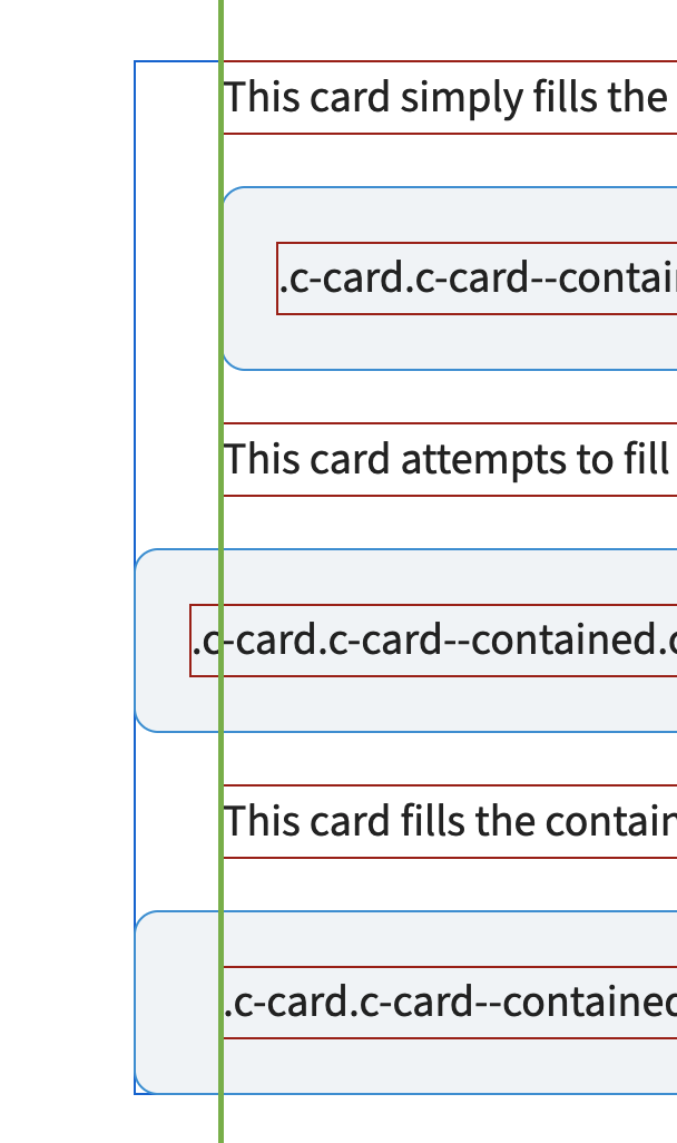
This adds two elements to
o-containerto allow child elements to fill that element's inline padding and optionally re-apply that padding. This allows certain elements to "fill" the available space while aligning with adjacent content.I was originally tackling this as a modifier to
c-card, but realized that the styles had more to do with the container object than cards, and that it might be nice to have access to this without always relying onc-card. But I'm open to feedback on that.Screenshots
Testing
On the deploy preview...
/CC @AriannaChau