[WIP] Fixes #500 #498 Uniform Button styles #506
Conversation
|
Deploy preview for donut-frontend ready! Built with commit e0542fc |
 ksraj123
changed the title
ksraj123
changed the title
| <p>By {project?.projectOwner || "CODEUINO"}</p> | ||
| <div className="view-project"> | ||
| <Button className="view-project-btn">View Project</Button> | ||
| <Btn className="view-project-btn">View Project</Btn> |
There was a problem hiding this comment.
Hey @ksraj123,
We are using react-bootstrap throughout the platform. So we should use the same for the button itself and then customize it as per our design for the whole platform not only dashboard.
There was a problem hiding this comment.
The Btn component is based on react-bootstrap Button component, Please have a look at src/common/Button.js its just a wrapper around that which makes sure the styling attributes which matter to us (i.e. fontFamily, boxShadow, borderRadius, backgroundColor and color) for maintaining uniformity in style cannot be changed through styles passed through props or external stylesheets or even bootstrap related props (variant, bsPrefix etc) . The other way to do it would be to manually change css across the project but we would have to rely on new developers to be diligent to ensure that new buttons added are styled similarly. I felt having a common component which could be used to get a button as per the style requirements of the project would be an elegant solution to this. Thanks. Would love to know what you think.
And as I mentioned in the body of my PR, I have done this only for the dashboard now to get feedback on if this is the design that's wanted. If so would do it in the entire project. Please go through the PR body. Thanks.
There was a problem hiding this comment.
yeah, I appreciate the way you have written the code as it's flexible and can be used anywhere.
But as the classes are already defined there, so you can simply modify there, because component style will overwrite that.
There was a problem hiding this comment.
Also this PR is changing all the button to rectangular shape, but that's not expected, like look at the tags of notification it should not be rectangular. Also that tabs in dashboard
There was a problem hiding this comment.
Also this PR is changing all the button to rectangular shape, but that's not expected, like look at the tags of notification it should not be rectangular. Also that tabs in dashboard
@Rupeshiya Thank you for the review and suggestions,
Restored changes made to tags and section buttons, also aligned things a little, please see if it looks good now.
But as the classes are already defined there, so you can simply modify there, because component style will overwrite that.
Also, about the Btn component should I scrap that and just modify styles everywhere? Thanks.
| .tag-btn { | ||
| background: #1a73e8; | ||
| border-radius: 15px; | ||
| font-family: Inter; |
There was a problem hiding this comment.
also, we are having font-family Inter for almost all the texts we are using on donut.
There was a problem hiding this comment.
Its been removed because that CSS code is redundant now. Our Btn comoponet will always have the following styles
        fontFamily: 'Inter',
        boxShadow: 'none',
        borderRadius: '0.25rem',
        fontStyle: 'normal'
        backgroundColor = '#1A73E8';
        color = '#ffffff';
the backgroundColor and color would interchange if outline btnType is selected.
Please go though declaration of the component in src/common/Button.js.
Thanks.
|
Since this is done using redux , node.js |
| display: flex; | ||
| align-items: center; | ||
| } | ||
| } |
|
Being fixed in #515 |
4 participants
fixes #500 and #498
A new component is introduced in the common directory which is a wrapper around react-bootstrap primary Button and can accept all the props as bootstrap Button but remains its concerned style properties remain unaffected to styles introduced via style prop or style sheets (except when !important). CSS code made redundant due to this is removed. In few places where introducing this component might break the app, simply styles has been changed.
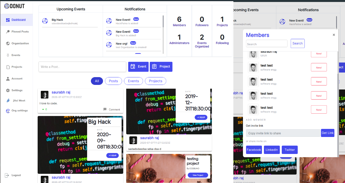
Is the styling as per what is wanted? only done the dashboard page, will do the rest if its alright.
Please share feedback and suggestions.