-
|
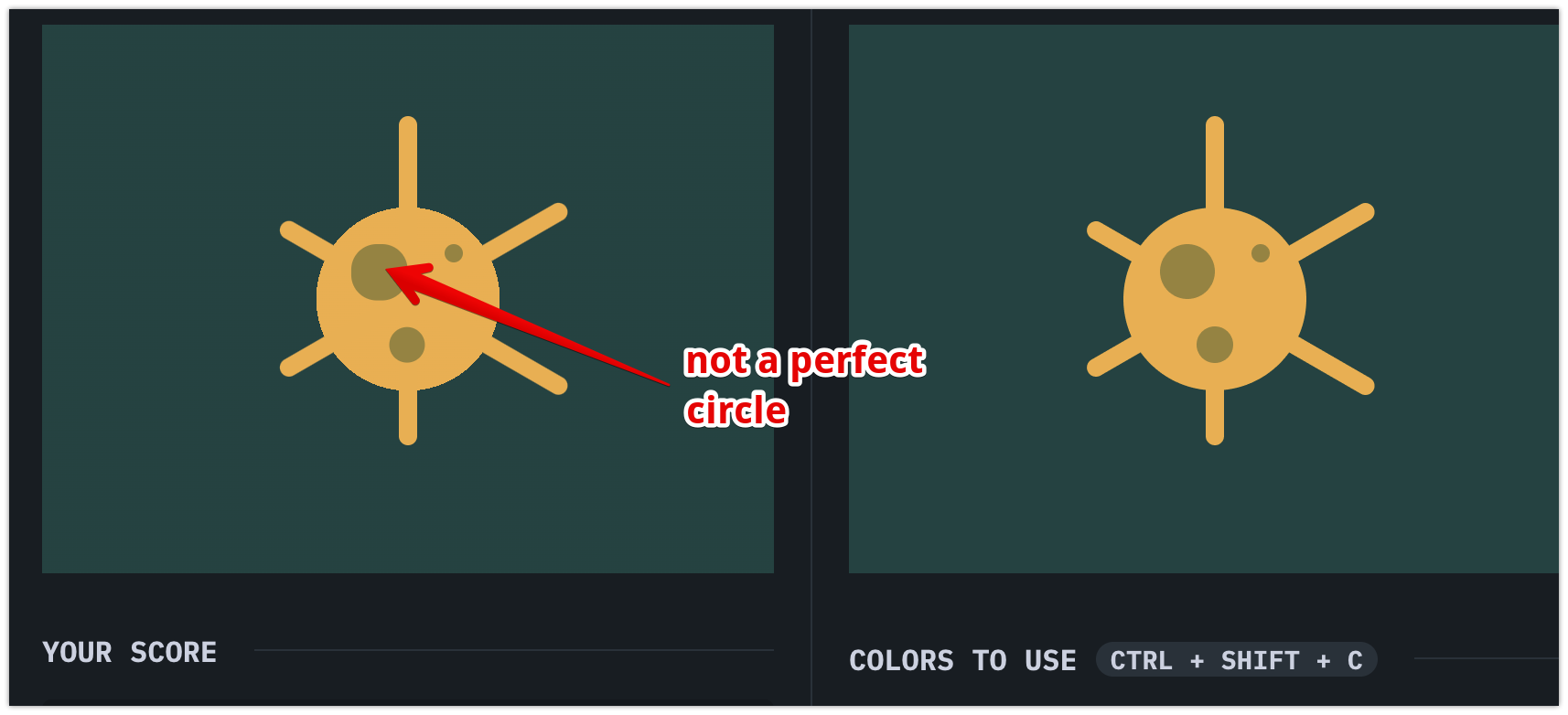
Since Chromium 104 backend update has been implemented, I went and saved a few chars through all my solutions which involved <p><p a><p b><p c><style>*{background:radial-gradient(circle,#F3AC3C 21%,#1A4341 1q)}p{position:fixed;width:10;height:180;top:34;left:195;background:#F3AC3C;border-radius:11q}[a],[b]{transform-origin:50% 55.5%;rotate:120deg}[b]{rotate:60deg}[c]{height:10;top:104;left:220;background:#998235;color:998235;box-shadow:-43q 11q 0 11q,-27q 53q 0 5qI've tried pretty much anything (from repositioning the circles to using different units), and also used the other previewer for more accuracy, but no luck. I'm opened to any suggestion, just want to save those 22 chars. 😄 |
Beta Was this translation helpful? Give feedback.
Replies: 1 comment
-
|
Its most probably because of the border-radius change that landed in chromium browsers recently |
Beta Was this translation helpful? Give feedback.
Its most probably because of the border-radius change that landed in chromium browsers recently