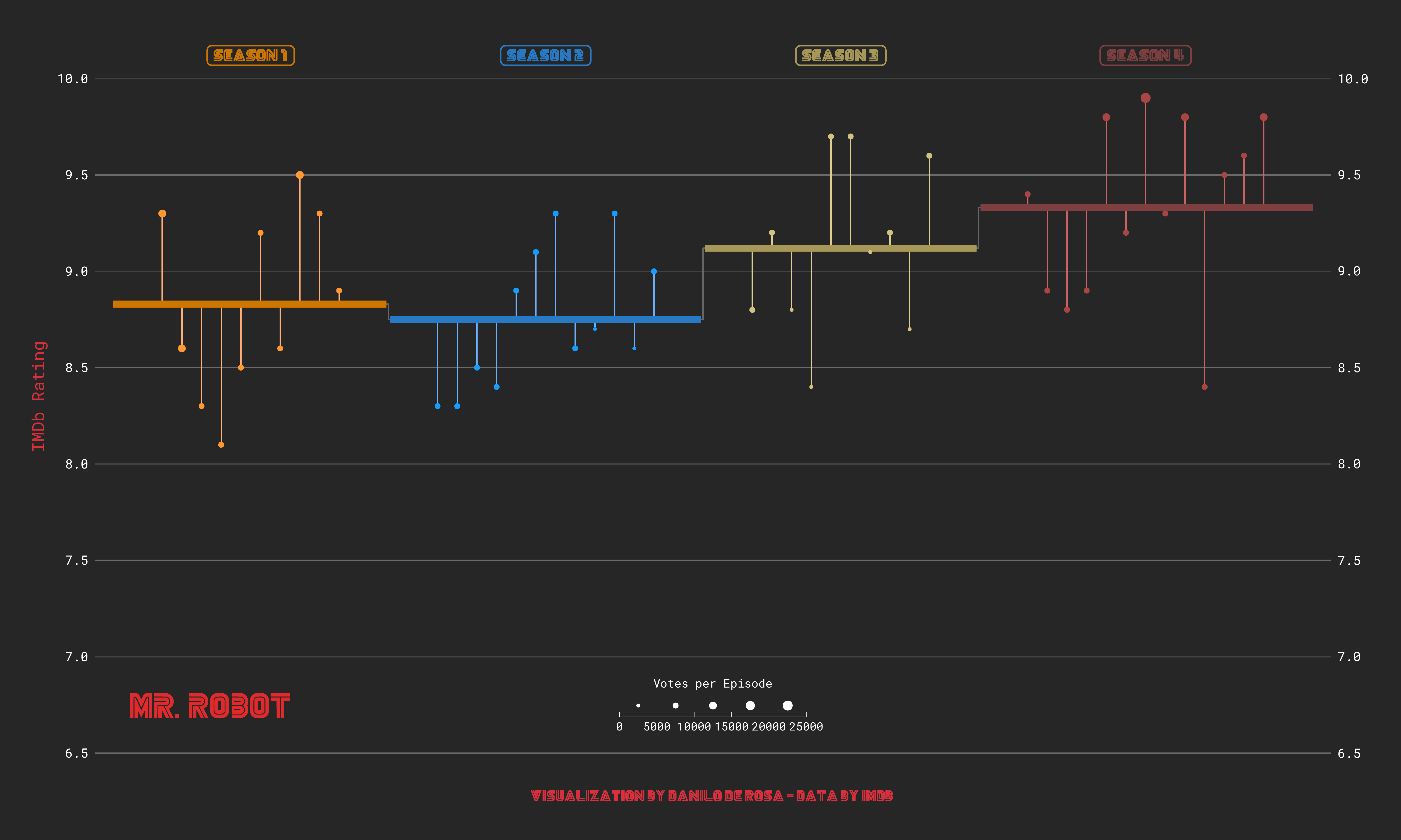
This is a chart heavily inspired by the beautiful plot made by Cédric Sherer about The Office (he made it for #TidyTuesday week 2020/12). You can see Cedric's plot here: highly recommended!
Feedback is very welcome via mail or Twitter.
The code is available here. It's entirely made with R and ggplot2: not a single touch on Adobe Illustrator :)