A Flutter package providing multiple Material Design and Cupertino (iOS) dialogs with easy-to-use APIs, including loading dialogs, alert dialogs, list dialogs, action sheets, and customizable dialogs.

- 🎨 Multiple Material Design dialog types
- 🍎 Full Cupertino (iOS) dialog support
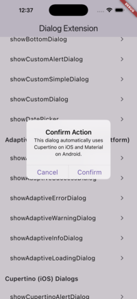
- 🔄 Adaptive dialogs - Automatically use Cupertino on iOS and Material on Android
- ⚡ Easy-to-use APIs similar to Flutter's built-in dialogs
- 🔧 Highly customizable
- 📱 Null-safety support
- 🎯 Modern Flutter widgets (ElevatedButton, TextButton, CupertinoButton)
- 🚀 Compatible with Flutter 3.x
- 🎭 Material 3 adaptive styling support
Automatically adapt to the platform (iOS → Cupertino, Android → Material)
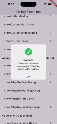
Adaptive Success |
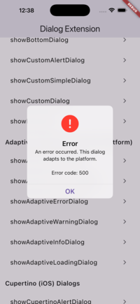
Adaptive Error |
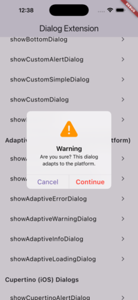
Adaptive Warning |
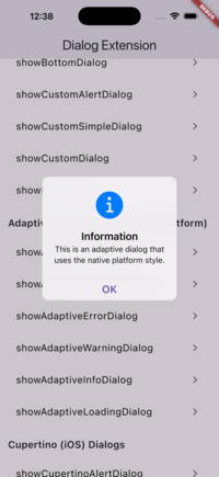
Adaptive Info |
Adaptive Alert |
Pre-configured dialogs for common use cases (Success, Error, Warning, Info)
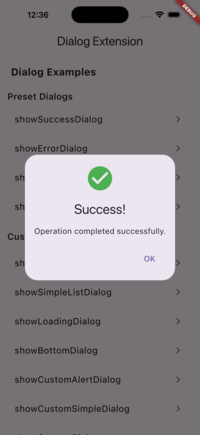
Success Dialog |
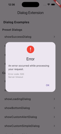
Error Dialog |
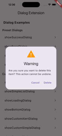
Warning Dialog |
Info Dialog |
Add this to your package's pubspec.yaml file:
dependencies:
  flutter_multi_dialogs: ^0.2.0
Then import it in your Dart code:
import 'package:flutter_multi_dialogs/flutter_multi_dialogs.dart';The adaptive dialogs automatically use Cupertino on iOS and Material on Android, giving you native look and feel on each platform with a single API.
showAdaptiveSuccessDialog(
  context: context,
  title: 'Success!',
  message: 'Operation completed successfully.',
  onConfirm: () => Navigator.pop(context),
);showAdaptiveErrorDialog(
context: context,
title: 'Error',
message: 'An error occurred.',
onConfirm: () => Navigator.pop(context),
);showAdaptiveAlertDialog(
context: context,
title: 'Confirm',
content: 'Are you sure?',
actions: [
TextButton(
onPressed: () => Navigator.pop(context),
child: const Text('OK'),
),
],
);showSuccessDialog(
context: context,
title: 'Success!',
message: 'Operation completed successfully.',
onConfirm: () => Navigator.pop(context),
);showErrorDialog(
context: context,
title: 'Error',
message: 'An error occurred while processing your request.',
error: 'Error code: 500', // Optional error details
onConfirm: () => Navigator.pop(context),
);showWarningDialog(
context: context,
title: 'Warning',
message: 'Are you sure you want to continue?',
confirmText: 'Continue',
cancelText: 'Cancel',
onConfirm: () {
Navigator.pop(context);
// Proceed with action
},
onCancel: () => Navigator.pop(context),
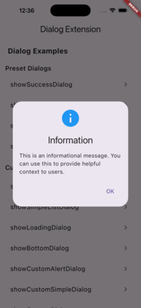
);showInfoDialog(
context: context,
title: 'Information',
message: 'This is an informational message.',
onConfirm: () => Navigator.pop(context),
);Display a loading dialog with customizable orientation and message:
ElevatedButton(
  style: ElevatedButton.styleFrom(
    elevation: 10,
  ),
  child: const Text("Show Loading Dialog"),
  onPressed: () {
    showLoadingDialog(
      context: context,
      direction: Direction(
        message: "Loading...",
        messageStyle: const TextStyle(fontSize: 16),
        orientations: Orientations.Horizontal,
        width: 120,
        height: 120,
      ),
    );
  },
),Extended AlertDialog with more customization options:
ElevatedButton(
  style: ElevatedButton.styleFrom(
    elevation: 10,
  ),
  child: const Text("Show Alert Dialog"),
  onPressed: () {
    showAlertDialog(
      context: context,
      title: const Text("Title"),
      content: const Text("This is the content"),
      semanticLabel: "AlertDialog Extension",
      actions: <Widget>[
        TextButton(
          child: const Text("Confirm"),
          onPressed: () {
            Navigator.of(context).pop();
          },
        ),
        TextButton(
          child: const Text("Cancel"),
          onPressed: () {
            Navigator.of(context).pop();
          },
        ),
      ],
    );
  },
),Display a dialog from the bottom of the screen (see example folder for implementation):
ElevatedButton(
  style: ElevatedButton.styleFrom(
    elevation: 10,
  ),
  child: const Text("Show Bottom Dialog"),
  onPressed: () {
    showBottomDialog(
      context: context,
      title: const Text("Title"),
      content: Container(child: const Text("Content")),
      isScrollControlled: true,
      backgroundColor: Colors.deepOrange,
      actions: <Widget>[
        TextButton(
          child: const Text("Confirm"),
          onPressed: () {
            Navigator.pop(context);
          },
        ),
        TextButton(
          child: const Text("Cancel"),
          onPressed: () {
            Navigator.pop(context);
          },
        ),
      ],
    );
  },
),Create a custom alert dialog with a builder pattern:
ElevatedButton(
  style: ElevatedButton.styleFrom(
    elevation: 10,
  ),
  child: const Text("Show Custom Alert Dialog"),
  onPressed: () {
    showCustomAlertDialog(
      context: context,
      dialogBuilder: DialogBuilder(
        simpleBuilder: SimpleBuilder(
          title: const Text("Title"),
          content: SingleChildScrollView(
            child: ListBody(
              children: <Widget>[
                for (var item in items)
                  InkWell(
                    child: Text(item),
                    onTap: () {
                      debugPrint('Tapped item: $item');
                    },
                  ),
              ],
            ),
          ),
        ),
      ),
      confirmWidget: const Text("Confirm"),
      cancelWidget: const Text("Cancel"),
      onConfirmCallBack: () {
        Navigator.pop(context);
      },
      onCancelCallBack: () {
        Navigator.pop(context);
      },
    );
  },
),Display a simple dialog with custom children:
ElevatedButton(
  style: ElevatedButton.styleFrom(
    elevation: 10,
  ),
  child: const Text("Show Custom Simple Dialog"),
  onPressed: () {
    showCustomSimpleDialog(
      context: context,
      simpleBuilder: const SimpleBuilder(),
      children: <Widget>[
        const Text("Custom SimpleDialog"),
      ],
    );
  },
),Display a list dialog with item callbacks:
ElevatedButton(
  style: ElevatedButton.styleFrom(
    elevation: 10,
  ),
  child: const Text("Show Simple List Dialog"),
  onPressed: () {
    showSimpleListDialog(
      context: context,
      simpleBuilder: const SimpleBuilder(),
      children: <Widget>[
        for (var item in items) Text(item),
      ],
      onItemCallBack: (index) {
        debugPrint('Selected item: ${items[index]}');
      },
    );
  },
),Create a fully customizable dialog with gravity control:
ElevatedButton(
  style: ElevatedButton.styleFrom(
    elevation: 10,
  ),
  child: const Text("Show Custom Dialog"),
  onPressed: () {
    showCustomDialog(
      context: context,
      gravity: 0, // -1 (top) to 1 (bottom), 0 is center
      child: const Text("Custom Dialog"),
    );
  },
),
Note: The gravity parameter controls the vertical position from -1 (top) to 1 (bottom), with 0 being the center.
Display an iOS-style alert dialog:
showCupertinoAlertDialog(
  context: context,
  title: 'Confirm Action',
  content: 'Are you sure you want to proceed?',
  actions: [
    CupertinoDialogAction(
      onPressed: () => Navigator.pop(context),
      child: const Text('Cancel'),
    ),
    CupertinoDialogAction(
      isDefaultAction: true,
      onPressed: () => Navigator.pop(context),
      child: const Text('Confirm'),
    ),
  ],
);Display an iOS-style action sheet (slides up from bottom):
showCupertinoActionSheet(
  context: context,
  title: 'Choose an Option',
  message: 'Select one of the following options',
  actions: [
    CupertinoActionSheetAction(
      onPressed: () {
        Navigator.pop(context);
        // Handle action
      },
      child: const Text('Option 1'),
    ),
    CupertinoActionSheetAction(
      onPressed: () {
        Navigator.pop(context);
        // Handle action
      },
      child: const Text('Option 2'),
    ),
  ],
  cancelButton: CupertinoActionSheetAction(
    onPressed: () => Navigator.pop(context),
    child: const Text('Cancel'),
  ),
);Display an iOS-style loading dialog:
showCupertinoLoadingDialog(
  context: context,
  direction: const Direction(
    message: 'Loading...',
    orientations: Orientations.Horizontal,
  ),
);showCupertinoSuccessDialog(
context: context,
title: 'Success!',
message: 'Operation completed successfully.',
onConfirm: () => Navigator.pop(context),
);showCupertinoErrorDialog(
context: context,
title: 'Error',
message: 'An error occurred.',
error: 'Error code: 500', // Optional
onConfirm: () => Navigator.pop(context),
);showCupertinoWarningDialog(
context: context,
title: 'Warning',
message: 'Are you sure you want to continue?',
confirmText: 'Continue',
cancelText: 'Cancel',
onConfirm: () {
Navigator.pop(context);
// Proceed with action
},
onCancel: () => Navigator.pop(context),
);showCupertinoInfoDialog(
context: context,
title: 'Information',
message: 'This is an informational message.',
onConfirm: () => Navigator.pop(context),
);showSuccessDialog()- Display a success dialog with check iconshowErrorDialog()- Display an error dialog with error iconshowWarningDialog()- Display a warning dialog with warning iconshowInfoDialog()- Display an info dialog with info icon
showLoadingDialog()- Display a loading dialogshowAlertDialog()- Display an extended alert dialogshowIconAlertDialog()- Display an alert dialog with iconshowCustomAlertDialog()- Display a custom alert dialog with buildershowCustomSimpleDialog()- Display a custom simple dialogshowSimpleListDialog()- Display a list dialog with callbacksshowCustomDialog()- Display a fully customizable dialog
LoadingDialog- Loading dialog widgetCustomDialog- Customizable dialog widgetCustomAlertDialog- Custom alert dialog widgetCustomSimpleDialog- Custom simple dialog widgetSimpleListDialog- List dialog widgetDirection- Configuration for loading dialog orientationDialogBuilder- Builder for custom alert dialogsSimpleBuilder- Builder for simple dialogs
If you want to customize the dialogs further, you can override showCustomDialog or showCustomAlertDialog to create your own implementations.
- Flutter SDK: >=2.17.0 <4.0.0
- Dart: >=2.17.0 <4.0.0
Contributions are welcome! If you have suggestions or find issues, please feel free to open an issue or submit a pull request.
Copyright 2025 EmD-228
Licensed under the Apache License, Version 2.0 (the "License"); you may not use this file except in compliance with the License. You may obtain a copy of the License at
http://www.apache.org/licenses/LICENSE-2.0
Unless required by applicable law or agreed to in writing, software distributed under the License is distributed on an "AS IS" BASIS, WITHOUT WARRANTIES OR CONDITIONS OF ANY KIND, either express or implied. See the License for the specific language governing permissions and limitations under the License.