-
Notifications
You must be signed in to change notification settings - Fork 1.2k
Homepage UI refactoring #351
New issue
Have a question about this project? Sign up for a free GitHub account to open an issue and contact its maintainers and the community.
By clicking “Sign up for GitHub”, you agree to our terms of service and privacy statement. We’ll occasionally send you account related emails.
Already on GitHub? Sign in to your account
Conversation
a69588a to
7c6019a
Compare
There was a problem hiding this comment.
Choose a reason for hiding this comment
The reason will be displayed to describe this comment to others. Learn more.
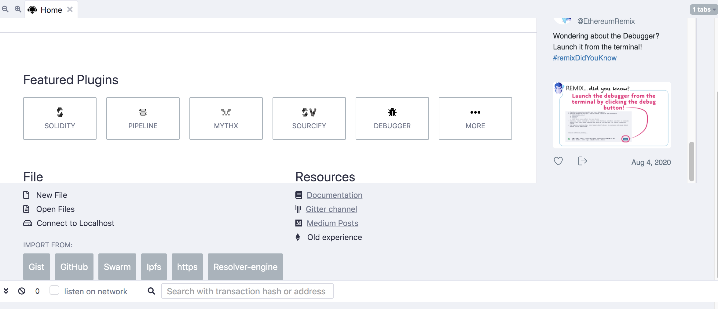
This review won't solve the problems I have with this PR -but it will point out my issues with it. In general, I find that this iteration of the homepage is too noisy. Part of the noise is that there are many graphic styles on the page with the twitter column and the rest of the page. But here is list of concerns. I'll try to develop some solutions in the next comment.
- The former jumbotron:
-
Sleeping Remi is taking up too much room and it is not clear what she has to do with the site - no matter how cute or comforting she appears to be. Currently she is 150px high - she should at least be smaller.
-
Where the learn more button had been there is nothing - but it is valuable real estate - especially with Remi on the left side.
- The remixIDE_TwitterBlock
-
Its very noisy with lots of links and you have to read pretty carefully to understand which link you are clicking on. I'm not convinced that we need twitter here or so many - maybe just last tweet will be enough. And people can go to twitter if they want to see more from us.
-
There is no scroll bar. Of course a lot of this review is saying that that the homepage is too noisy - but I'd sort of like a scroll bar here - but uhhh it would be ugly or at would add noise to the page - but I'm not comfortable that it is missing.
-
What happened to Environments? Are we loading Solidity Env by default and forgetting about the Vyper env for now?
-
The File & Resources section
-
I'm not sure that the icons are adding much. The only one that does help me is the link to the Old Experience with the Ethereum logo. These logos don't bother me that much- just we need to balance what the user should focus on - and if the page is too noisy - it will be hard to focus on anything - but maybe they should stay.
-
I don't see a link to https://remix-project.org/ - oh yes - having reread above - I see this will happen...
-
The Sourcify Logo is not the one that is used with the Sourcify plugin.
-
Maybe we should have a link for https://twitter.com/hashtag/remixDidYouKnow?src=hashtag_click
I'll develop some ideas for the top right of the page.
we should fix Sourcify icon in general, I agree that is is noisier now, i tried to remove some not necessary stuff but if we put Titter and Medium there is not much we can do. |
|
If we have a button on the jumbotron for New Features -it could point to a page on our site (remix-project.org) that is essentially a blog of new features. So when we make some new features we make a new blog post that shows what the new features are. And when the next set of new features comes along, placed above the previous new features post. |
|
how you did this? I can't reproduce your screenshot |

fix #54
fix #73
#196 the link should be added after website update #358