Now, it's time to practice your understanding of CSS Grid by using it on couple sections of a web page.
Clone the practice from the starter.
Once you've in VS Code, you can drag the index.html file into your browser to view the webpage, or use the File Explorer to open it in your browser. The only file you will need to edit for this practice is main.css.
Remember to save the CSS file and refresh the page in the browser whenever you make changes.
The web page has been created for you with HTML and some CSS already in place. You only need to add the Grid Container and Grid Item styles to match the provided specifications in each phase.
You may use the MDN CSS grid documentation or CSS-TRICKS Guide to Grid reference as you complete these tasks. Additionally, similar examples are covered in the readings, so you may also refer to them as you see fit.
To begin any grid layout you need at least three properties on the Grid
Container. In main.css, find the the .grid-container class selector,
and add styles with appropriate values per these requirements.
- Display a grid that fills the full width of the page
- In the grid, template three columns:
- First column uses 3 fractions of the available width
- Middle column matches the width of the content
- Third column uses 1 fraction of the available width
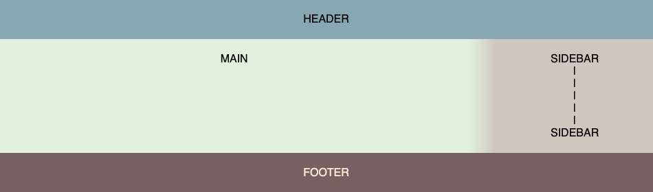
- For the grid, specify these template areas:
- First row is the
header(across all 3 columns) - Second row has
mainon the left andsidebaron the right (with an empty cell between) - Third row is the
footer(across all 3 columns)
- First row is the
Next, you need to configure the Grid Items to connect the class for each
div to its associated grid-area from the template. Look at the index.html
to figure out which class names are the header, main, sidebar and
footer. Then find those class selectors in main.css and the necessary
style to each.
When you get it right, it will look like this.
Begin by identifying the CSS Selector for the second grid area (under the "Grid Flow" heading), and find it in the main.css file.
Add a style, so it displays:
- As a grid (rather than a block where every item is displayed on a new line)
- Automatically sizes to the width of it's content (so other content could appear in the same line with it).
Next, figure out how many columns you'll need if you want to have exactly 3 rows of numbers. Add the appropriate styles to configure the grid's template with that number of columns that each have a width of 100 pixels, and three rows with a height of 50 pixels.
Next, set grid's automatic flow direction, so the numbers fill in going down
each column first, before going across the rows.
Finally, use the Grid Container to align / justify the items as centered in their cell area (both horizontally and vertically).
Here is a screenshot of the desired result.

The designer has requested some white space between the rows in the layout grid you set up in Phase 1. Specifically, 15 pixels. Please add the appropriate style to the CSS class selector for the Grid Container under the "Grid Layout" heading.
Hint: Be careful not to add any gap between the columns else the gradient divider will no longer seamlessly connect the MAIN area to the SIDEBAR.
Speaking of the divider, the designer has also requested that it be a bit larger to make the transition look smoother. Specifically, 100 pixels.
Hint: There is padding applied to all divs (see top of CSS file), so you may need to modify how the box sizing handles the width change.
Here is a mockup of the expected result once both changes have been made.

You practiced
- Creating a Grid Container with
displayofgridinline-grid
- Applying templates to the Grid Container and Grid Items
grid-template-columnsgrid-template-rowsgrid-template-area(on container)grid-area(on items)
- Setting widths using fractions (
fr),auto, andrepeat() - Using CSS Grid styles to adjust the grid behavior
grid-auto-flowalign-itemsjustify-itemsgrid-gap