Added frontend UI for Hover and Go To Definition#221
Added frontend UI for Hover and Go To Definition#221nangtrongvuon wants to merge 29 commits intoxi-editor:masterfrom
Conversation
This will make the hover not behave erratically when moving small distances and prevent cases where
the hover is shown at the last mouse moved location instead.
- The commit fixes the issue where hover views would be sized to their
previous result. Now the hover view is sized snugly to its content.
- This commit also reverts HoverViewController being repurposed to accomodate definition
support. Definition view will be managed in a different view
controller in another commit.
The definition view now highlight rows on hover, much like XCode's own
definition view.
The hover effect now looks similar to XCode's own definition hover - it takes the user's alternate highlight color.
dd4c2ce to
0bac8eb
Compare
|
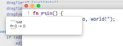
What's going on with the ^ in the definition screenshots? |
|
It's just part of the popover, the arrow's origin is where the cursor was. MacOS's screenshot doesn't capture the cursor, so it's not very clear. |
|
I mean the border looks weird in the screenshots. Like the draw order is wrong? It looks right in the hover screenshot. |
|
Oh and please align the point of the ^ with the baseline of the text if possible, instead of centering it on the line. That way it's still clear what it points to but it doesn't obscure the word needlessly. EDIT: just noticed you said it's positioned on the cursor. I'd still move it to the baseline of the line the cursor is on. |
|
The border seems to be a screenshot thing where the popover shadow doesn’t get rendered. I might take other screenshots that aren’t window shots. Gotcha on the line thing. |
|
Very cool that this is working! I noticed that the hover view seems to clip the definition if the definition is too long. We should probably either resize the view in this case, or maybe allow scrolling? What do you think? |
|
Also I see what I think @jansol was pointing out, which is that in the |
|
I’ll have to check again, but I don’t think it looks like that normally? I took the screenshot as a window specific screenshot, so maybe that could be why. |
|
I was testing manually when I saw this. |
|
Got it, I’ll check that too. |
0e9c19e to
9ed92bb
Compare
This commit also does a little refactoring - namely, methods related to
HoverViewController and DefinitionViewController are now an extension for EditViewController.
9ed92bb to
357172a
Compare
|
Both of the aforementioned issues were fixed. You can see how the popover views look like now here.
|
501937f to
f17560f
Compare
f17560f to
64dfd55
Compare
This also fixes the jarring resize that happens when scrolling stops.
Many repetitive names that references hover or definition have been renamed, as having "hover" or "definition" seemed redundant if they are coming from their respective view controllers.
|
I'll close this PR, since this work will be split in two parts - Hover and Definition. |
This PR adds frontend UI for hover and goto definition, both of which are LSP features implemented in xi-editor #717.
Currently, the UI elements are styled similar to XCode's way of showing quick help and definition.
To use Hover, Option+Click on the symbol desired, or move the mouse to the symbol while holding Option. To use Definition, Control+Click on the symbol desired.
Some screenshots of these elements can be found below:
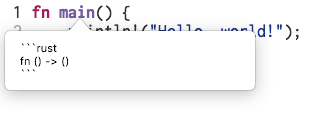
Hover
The hover screen does not use markdown yet. I still feel this is open to discussion.
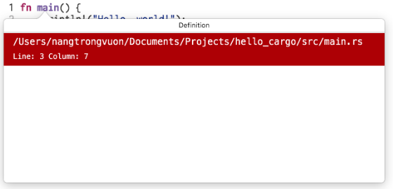
Definition
Definition is styled to be very similar to XCode's own definition view. Rows are highlighted on mouse hover, although the actual goto command is not implemented yet.
Feedback
@raphlinus @cmyr @betterclever @scholtzan @jansol
There is still a bit of work to do - such as cleaning up code here and there, or more documentation in general, though I think it is ready for some preliminary feedback.
Feedback, especially on how the elements should look, is very much appreciated. My personal opinion is the hover view could use a little more work to make it look nicer, and a Markdown library could be put in Xi, although I don't know how that will work, considering Xi's status as an open source Google project. That being said, I'm open to any and all suggestions.