Skip to content

Conversation

@oredavids
Copy link
Contributor

@oredavids oredavids commented Jul 14, 2020

  • Updates partner logos on the homepage WWW-90

Screen Shot 2020-07-16 at 9 31 15 PM

Screen Shot 2020-07-20 at 11 45 27 AM

@netlify
Copy link

netlify bot commented Jul 14, 2020

Deploy preview for keen-clarke-470db9 ready!

Built with commit 2375e3c

https://deploy-preview-338--keen-clarke-470db9.netlify.app

@josh-padnick
Copy link
Contributor

Thanks, Ore! There are a few open items I see:

  1. These logos should all be about the same width/height vs. completely different sizes:

image

In this case, you might consider using the vertical HashiCorp logo:

image

  1. The logos should all be a solid white color, versus colored. The colors are pretty distracting against the blue.

  2. The CIS logo is not proportional, however, see Change package styling #4 for a proposal on what to change here.

  3. Seeing this live, I think it'd be more meaningful to have the following logos in the following order:

  • AWS
  • GCP
  • Kubernetes
  • Terraform

We can remove CIS since it doesn't really fit with the others. And we focus more on Terraform than on HashiCorp in general.

I realize there's some graphic design work here. If this is time-consuming, we could consider assigning this one to Altalogy, or you could invest in learning some graphic design. Your call.

@brikis98
Copy link
Member

Seeing this live, I think it'd be more meaningful to have the following logos in the following order:

  • AWS
  • GCP
  • Kubernetes
  • Terraform

We can remove CIS since it doesn't really fit with the others. And we focus more on Terraform than on HashiCorp in general.

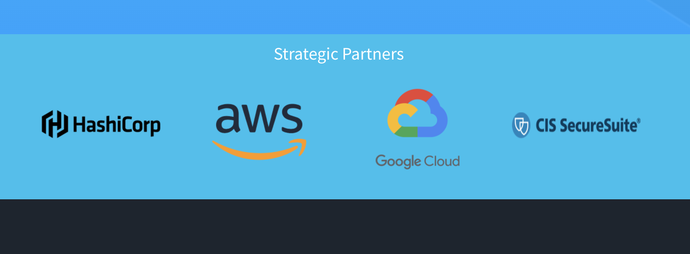
Agreed with all of this, but I think CIS could be quite valuable to have here. E.g., When you go look at websites for a product, don't well-known security standards (e.g., PCI, HIPAA, etc) make you trust the solution more?

@oredavids
Copy link
Contributor Author

I would like to take the time to pick up the design skills to get the logos as desired but the initial task was estimated as a trivial .5 task of placing already sourced logos hence I have the implementation of the Cognito module on my plate for this week which is a blocker for getting Portal Auth done.

@josh-padnick would Altalogy drop whatever they are working on right now to do this right away or add it to a backlog? Because I assume this is a priority.

@eak12913 thoughts?

Going to do a quick spike to see how much time this would take me to implement.

@oredavids
Copy link
Contributor Author

Update:
I'll get this done. I downloaded Photoshop and should be able to sort this out.

@josh-padnick
Copy link
Contributor

Thanks, Ore. FWIW, I use Pixelmator to apply a fill to the whole image to achieve this effect and it works pretty well.

Based on Jim's comment, let's add in CIS, though we'll have to see how it works to fit in so many logos at once.

Re: priority, the fact that this PR is public is evidence enough that we're taking this seriously IMO. If you have a lot on your plate and we need to delay by a few days by pushing to Altalogy that's ok with me.

@oredavids
Copy link
Contributor Author

This is ready for another review.

@tsmit291
Copy link
Contributor

Just a note from Platform sync- can we align the edge of the first logo (aws) with the 'get demo' button?

@josh-padnick
Copy link
Contributor

This is looking good, Ore! Some nitpicky final changes:

  • Can you increase the Terraform logo height (and proportionately the width) so that the bottom of the T and the top of the T matches the bottom and top of the K8s logo?
  • The CIS logo looks pretty good, but I think too small tweaks would make it look more consistent with the rest of the site:
    1. Set the border-width to 1px so it stands out less.
    2. Set the border-radius to 4px.

Otherwise, ready to launch!

@oredavids
Copy link
Contributor Author

@josh-padnick done.

@josh-padnick
Copy link
Contributor

Nice, but I'm actually finding a couple other issues. Sorry to drag it out:

  1. I'd argue the box-shadow on the border is inconsistent with the other logos and creates a 3D effect where everything else here is 2D. Therefore, we should remove the box-shadow.

  2. The Terraform and CIS images looks good zoomed in, but the other images are blurry. You can solve this by either (a) finding higher-res original images, (b) making sure that you export a larger PNG that you are then using the HTML code to reduce in size, or (c) experimentally converting the PNGs to SVG files so that they are rendered by the browser and there's zero loss. We seem to have a history of using blurry images, so perhaps we can figure out some kind of standard protocol for making sure the images aren't blurry.

  3. On the iPad Pro, the logos are spaced too tightly together. Can you increase the space between the logos to take up more space on the right?

  4. On mobile, rather than a vertical stack of the logos, you can make better use of the available space by having two columns of logos with the CIS logo on the bottom.

@oredavids oredavids force-pushed the task/update-partner-logos branch from 1e09a5e to f7740a4 Compare July 17, 2020 03:31
@oredavids
Copy link
Contributor Author

@josh-padnick I've implemented your suggestions for 1, 2 & 4.
For 3

On the iPad Pro, the logos are spaced too tightly together. Can you increase the space between the logos to take up more space on the right?

Doing this would result in losing the alignment on the right with the other images further down on the page. Is that Ok?

Also, in the mobile view; would you want to place the "Get Demo" button above centrally to align with the logos?

@josh-padnick
Copy link
Contributor

Doing this would result in losing the alignment on the right with the other images further down on the page. Is that Ok?

That's a good question. My take on this is that we have an invisible line on the left side where things are aligned, but not on the right. For spacing on IPad, feel free to use your judgment on what looks best. Either way should be fine.

Also, in the mobile view; would you want to place the "Get Demo" button above centrally to align with the logos?

Good pickup! I actually realize now that everything is left-aligned except those logos, which we've now centered. Nothing obvious occurs to me here, but one thought is that you could left-align the top 4 logos on one row and on the next row either left-align or center the CIS logo. Not sure here.

@oredavids
Copy link
Contributor Author

@josh-padnick I've adjusted the display on the iPad.

I think we should leave the 2 columns arrangement on the smaller devices as it is for now. Placing all 4 logos on one row doesn't scale well as the device screen gets smaller. I didn't get a better feel by making the logos smaller too.

If you are ok with that; I need the approval to get this merged.

@josh-padnick
Copy link
Contributor

Fair enough! This looks great, Ore. Approving!

@oredavids oredavids merged commit 2030b66 into master Jul 21, 2020
@oredavids oredavids deleted the task/update-partner-logos branch July 21, 2020 16:18
@oredavids
Copy link
Contributor Author

oredavids commented Jul 21, 2020

@brikis98 do we need to inform Hashicorp we've effected the change?

@brikis98
Copy link
Member

No, I don't think so.

Sign up for free to join this conversation on GitHub. Already have an account? Sign in to comment

Labels

None yet

Projects

None yet

Development

Successfully merging this pull request may close these issues.

5 participants