SimpleTicket Style Guide is a project I completed as part of the Codecademy Full Stack Engineer Path course.
The task for this project was simple and open-ended: build your own basic design system for a website.
To help make the project feel like more of a real world task, I decided to spin up a fictitious product and brand called SimpleTicket to build a style guide around.
I got the idea for SimpleTicket from my current full-time job, where we are in the midst of implementing a new full-scale ERP system. Given the numerous bugs that have been popping up with the new system, the ERP team created an internal ticketing tool built on Notion to help employees submit bugs and issues. The tool works pretty well, but has a few shortcomings. I felt it would be cool to create a super simple ticketing tool with a clean, minimal UI to help serve this purpose.
My goal was to create a professional looking style guide with the feel of a real brand, but utilize tools and resources to expedite the process so I wouldn't spend too much time on the project.
My first step was to create the SimpleTicket logo. I decided to employ the help of DALL•E 2 to assist with this effort.
On my fifth prompt to DALL•E, I landed on some good results and found my logo mark of choice.
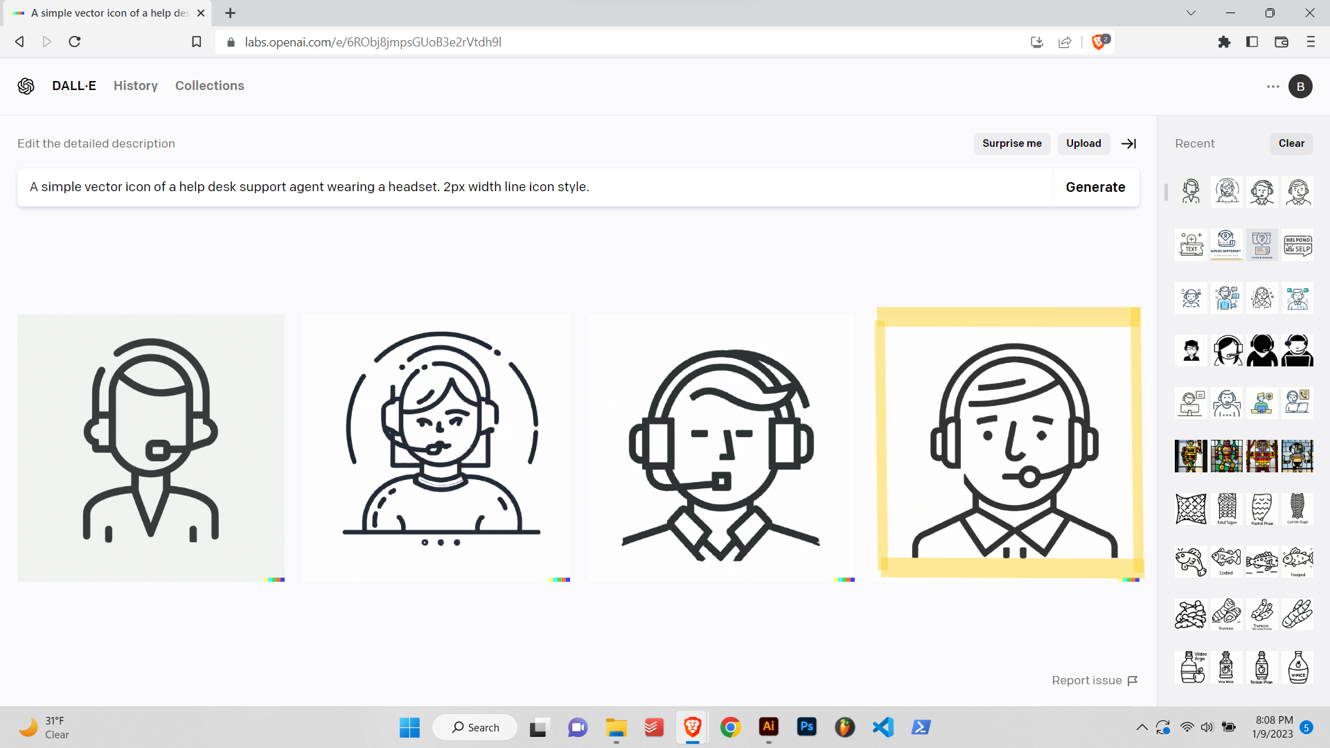
This nicely designed and somewhat distraught-looking helpdesk agent spoke to me. We've all been there before, tethered to the support line and at the whim of endless inquiries and disgruntled customers.
I downloaded the DALL•E .png icon file, then imported it into Adobe Illustrator and performed Image Trace to vectorize the image for further editing.
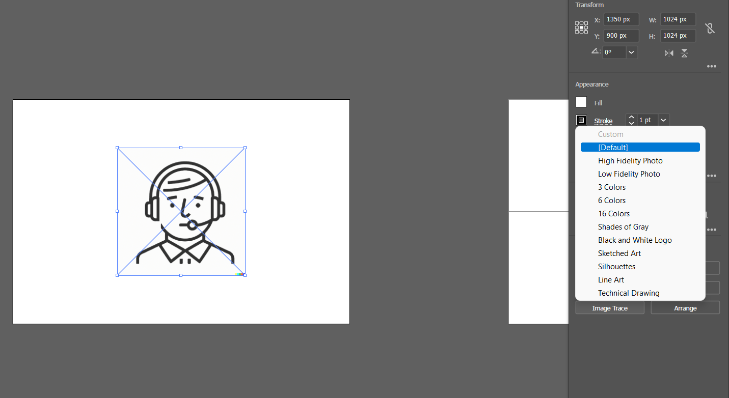
I removed the neck and shoulders portion of the icon, cleaned up some of the vector lines with the Smooth tool, added the SimpleTicket text in Avenir font, and the logo was finished. The full process from start to finish took around 30 minutes.

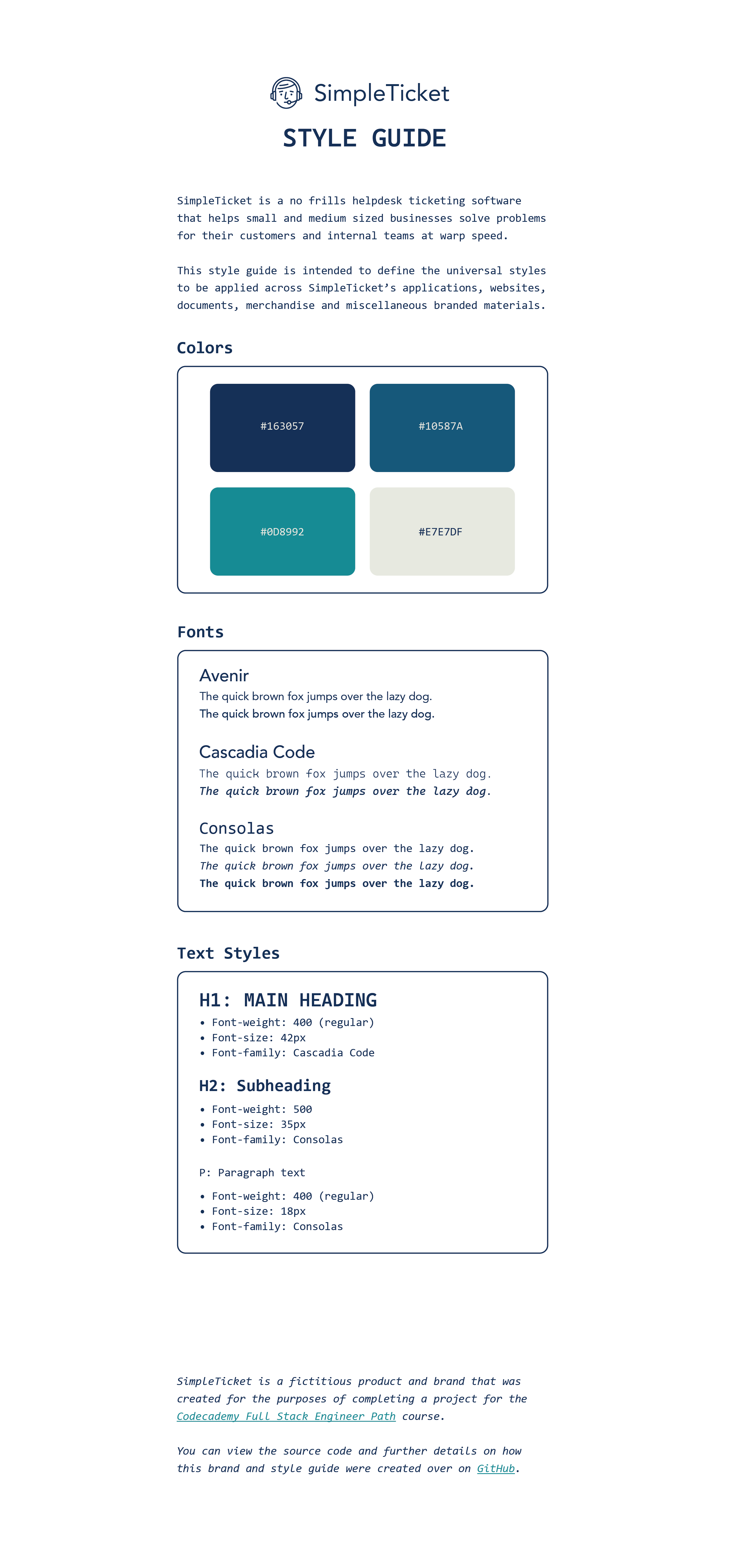
My next move was to dial in the SimpleTicket brand colors.
I utilized a fantastic website called Color Hunt to search for pre-made color palletes and quickly found a beautiful color scheme that would fit nicely with the brand.

Now that I had the logo and colors, I was ready to create the website prototype.
I again utilized Adobe Illustrator to create a rough mockup of the look and feel I had in mind for the style guide website. I also figured out the fonts and text styles at this stage.
With the logo, color scheme and prototype all finalized, I was now ready to convert the design into HTML and CSS code.
I utilized VSCode to build out the website and continually preview the site in Chrome to check my work. The Show in Browser shortcut (Ctrl+K W) was a very helpful workflow tool to fire up quick site previews.
It took a few days and some overcoming of roadblocks to complete the site build and achieve a finished product that closely resembled my design mockup. I had to adjust the design slightly in a few areas so that the website would be optimized across screen sizes, but ultimately I believe these changes improved the design overall. Part of what I have greatly enjoyed thus far with web design and development has been the challenge of working around constraints, and using them to as an opportunity to solve problems with creativity.
I learned several new skills through this project, including how to utilize .svg image files (the quality of the SimpleTicket logo boosted tenfold after converting it from a .png to an .svg for the site), how to add a favicon to a website and how to properly link fonts and images within a GitHub repository. The project also definitely helped me level up my CSS styling skills and gain a better handle on how to achieve a certain look and feel on the web.
Overall, I am very happy with the end result. Here is a link to check out the live SimpleTicket Style Guide.