1.3_branding_research
This chapter will research and compare the styles of some dating apps and of gaming apps. This will help define a style/branding guide for the dating app.
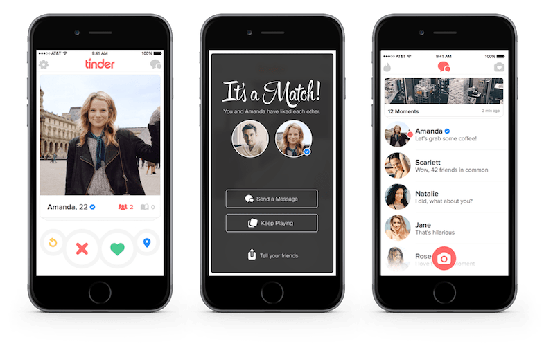
Tinder UI
Bumblr UI

Both tinder are based on a light color scheme. Using white background with colors on icons. Tinders uses more colors than only its logo. While Bumble uses it's yellow brand color alot.
Discord UI

Steam


Both these apps focuses on games and use various shades of grey. In discord this always the other colors, which are brighter, to contrast well. Still Discord uses color only on several places. Using grey could result in an UI being dull, but discord uses it's color and round icons to still keep to counter it. (squares means business and dullness, rounded and circles mean joy)
The steam store also uses various shades of grey. This allows in the library view to see the screenshots of the games, which counters the dullness of grey.
The store is were they need to sell, using blue and blueish grey, communicates that the store is the authority on buying games. Using squares gives the UI a bit of a dull look, however it allows the game they want to sell to contrast very well.