Feature/session provider#16
Conversation
 ajacksified
left a comment
ajacksified
left a comment
ajacksified
left a comment
There was a problem hiding this comment.
Looks good! Just a couple comments - remove src/components/dashboard, and restore the login and logout button stories.
| import React, { ReactElement } from "react"; | ||
| import { Button } from "@material-ui/core"; | ||
| import LoginButton from "../src/logIn"; | ||
| import React from "react"; |
There was a problem hiding this comment.
These stories should still exist separately so that a user can see the documentation for login/logout buttons.
There was a problem hiding this comment.
Additionally, this code - because it's documentation-specific, not a component any user would actually use - should live in the SeessionProvider story.
| setSessionRequestInProgress(false); | ||
| onLogin(); | ||
| } catch (error) { | ||
| onError(error); |
There was a problem hiding this comment.
setSessionRequestInProgress(false) should also be called if an error occurs.
| export default { | ||
| LoginButton, | ||
| LogoutButton, | ||
| SessionContext, |
There was a problem hiding this comment.
I'm guessing this file is the list of 'public' stuff for the module/sdk? In which case, we want the SessionProvider/useSession in here (dunno about the SessionContext)
There was a problem hiding this comment.
cool, removed context and added the provider and hook
| <BodyType>{sessionRequestText}</BodyType> | ||
| </div> | ||
| ); | ||
| } |
There was a problem hiding this comment.
this can stay here for now (file's not too long, and makes it easier to see the full picture in one file), but one for a discussion at some point I think — we might want to set up a common folder in /stories for this sort of demo component, or give each story it's own folder where these can live
There was a problem hiding this comment.
Agreed, I think it will be a bit cleaner splittling it into a different folder. Will leave it for now, but a discussion to be had later.
There was a problem hiding this comment.
I think that this is a very specific component used to show how useSession is used, so sharing isn't necessarily useful. Additionally, in order for the documentation to be useful, we need the source displayed, and keeping the definition in a separate file makes that more difficult (if Storybook can even handle it.)
Each component should have a story with minimal "noise"; that is to say, add just enough code to show all possible configurations for the component you're documenting, and not anything more. In this case, as per my comments above, you should remove the styling, onLogin, onError, etc - this is meant to show SessionProvider, not how to inject JSS into headings.
|
Hey Jack, if you're around - could you take a look at this? |
| } | ||
|
|
||
| function Dashboard() { | ||
| const { session, sessionRequestInProgress } = useSession(); |
There was a problem hiding this comment.
When looking at the generated documentation, this example doesn't actually show how useSession is actually getting used:
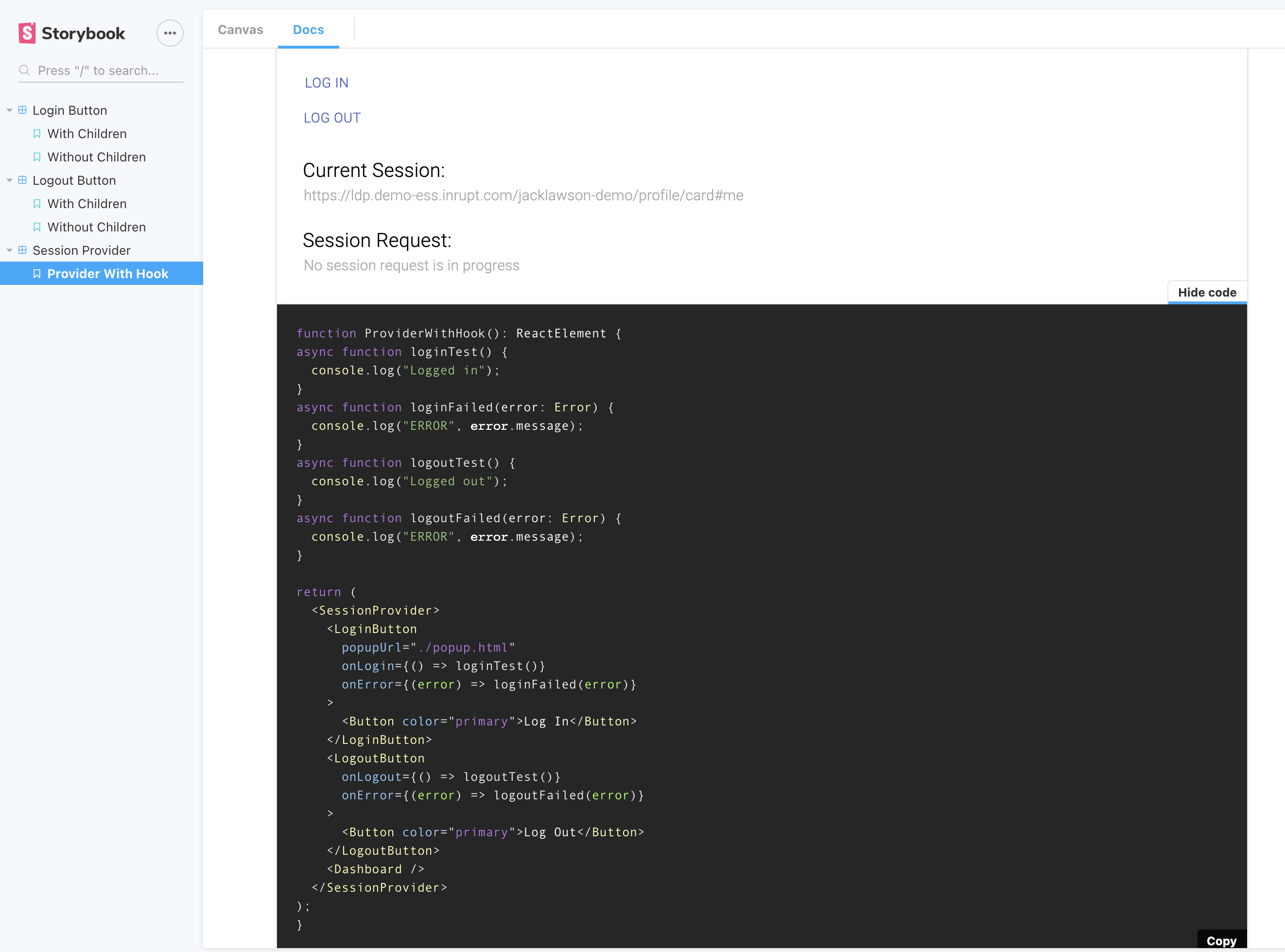
I think you should minimize the extra code so that the focus is on the SessionProvider:
- Get rid of the onLogin / onError functions
- Get rid of the styling
Additionally, we may need to replace @storybook/addon-docs with @storybook/addon-storysource in order to display the actual source code, so that the Dashboard function- which is what developers are likely most interested in- is displayed in the documentation.
There was a problem hiding this comment.
Hey Jack, Iatest version has the syling removed and I've replaced addon-docs with addon-storysource. I noticed in the docs, that the actions pane isn't being utilised at the moment - will this be required for other components, or should we remove it?
There was a problem hiding this comment.
I think it could be useful for onLogin, onLogout, onSave, and onError - not sure yet. I'd leave it for now. We can remove it later if we don't end up using it.
| <BodyType>{sessionRequestText}</BodyType> | ||
| </div> | ||
| ); | ||
| } |
There was a problem hiding this comment.
I think that this is a very specific component used to show how useSession is used, so sharing isn't necessarily useful. Additionally, in order for the documentation to be useful, we need the source displayed, and keeping the definition in a separate file makes that more difficult (if Storybook can even handle it.)
Each component should have a story with minimal "noise"; that is to say, add just enough code to show all possible configurations for the component you're documenting, and not anything more. In this case, as per my comments above, you should remove the styling, onLogin, onError, etc - this is meant to show SessionProvider, not how to inject JSS into headings.
| <SessionProvider> | ||
| <LoginButton | ||
| popupUrl="./popup.html" | ||
| onLogin={() => console.log("On Login")} |
There was a problem hiding this comment.
onlogin / onlogout should be removed from the SessionProvider story.
|
This pull request is being automatically deployed with Vercel (learn more). |
| @@ -1,83 +0,0 @@ | |||
| /** | |||
There was a problem hiding this comment.
Why were these tests deleted?
|
@maidbarion one quick thing — I think we mentioned in passing in a chat, but I don't know if it makes sense to number the story files for the components e.g. Just alphabetical would make it easier to find things and we don't have to worry about editing all the other file names to put something in a specific place. |
 ajacksified
force-pushed
the
feature/session-provider
branch
from
ajacksified
force-pushed
the
feature/session-provider
branch
from
9c2b4e5 to
e3cb6f5
Compare
ajacksified
force-pushed
the
feature/session-provider
branch
from
e3cb6f5 to
e7f3322
Compare
 ajacksified
force-pushed
the
feature/session-provider
branch
from
ajacksified
force-pushed
the
feature/session-provider
branch
from
e7f3322 to
c55a695
Compare
Co-authored-by: Aaron James Madden <aaronjamesmadden@Aarons-MacBook-Pro.local>
3 participants
Hey Jack, just raising a draft PR for feedback like last time. Testing to follow, just wanting some feedback while you're still in the office.