feat: new buttons #22
Conversation
|
Please note that this PR is not against master, it's against a design system 2 branch. |
|
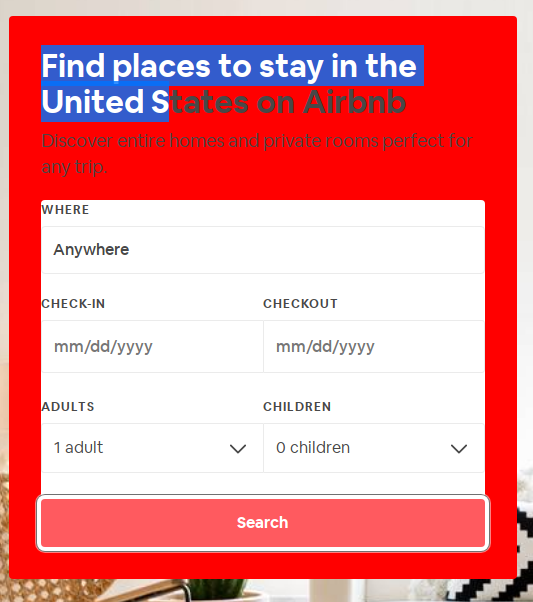
I checked the styleguide and all seems to look good. I know we talked about this already, but I'm still not happy with the focus outline. I had another look and found this resource (honestly it was the first result on google). They say that you shouldn't remove outline because keyboard users won't have visual feedback about which element is currently focused. An alternative they mention is styling the element itself. So if you give a button a different border or shadow, you should be fine. I had a look at Airbnb. Their important buttons are styled this way: Here are screenshots of our and their buttons
What do you think? We can, of course, move the discussion somewhere else :-) Apart from this issue I'm happy with the PR |


|
@jkettmann i didn't removed the outline in this pr (should be the default). The airbnb solution works but depends on the exact color of the background. Not sure if we want it that way...
|
|
Ok, you're right. We discussed that anyways already. |
…eponsibility of the user to use it in combination with valid elements like button
No description provided.