Skip to content

[Settings V2] Visual improvement: Minimal gap between settings text and side panel #7789

@htcfreek

Description

@htcfreek

📝 Provide a description of the new feature

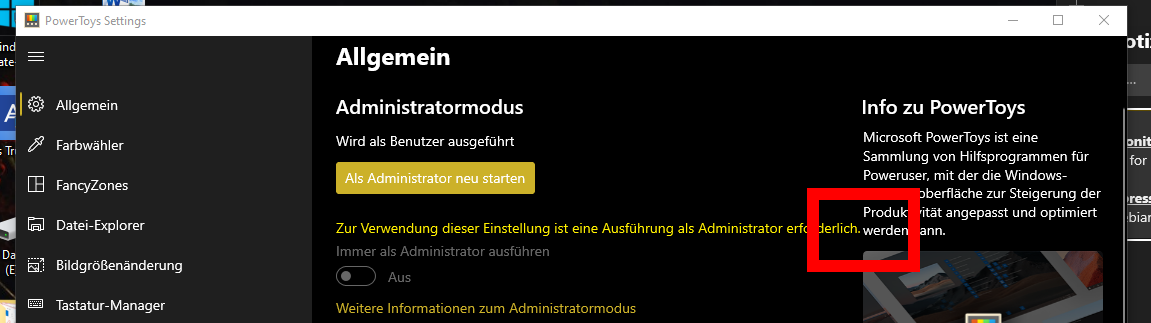
For a better look and feel of the settings window we should define a gap between the text and the side panel which must exist minimal. Otherwise the text looks squeezed together.

I think we should define the same gap as we have between navigation pane and text.

Small window without gap
image


If you'd like to see this feature implemented, add a 👍 reaction to this post.

Metadata

Metadata

Assignees

Labels

Area-User Interfacethings that regard UX for PowerToysCost-SmallSmall work item - 0-8 hours of workIdea-EnhancementNew feature or request on an existing productProduct-SettingsThe standalone PowerToys Settings applicationResolution-Fix CommittedFix is checked in, but it might be 3-4 weeks until a release.

Type

No type

Projects

No projects

Milestone

No milestone

Relationships

None yet

Development

No branches or pull requests

Issue actions