Conversation
 bpasero
left a comment
bpasero
left a comment
bpasero
left a comment
There was a problem hiding this comment.
@sbatten I am not sure every color works as expected, here is some individual feedback:
menubar.inactiveMenuForeground: this color is not doing anything for me and I would rename it tomenu.inactiveForeground. Once it works we should also add a correspondingmenu.inactiveBackgroundmenubar.menuActiveBorder: I would rename this tomenu.activeBorderand apply it for any active menu item including the menu barmenubar.activeMenuBackground: I would rename this tomenu.activeBackgroundand apply it for any active menu item including the menu barmenubar.activeMenuForeground: I would rename this tomenu.activeForegroundand apply it for any active menu item including the menu bar
On top of that I think we also need these colors:
menu.background: overall background color of the menu (maybe only when expanded)menu.foreground: overall foreground color of the menumenu.hoverForegroundandmenu.hoverBackgroundwill probably come up as well at one point
 sbatten
force-pushed
the
sbatten/menuBarThemes
branch
from
sbatten
force-pushed
the
sbatten/menuBarThemes
branch
from
6515699 to
c4d35bd
Compare
|
@bpasero I've updated to be complete now. I've updated the names to be a bit less verbose in response to your feedback, but I've settled on a different set of keys. This is because the menubar needs to be separate from the menus themselves as it needs to blend with the titlebar. Due to this, I only allow theming of the menubar's selected item. The rest is decided by the titlebar. Another note. I theme the menus in the menubarPart instead of attaching a styler to the menu for simplicity. If I understand correctly, exposing the colors/styling on the menu widget would require quite a bit more code since the menu composes an actionbar and thus we would also need to expose it there. Further, anywhere menus are created, the styler would have to be applied which includes the menubar, the context menus, and dropdown actions, at least. |
|
To summarize, here are the new colors:
The
Whereas the other colors apply to every menu, including the context menu. I think the distinction between
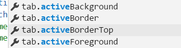
In other areas we typically have a dedicated color for the case where you hover over an element vs. the active selected element. Do we want to distinguish between these 2 cases here as well? When I look at native menus on Windows there does not seem to be any difference between hovering and selection, so maybe its fine to keep this as one color, but then maybe it should not be called "selected" but rather "active"? Similar to these colors from tabs:
Adding @aeschli to this review to comment on the picked color keys. |
bpasero
left a comment
bpasero
left a comment
There was a problem hiding this comment.
Works great, I also suggest to make a pass over our built in themes and add the colors once we have decided on the final color keys.
|
Names are good |
|
@sbatten I renamed "selected" to "selection" and will merge. Also do not forget to update our docs: https://code.visualstudio.com/docs/getstarted/theme-color-reference |
|
What color is the divider between subgroups in the menu? Would it make sense to create a key for that, too? |
4 participants
ref #52914
incomplete, theming the menubar (done) and menus (not done)