UI improvement ideas #881
Description
Hi, this is my list of things that annoy me in the current version of the app (2.16.1). Changing these should improve the user experience. These may be small things, but they sum up. Here are my ideas:
Flaw 1
Move the change title option
- The change title option is hard to find for new users
New users may try to just tap on the title to edit it. But this doesn't work. They have to search in the three-dot menu to find this option. Not very user friendly.
- Changing the title are too many steps to do
Open the note. Tap on the three-dot menu (1). Tap on change title (2). Tap on the text field to open the keyboard (3). Tap on save (4).
These are 4 steps. Let me compare this to the Google Notes app:
Open the note. Tap on the title (1). Keyboard opens automatically. No need to press save. This is much less annoying, especially when you are editing titles often.
What about doing it like Google's app? This is much more user friendly.
Example video, comparing changing title in Nextcloud Notes vs Google Keep app:
https://www.youtube.com/watch?v=YjHAYLFie34
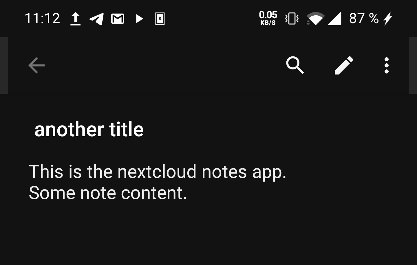
Just move the title down (out of the title bar) to a text field above the note content.
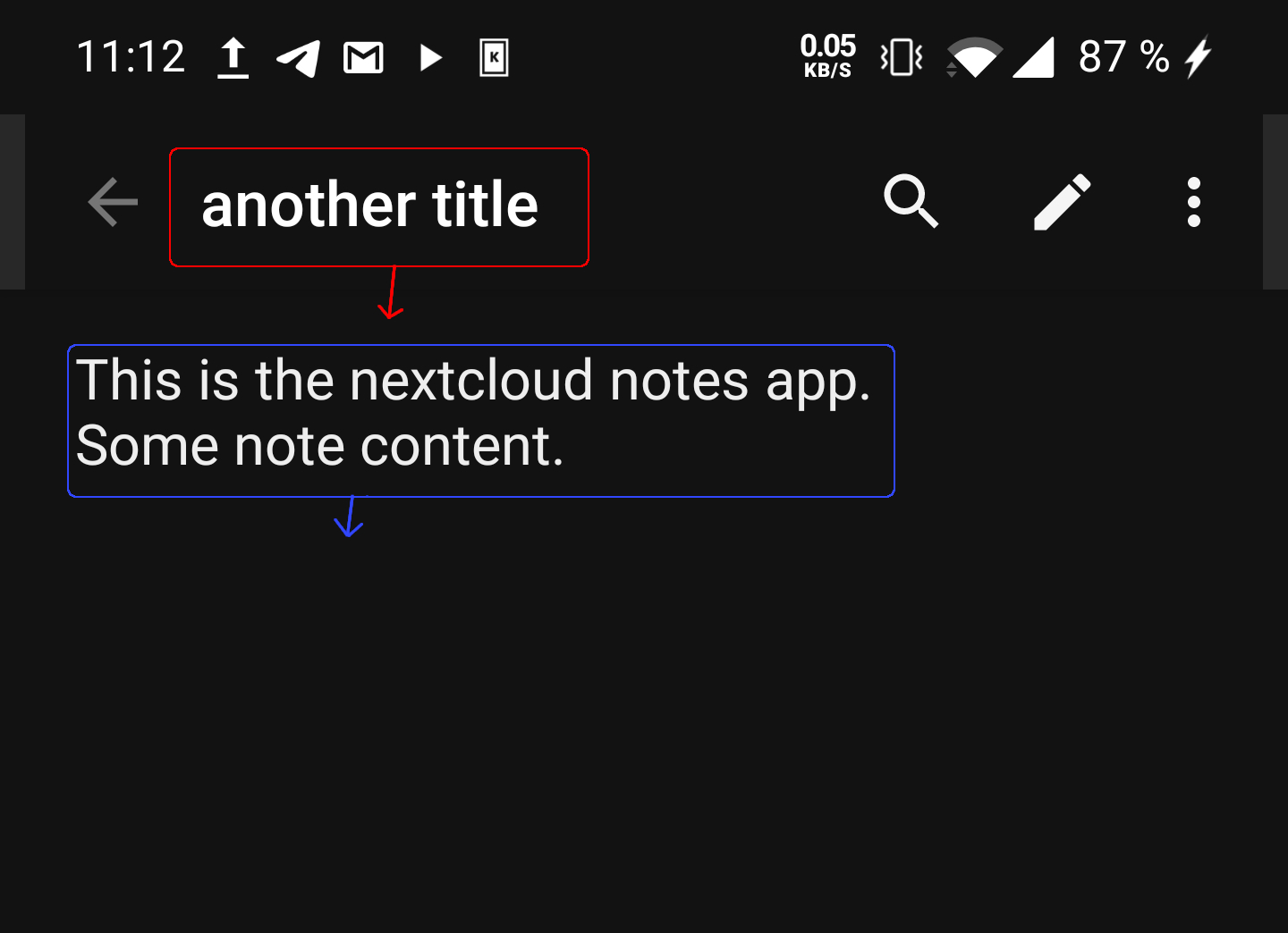
So that it would look like this:
Flaw 2
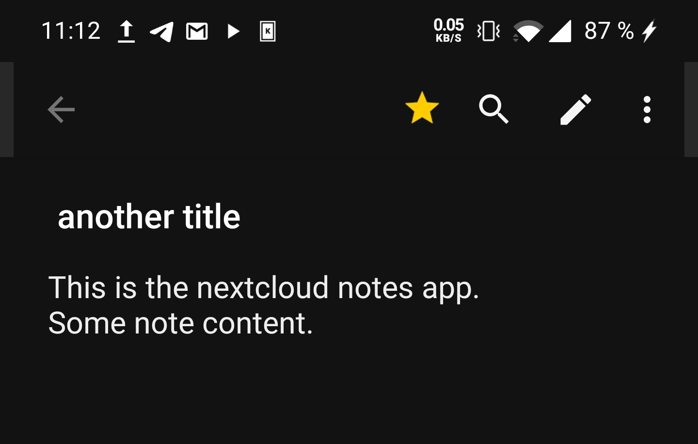
Move the fav star in grid mode
When using the phone in one handed mode, the bottom right of a tile is the best area to reach. But this is where the fav star is placed. So it is easy to accidentally fav a note instead of opening it.
Demo video:
https://www.youtube.com/watch?v=BvAaakbesmk
Someone may come up with something better, but this would be one way to solve it:
Move the star icon into the note view.
So let me take the screenshot from Flaw 1 again and edit it a little. If you fix Flaw 1, there is enough place in the title bar when in a note to place another button. So it may look like this:
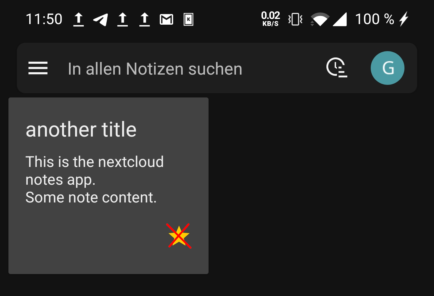
Now you can remove the star icon from the grid view:
Flaw 3
Option to disable swipe to delete
I found this:
#665
So I understand if you don't want to fix it. I still did want to add it to the list.
Because of new Android 10 gesture / swipe navigation, this problem happens more often.
Swipe from right is going back. But it is also deleting a note.
Sure, there is an undo button. But for example ealier today I managed to accidental delete a note but until I processed what just happened and reached the bottom of the screen in one hand mode, the undo option was already gone. So I had to open the website, login, and restore from trash.
An easy way to make it a little better would be to show the undo option for a longer time. Currently it seems to be 3 seconds. Increasing it to like 5 seconds could already help a lot without new maintenance work.
Flaw 4
Better grid view design
Currently it looks like this:
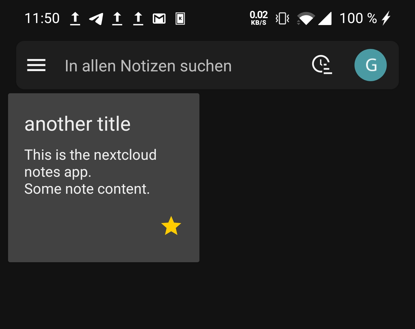
But it can be improved:
- Use a little more spacing
The upper note tiles look like they are glued to the search bar. A little more space to separate them would be nice.

- Do not use different background color in grid view note tiles
In dark mode. The main background color of the app is just fine. The light gray doesn't fit in well as background. Also it lowers the contrast and so makes the text a little harder to read.
My idea would be to use the light gray only as border, so that it looks like this:
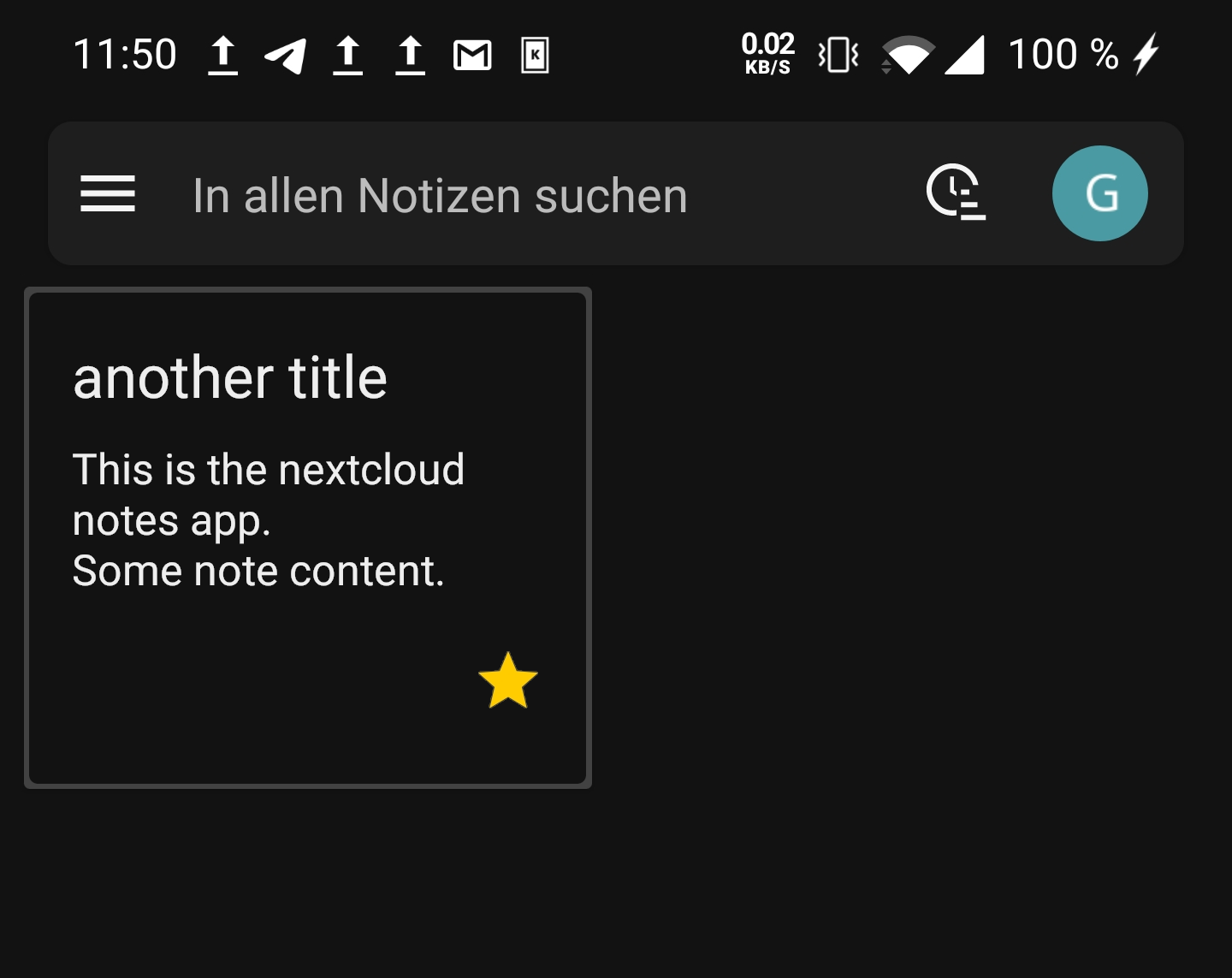
- Increase round corners on note tiles
Just like the search bar. It is more round than the note tiles. This just adds inconsistency. Make the note tiles edges as round as the edges of the search bar so that they look the same.
So in the end it could look like this:

Conclusion
This is not a rant. This are just my ideas on how the UI could be improved so far. I may add to this list as new things come up.
Thanks for taking the time to read this and thanks for the already great app :)