Design Tip: Avoid Colored Text Syndrome! #382
Description
Avoid Colored Text
It’s an unavoidable truth of UI design that the world’s best designers use colored text way less frequently than beginners. I’m not saying it never happens. But if you crack open the popular apps on your phone, you’ll be hard pressed to find text that isn’t a.) black, b.) dark gray, or c.) white (if the background is darker, of course). In fact, if you define gray as inclusive of black and white (and you should), then pro designers are basically only making text gray.
But look at some beginner mockups, and you’ll be tasting the rainbow left and right. No bueno. Let’s leave that to the breakfast cereal and kid’s games.
Now we know good design has to meet a goal (that’s what separates it from art). And beginning designers will make their text colored as a way of trying to achieve a specific goal. So let’s break down some of those goals, and discuss how you might achieve the same ends without all the rainbow-tasting.
Use Case #1: Scannability
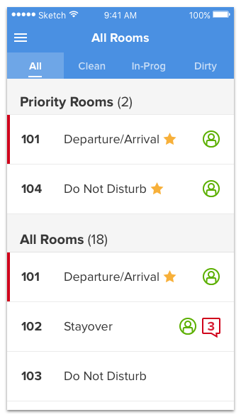
OK, here’s an example based on an old client design that I saw. It uses a ton of colored text, and as you’ll see in a minute, the purpose of all this nonsense is scannability.
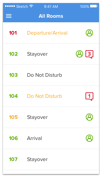
It’s a list of rooms in an app for hotel housekeepers.
It’s a bit of a mess right now. But let me explain it, and you’ll understand how we got into this situation.
- The room number color represents room state – clean, dirty, in-progress
- The occupancy status color represents priority status – gold is priority (VIPs, etc.), gray is regular
- The person icon represents the guest being in the room, which some small hotels keep track of
- The chat icon represents new messages about the room from other housekeepers or hotel staff
Each of these four items is sometimes or always colored. So yeah, plenty of colored text. Ouch.
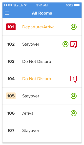
But what’s the goal of the color? Scannability. The list needs to be scannable.
- You want to quickly pick out the dirty rooms, so you scan the left-hand side, looking for red
- You want to quickly pick out the priority rooms, so you scan the middle of the screen, looking for gold
- You want to quickly pick out the rooms with unread discussion, so you scan the right-hand side, looking for red
(Scroll up and try it. It works. You can pick these things out – it’s just gross-looking and not exactly user-friendly as to what each color means)
Anyhow, this is one of the most common reasons beginners color their text. They need items to appear quickly when scanning.
Unfortunately, colored text is a bad way to do this. Why?
- Representing state with only color means colorblind folks can’t always tell which state something is in
- It looks nasty
(Regarding the colorblindness issue, consider again that red-green colorblind is the most common type of colorblindness, and yet representing red=bad, green=good is the most common type of color-related state signaling. Oh snap! Stoplight-design won't cut it!)
So here are our goals:
- Keep the list scannable
- Don’t represent state only with color
- Make it look nice
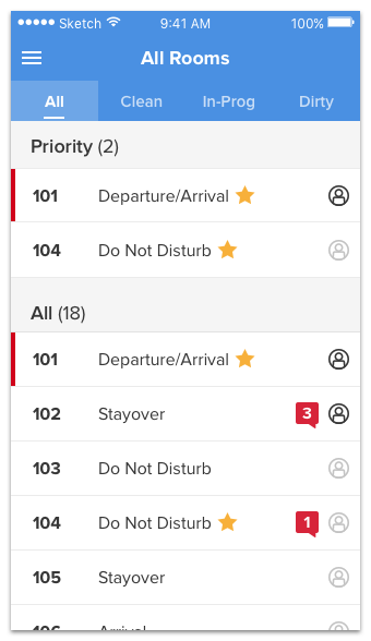
One technique I often try is what I call “bulletizing”. Let’s turn the colored textinto gray text in a colored bullet (AKA pill AKA tag AKA chip).
OK, so we’ve uncolored the room number text. Dirty rooms have a red bullet. In-progress rooms have a really light yellow bullet. Normal rooms are displayed, well, normally. This is slightly better, but not amazing. While “bulletizing” colored text works sometimes, let’s try another marker of state here.
(Note: “Red box vs. yellow box! Isn’t that representing state with color!?” Technically, yes. However, light yellow is so luminous and the red so dark/rich that they’re not going to get mixed up, even if you can only see in grayscale)
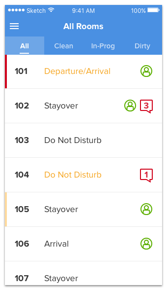
Ooh, this is closer. I can feel it. The state marker is a simple band on the left-hand side, but we’ve also considered the use-case here. We’ve thought about the broader picture and said, hm, would it be useful for the user to see JUST the dirty rooms or JUST the clean rooms? And in this little made-up example, the answer is yes. So we’ve added a tab control that allows us to toggle views between the major room states.
You could call that the filter strategy for replacing scannability-oriented colored text: make the variable in question filterable so users can easily see JUST those items. This solves the scannability question by avoiding it entirely (although we still have these extra unexplained rectangles on the left-hand side of the screen that hopefully users will catch on to – and very well might, if they regularly look at the filtered views!)
Cool, let’s try our hand at the priority-marker next.
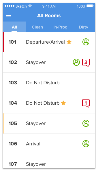
Well that was hard. This is the icon strategy for replacing colored text. (Maybe you thought of doing something similar for the room-cleaning status – in which case, that’s great! It’s definitely an option there too!)
But we’re not done yet. Remember: scannability. Why do you scan?
Well, let’s ask the users: why does priority status matter for a given room?
I’ve done this before, so I can answer this one: because you want to clean the priority rooms first.
This screen is being used to decide what room a housekeeper should clean, and in the current state, it’s really not easy to see which ones are priority. So we could a.) add another filter control to the top or b.) something else.
Something else, I choose you!
This solution may not work for big hotels where there are tons of priority rooms, but for smaller joints, the grouping strategy will be a viable way for meeting a goal previously achieved with colored text. Sweet!
Now I’m going to breeze through the last two steps real quick.
I’ve taken the color out of the room-occupancy status (which was a bit confusing – does green mean "yes, it’s occupied, so don't go in" or "yes, you can go in now"?). The grayed-out icons represent rooms where the occupants are away. I think this makes it a bit easier to comprehend at a glance.
Notice what I did with the message icons? Let’s call that the fill-in variation on the icon strategy. Instead of colored text, I have a filled-in colored icon with white text on it! Nice.
The final change was to tighten up the spacing of everything. Now each list item is about 50px tall (ignoring Retina multiplication here), which is perfect for a list of simple, tappable items on an iPhone.
And look, no colored text to boot!
So to review, here are the ways of removing colored text we’ve talked about so far.
- The bullet strategy. Change colored text into white text in a colored bullet (AKA pill AKA tag AKA chip).
- The icon strategy. Represent the state with an icon (colored or grayscale) instead of colored text.
- The grouping strategy. Show state by grouping like items rather than using colored text to distinguish them.
- The filter strategy. Allow users to filter down to relevant items instead of using colored text so users can browse for them.
- The fill-in variation on the icon strategy. If you’re using colored text inside of an icon, fill in the icon and make the text white.