feat(nc-gui): add color scale to erd view #4071
Conversation
ee60b86 to
e908dab
Compare
|
@bcakmakoglu IMO the color and thickness of the edges feels a little cluttery. At least for me, I am finding it hard to read the tables especially when zoomed out. |
|
@mustafapc19 I increased the max zoom because on ERDs with a lot of tables the fit view doesn't work properly, so it kinda fits in the middle of seemingly nowhere (it fits in the center but because the zoom can't contain all elements it looks off). How about this for edges: On hover / select: |
|
On second look, agree with @mustafapc19. We can keep the lines joining table thinner like before. And on hover we can a highlight/flowing-animation. |
|
@o1lab
Screen.Recording.2022-10-14.at.13.15.38.mov |
|
Skeleton mode is really nice. A small animation or a way to tell it got activated will be nice. Pls check if this plays well with checkboxes behaviour too. cc : @mustafapc19 who has more context on this. |
|
I'll open a separate PR for the skeleton mode as to not bloat this PR more, this was just meant to do some coloring 😄 |
|
Sure :) Love the idea of automatic skeleton mode. Infact, @mustafapc19 & myself had discussed this and we had put checkboxes instead to achieve the same :) |
|
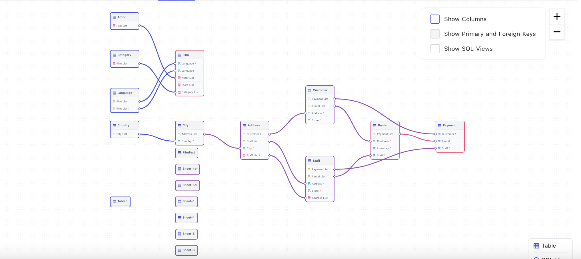
@o1lab I don't remember discussing the Skelton part. What I remember was to show the relation info when we hover over the edge. But Skelton looks nice and useful. @bcakmakoglu how is the color for each node border determined? |
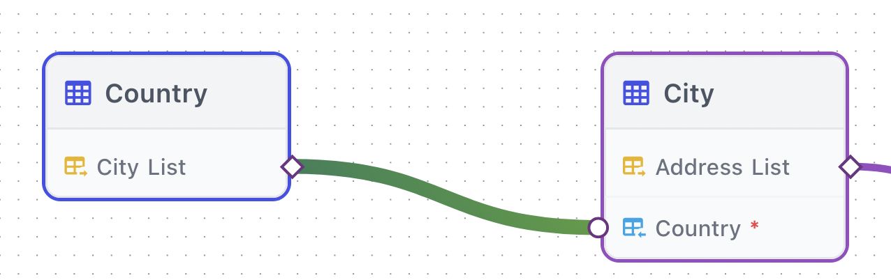
const color = colorScale(dagreGraph.predecessors(el.id)!.length)Depends on the number of predecessors a node has - if there's only a single connection the color gradient will go from start -> end instead of start -> step -> step -> end |
|
@bcakmakoglu imo I don't see the use of colours in this case. If a color was associated with a table or its type(i.e junction/non junction table) it makes sense but here from UX perspective I don't see any unless I am missing something. Its my opinion but ERD view contain a lot of info already for a user to absorb. And having more colors just causes more confusion. |
|
It's just visually more pleasing and hints towards the depth of the links. |
|
That is true lol, but the reason why ppl use ERD is to see lots of tables info and how they are related to each. Having color signifying depth of link doesn't mean much in this case. I do understand the stylistic reason tho :) |
|
I have an alternative proposal, give me a second 😋 |
|
Okay, so in the regular old column view it could just look like this: That is just very slightly updated in regards to styles, not much. And when zooming out far enough for elements to become sort of unreadable we switch into "skeleton" mode which would look like this: |


|
If we have border of Skelton in the similar to normal view and edge color is consistent, it's good for me. Also the one more issue I see is in the Skelton view there is no way to know what relation(hm/mm) each table has. In the normal view, we use circle and rectangle to signify that. One solution is to have a label(hm/mm) on the edge which is visible on hover. |
|
Its kind of a deliberate choice because one table could have multiple connections to a table that could be of different type, then we would have mixed indicators, instead the skeleton is really just meant to show what tables have any relations to another table. |
|
Yeah makes sense. |
b5cfd9d to
8979a12
Compare
8979a12 to
c97b116
Compare
4c7b64f to
cbaa3f6
Compare
cbaa3f6 to
4ab7ff0
Compare
d23e9f8 to
e28a7b4
Compare
Change Summary
Change type
Test/ Verification
Provide summary of changes.
Additional information / screenshots (optional)
Screen.Recording.2022-10-14.at.02.35.19.mov