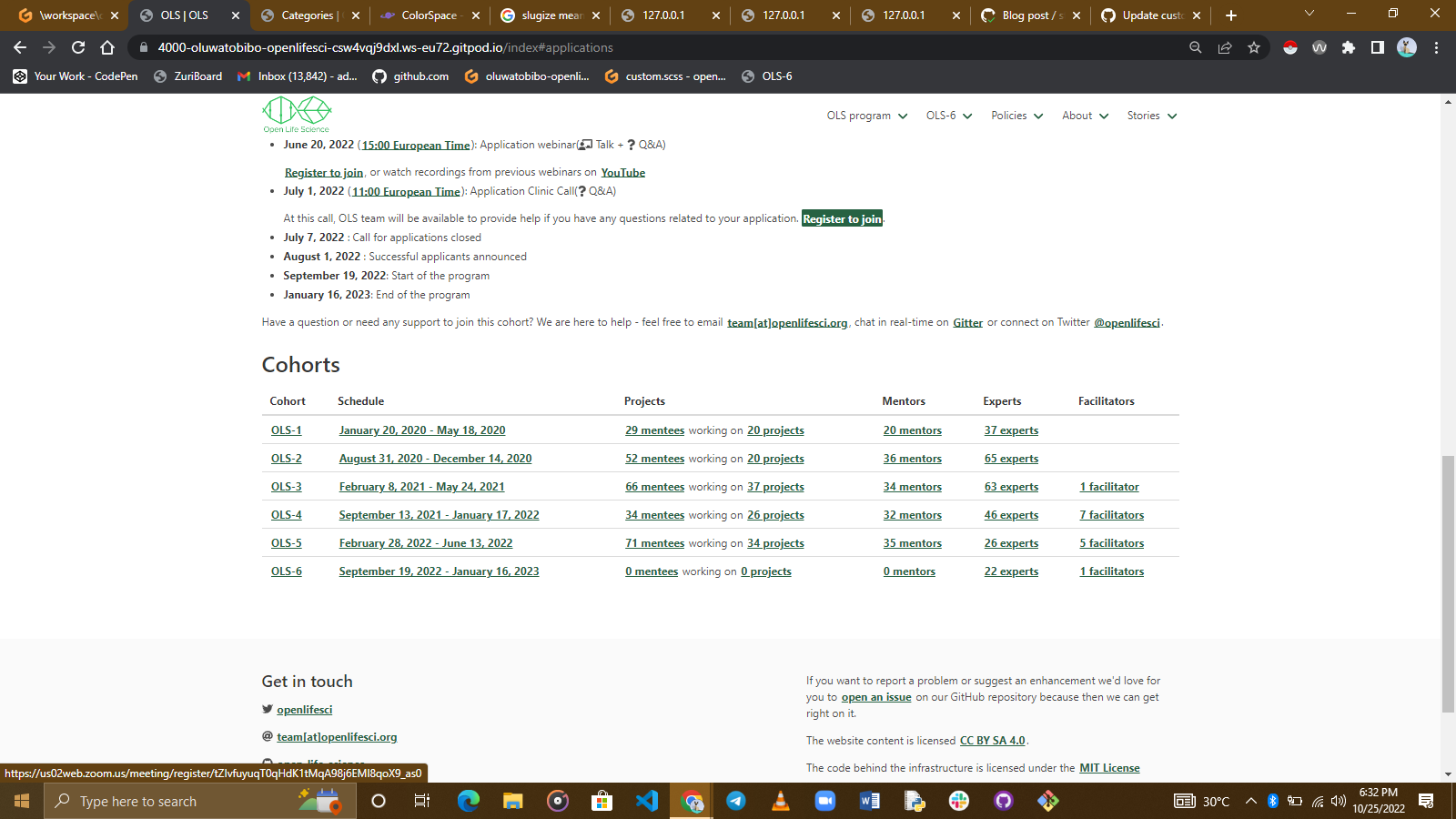
Update custom.scss #430
Update custom.scss #430
Conversation
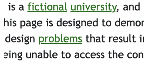
to remove the distracting green links on the website
|
As defined in the OLS Outreachy contribution guide,
@hsadia538 were the first one to comment the issue #417. Maybe we could let them to the first try on that |
Ok. I had just read the guide now. I wasn't aware we had to comment before working on it. A review would still be appreciated. |
|
Maybe @hsadia538 could review it |
@bebatut could it be given a review now, i think it's past the three waiting days |
|
Yes it should be reviewed now 😄 One first quick comment: with your changes, it is now difficult to see where there are links |
changes have been made |
|
Thanks. Can you check using Wave if this changes the accessibility (contrasts, etc)? |
i have changed the link color from #48b87d to a more darker #265F3F to pass the contrast accessibility
|
|
Hey @oluwatobiBolu, |
The point of making it green is to entirely differentiate the links |
|
this PR also fixes issue #438 |
|
Quick note from my side - I think the colour looks fine, but it also makes it harder to tell there is a link there since it's similar to the main text colour. Any suggestions for ways to make the link affordance more obvious? https://web.accessibility.duke.edu/link-and-button-affordance/ |
I think we could maybe see if a slightly lighter color would work (I do think in the avatars that green looks a bit too dark). We could also maybe keep the underline, but move it closer to the text, and make both the same color. Like in the page you linked:
|
|
@yochannah @vasconsaurus i changed the text decoration property of the main contents |
I think the links are pretty clear now. Even though we brought back the underline for this test, I don't think it's as 'vibrant'(?), as it was before. From my 'other-applicant-observer' position, this seems like it could be a solution. We should probably check what @bebatut thinks as well |
|
We come back there to the issue that underlining links make the text hard to read for people with dyslexia |
|
Closing this - thanks for the contributions 🙏 in this case we are updating the whole theme so this PR isn't needed anymore. |
to remove the distracting green links on the website
part of what i reverted in the first pull request
this tackles issue #417 only
please review
thanks for the earlier guide