This project consists of showing the menu of a fast food restaurant where when placed on each menu, a Hover effect is generated that changes the background color and the color of the letters to highlight the publication.
HTML:
<title>Menu de Hamburguesa</title>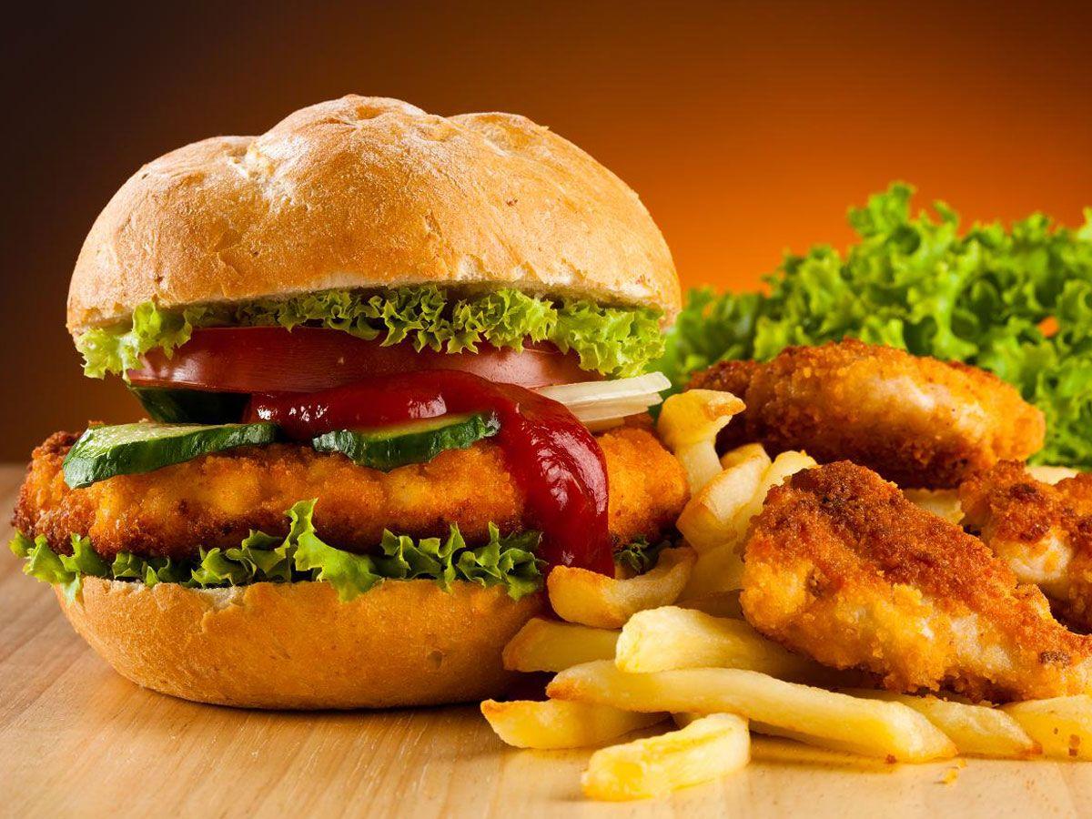

CSS:
*{
margin: 0;
padding: 0;
}
body{ background-color: orange; }
.content{
display: flex;
flex-direction: column;
align-items: center;
}
.heading{
font-size:40px;
font-weight: 800;
margin:60px auto;
color: blue;
}
.cateogaries{
display: flex;
flex-wrap: wrap;
}
.ctitle:active{
background-color:rgba(255,0,0,0.9);
}
.cateogaries .ctitle{
margin:10px;
border:4px solid red;
padding: 20px 65px;
border-radius:12px;
background-color: #000000;
}
a{
text-decoration: none;
color:#ffffff;
}
.container{
display: flex;
flex-wrap: wrap;
width:80%;
justify-content:center;
margin: 20px;
}
.items{
width:200px;
height:300px;
display:flex;
border:4px solid red;
padding:4px;
border-radius: 10px;
margin: 20px;
flex-direction: column;
color:blue;
}
.img{
width:200px;
height:200px;
}
.title{
font-size:20px;
}
.cateogary{
text-align: center;
margin: 10px 0px;
}
.details{
display: flex;
justify-content: space-between;
width:100%;
}
.items:hover{
background-color: #000000;
color:white;
transition-duration:0.7s;
box-shadow: 8px 8px 10px rgba(255,0,0,0.4);
transform:translate(-8px,-8px);
}
.img-conatiner{
height:200px;
width:200px;
overflow: hidden;
}
.cateogaries .ctitle:hover {
transform: translate(3px,-5px);
transition-duration: 0.7s;
box-shadow: 5px 5px 10px rgba(255,0,0,0.5);
}