Add 'nice' date-time x-axis labels for non-regular time series plots #27509
Description
Code Sample, a copy-pastable example if possible
import pandas as pd
import numpy as np

df1 = pd.DataFrame({'a':np.arange(5)},
                   index=pd.DatetimeIndex(['2019-07-01 12:00:00',
                                           '2019-07-01 17:00:00',
                                           '2019-07-02 03:00:00',
                                           '2019-07-02 16:00:00',
                                           '2019-07-04 13:00:00']))
# First plot - not nice x-axis labels
df1.plot()

df2 = df1.resample('1H').ffill()

# Second plot - lovely x-axis labels
df2.plot()
Problem description
The first plot created by the code above is:
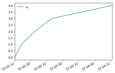
The x-axis labels here aren't formatted as nicely as they could be.
However, when the data is resampled to a regular frequency and plotted, you get the plot below:
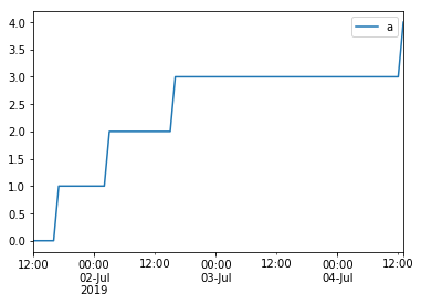
This has lovely x-axis label formatting, with multiple levels, and is very clear.
I've had a look at the code, and it seems that it is using a major formatter of pd.plotting._converter.TimeSeries_DateFormatter, but this seems to require data with a freq (ie. regularly spaced time series).
Is there any way to add this lovely formatting for non-regular time series data? Either as a default, or as something that can be done manually by the user.
Expected Output
The ideal expected output is the same x-axis labels for both plots.
Output of pd.show_versions()
pandas: 0.24.2
pytest: 4.3.1
pip: 19.0.3
setuptools: 40.8.0
Cython: None
numpy: 1.16.2
scipy: None
pyarrow: None
xarray: None
IPython: 7.1.1
sphinx: None
patsy: None
dateutil: 2.8.0
pytz: 2018.9
blosc: None
bottleneck: None
tables: None
numexpr: None
feather: None
matplotlib: 3.0.3
openpyxl: None
xlrd: 1.2.0
xlwt: None
xlsxwriter: None
lxml.etree: None
bs4: None
html5lib: None
sqlalchemy: None
pymysql: None
psycopg2: None
jinja2: 2.10
s3fs: None
fastparquet: None
pandas_gbq: None
pandas_datareader: None
gcsfs: None